Current Urban Studies
Vol.07 No.02(2019), Article ID:93490,23 pages
10.4236/cus.2019.72013
The Digital Urban Atlas of Jeddah: Some Raised Issues and Semiological Principles
Mohsen Dhieb*, Mohammed Al-Amri, Abdelhamed Jamil
Department of Geography and GIS, Faculty of Arts and Humanities, King Abdulaziz University, Jeddah, KSA

Copyright © 2019 by author(s) and Scientific Research Publishing Inc.
This work is licensed under the Creative Commons Attribution International License (CC BY 4.0).
http://creativecommons.org/licenses/by/4.0/


Received: April 23, 2019; Accepted: June 27, 2019; Published: June 30, 2019
ABSTRACT
The “Technological Transition” has had a tremendous impact on cartographic processes and outputs. Atlases, whether national, regional or urban, were affected as they moved from a static to an animated and interactive era. The overall positive development, consolidated by map automation and map animation, has taken various forms and directions. Nevertheless, some graphic and cartographic outputs, especially atlases, still suffer from serious pitfalls, regarding some semiological aspects of the resulting maps and graphics. The Digital Urban Atlas of Jeddah (DUAJ) is a research in progress aware of such deficiencies. It tries to spare it from some frequent errors in map design related to: the choice of the base map, the use of some frequent symbols such as columns and pie charts for multivariate quantitative data, and the alternative solutions to choropleth maps. These deficiencies are selected and examined among others. The authors are convinced that the generated maps and diagrams that should be produced in digital atlases must be examined with regards to the semiological rules that drew upon the theory of signs perception. They try to incorporate the basic principles of graphic semiology reviewed, corrected and adapted to the GIS requirements. This is also meant to avoid map noises and deficiencies. The goal is to attract future Digital Atlases producers towards developing higher interest in map look and design and users to grasp messages rapidly. Specifically, the use of GIS and linked spatial databases within the DUAJ should not pay attention only to data handling and crossing, but also, to the semiological features of the outputs and relevant visual communication. In its preliminary stage, the DUAJ should give answers not only to the three questions raised in this research but also to others not examined here. This is to prevent from incorrect, irrelevant or inadequate use of the cartographic tools and, following the analysis of concrete examples, to propose a set of recommendations in establishing maps and graphics. When necessary, the DUAJ GIS-based outputs are inserted in CAD or CAC systems to benefit from some their specific visual tricks and subtleties that yield better legibility and efficiency of communication for Atlases users as recommended by authors. This experience is discussed regarding its eventual contribution to better map reading through some examples of maps and graphics from the DUAJ project (in progress).
Keywords:
Digital Urban Atlas of Jeddah, Users Issue, Semiological Approach, Atlas Design

1. Introduction
During the past decades, cartography has accomplished an important evolution due to the “Technological Transition” ( Monmonier , 1985), passing from the paper to the digital era. This has had a tremendous impact on all aspects of the cartographic process, but mainly on the cartographic outputs. From the latter, atlases are concerned as maps moved from static paper status to an animated and interactive one. Most of the new atlases, whether national, regional, or urban, if we consider the spatial dimension, are by now at digital format, interactive, animated and GIS-based.
However, the overall positive development, provoked by map automation, has taken various forms and has not come without serious pitfalls with regards to the semiological characteristics of the resulting maps or graphic documents. That is what the research team working on the Urban Atlas of Jeddah (DUAJ) tried to consider. The generated maps and diagrams conform to the semiological rules regarding Bertin’s theory on signs perception and visualization (Bertin, 1967, 1973, 1987, 2005; Bonin, 1983; Dhieb, 2019).
Departing from the case study of Jeddah and a semiological approach on thematic atlases, the goal of this preliminary work is to discuss a few selected issues dealing with semiological deficiencies through a few examples. The examples are related to base map choice; the use of GIS-based frequent outputs using columns and pie charts graphics for multivariate data; and a critique addressed to the dominant use of the choropleth method.
2. Maps, Atlases and Semiology of Graphics
Since the “Atlas of Islam” of the Arab geographer Al Balkhi (Guilford Miller, 1929-1930; Kramers, 1931), Ibn Hawqal who was one of his disciples stated in 977 A.C. that the map belongs to the world of images in his major cartographic work titled “Surat Al Ardh”, which means literally, “Image of the Earth” in the tenth century (Figure 1). Al Qazwini drew a kind of land use scheme or model of his own town Qazwin far before Von Thunen (Figure 2). In the seventies of the twentieth century, Bertin went a further step when he defined the static map as “rational image” to distinguish maps from other figurative images (Bertin, 1973: p. 6). Today, another stage was reached by the introduction of the movement within maps. However, whether static or dynamic (animated or interactive), the map

Figure 1. In a, at right; this figure shows the cover of a study on the Arabic book of Arab Cartographer Ibn Hawqal titled “Surat Al Ardh”, which means literally Image of the Earth; in b, at left, Ibn Hawqal reconstituted world map (Sources: https://www.goodreads.com/book/show/33978095, and ,http://ibnayob.blogspot.com/2014/01/blog-post.html).

Figure 2. The figure shows the city of Qazouin drawn by Al Qazouini and enhanced by Mohsen DHIEB. It appears as a series of concentric circles with land use categories from the downtown to the surrounding suburbs, orchards and farms. Two main rivers designed as straight thick lines cross the city (Source: Dickinsons, R.E. City Region and Regionalism, London, 1964). Some Arab sources see a prefiguration of Von Thunen model (http://almerja.net/reading.php?idm=37484).
and the diagram may be used at the three major stages of the cartographic processes: data collection, data analysis and data communication. They are intended to convey a message and this message must be read and grasped by users without ambiguity in the least time. All cartographic models agree on these points: it is recognized that in addition to oracy, numeracy and literacy, “the skill of ‘graphicacy’ is best imparted at school, college, and university level through geography” (Balchin, 1976; Wilmot, 1999) and that map is much more powerful than a single text, a verbal discourse, or a statistical table. Many cartographers such as Bertin and Robinson have recognized this power (Bertin, 1967, 2019; Robinson, 1978, 2015).
Atlases are coherent collections of maps of a one given space that moved today from a static to an animated stage. Historically, “Ptolemeus Guide to Geography” included instructions on how to represent the Earth on maps. Translated first into Arabic in 800 and second into Latin in 1409, it influenced the first Ortelius Abraham Atlas in 1573 and further Mercator Atlas in 1595 (Van Raemdonck, 1869). This issue is important to prevent readers on the way maps and diagrams have been made in the past. In the first case, cartographers talk about general-reference, regional or urban atlases portrayed in a comprehensive manner, whereas in the second one, they mean thematic atlases covering a huge variety of themes and which may concentrate on one specific topic.
Today, whether in conventional or electronic form, atlases portray a geographical area (the entire world, a country, a region or a town... etc.): therefore, cartographers should first discuss the base map issue. Second, among the various cartographic methods offered, cartographers should not choose evenly the easiest or most frequently one such as the choropleth method, but the one that portray accurately the space and convey good message. Third, they have also to analyze the graphical signs runned by GIS systems without making changes to colors, sizes and textures to enhance the map design and augment legibility, especially when portraying multivariate data.
3. An Atlas of Jeddah: What For?
Jeddah is the second large populated metropolis of the Kingdom of Saudi Arabia reaching 3.976.400 million inhabitants in 2014 and would be 4,782,080 in 2019 (http://population.city/saudi-arabia/jeddah/). The average population density is not very high (2500 inhabitants/sq∙km) since the city is very extended (1600 sq.km for the City and 1686 sq.km for the urban area), but it is a very contrasted city in terms of land use as shown in Figure 3. Indeed, multiple nonresidential or wasteland interrupt the urban blocks and buildings. These characteristics must be considered when processing the data and choosing map methods, symbols and colors within the Atlas.
Jeddah is also a well-established city in the history since its origins were created at least two or three millennia. But after the establishment of Islam, Jeddah has started to play a key role as portal for holy places in the Kingdom, by sea, by land and more recently by air. Today it houses the first port of the Red Sea, the first airport in the Kingdom, and a rather complex road platform. These elements give it a special place in terms of openness, cosmopolitanism and integration, as evidenced by the presence of a large foreign population, representing half of its population, whether regular or irregular housing inside poor areas. Combined with the natural fragility of the city, this social factor has led to social and spatial risks due precisely to this attractive strategic position. Therefore, maps of Jeddah within its geopolitical environment should help to understand many inner features of this city.
The DUAJ should first present all these characteristics to readers. As an example, for school transportation, cartographers must put the theme in its context first. During the recent decades, along with development and urban sprawl, due to the economic boom experienced by Saudi Arabia, Jedddah has witnessed the creation of numerous educational and research institutions for all categories

Figure 3. Approximative retraced limit of the urban area of Jeddah from a satellite image. Source: TerraIncognita 2.45—http://maps.google.com/—satellite (1 km).
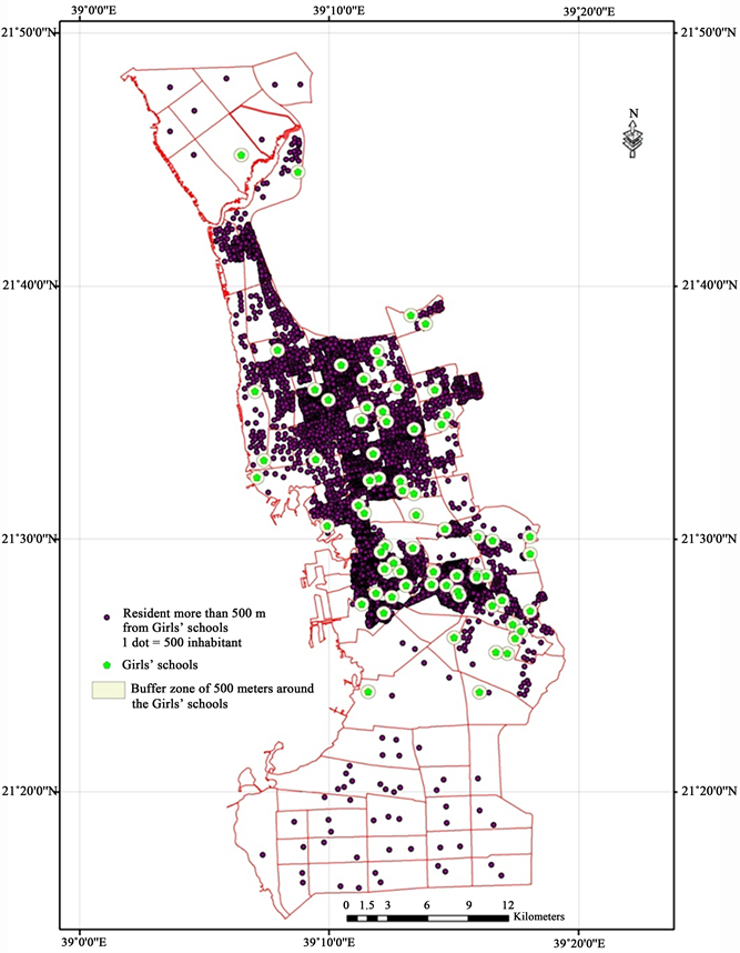
of scholars ages (Belarem et al., 2018). This was realized hand in hand with a tremendous rise of private transportation vehicles since there is no valuable public transportation system. Besides this, and until recent measures, the government rules stipulate separations between males and females who did not have until June 2018 the possibility to drive by themselves, which makes the transportation system for scholars a crucial issue. Yet, the numerous categories of transportations users do not have any guide map to help them to move from one place to another or define precisely the trips. Obviously, conceiving a map showing the main institutions itineraries at the peak hours and real time road congestion during the days may be very useful for scholars and should be adapted to their real needs (Belarem et al., 2018). Second, one may portray the location of equipment, schools, universities, transportation system and other educational institutions as well as their pertinent attributes to scholars. It may be worthy to have also general maps of the city showing the location of the various school institutions and land use as well as thematic maps useful for the readers. Third, one may design real time school access maps to help several categories of users to get easy access to these educational institutions (Figure 4).
4. Atlases, Study Areas and the Base Maps Question
The DUAJ that authors are presenting in the main design outlines here belongs to the first type of area-based atlases. It intends to be founded on semiological principles and refers permanently to the major findings in map design principles stated by many cartographers such as Robinson and Petchenik (1976) and Bertin (1967, 2005) and recognized worldwide. Therefore, the chosen maps and graphics are highly user-oriented.
However, today, when designing an urban atlas, many issues may arise primarily with links to the base-map choice. The most important are discussed in the following points:
1) Regarding the container level, which could be the most convenient area for the base maps? Is it the administrative area surrounding the city of Jeddah called here the “Mouhafadha” (Figure 5)?
2) Should it be the municipal or sub-municipal area called “Baladiyya” or “Baladiyya Fariyya” (Figure 6)?
3) Or should it obey the incessant changing boundaries of the city, as it is growing over time with urbanization, to fit a realistic functional definition of the city including the growing metropolitan areas (http://www.demographia.com/db-define.pdf) (Figure 3)?
4) The related questions cartographers should be aware of are: what are the consequences of each choice regarding the data they are based on? Is it easy to create data fitting the geographical boundaries of Jeddah keeping in mind that most gathered data fit administrative boundaries? To what extent can we ensure relative stability of the base map? Is the administrative region adopted here the best answer, scientifically speaking, to the development or planning objectives of the Kingdom?

Figure 4. Shows the accessibility to schools for girls in Jeddah (Source: Belarem M., Hamza M. H., Jamil A., & Ajmi, M. (2018). Mapping and Analysis of the School Network of Makkah Al-Mukarramah (Saudi Arabia), Jeddah Girls’ Secondary Schools as Example. Current Urban Studies, 6, 102-120; https://html.scirp.org/file/5-1150289x11.png).

Figure 5. The Mouhafadha of Jeddah containing its municipalities and submunicipalities (Baladiyya and baladiyya Fariyya).

Figure 6. The central part of the Mouhafadha of Jeddah containing its districts.
These various given responses are in concordance of the map objectives and the data density (Buckley & Field, 2011). But they should preserve the overall DUAJ unity and homogeneity.
5. Digital Atlases and GIS Multivariate Outputs
In most cases, when portraying one geographic variable, the cartographic response is mainly easy to find out. According to the literature, most cartographers apply the convenient visual variable in concordance with the data measurement level (nominal, ordinal, cardinal or ratio) and the visual variables properties, whether static (Bertin, 2005) or dynamic (MacEachren, 1995). But when it comes to combine several geographic variables in one unique map, many solutions are offered to cartographers. Among these solutions in Arcgis, columns and stacked columns as well as pie-charts are offered to portray for quantitative absolute or relative data. Cartographers should have in mind that such solutions do not offer good legibility or comparison possibilities and therefore do not convey totally right messages to map users (Bertin, 2005). Cartographers should keep in mind the following questions before choosing such methods:
1) Departing from the huge and growing quantity of available data that should be shown, and to avoid crowding and illegibility, one can ask: how to make data concise to obey graphic and cartographic considerations as they apply to dynamic maps? How to combine several information layers in GIS (Dhieb, 1993, 1994)? How can cartographers reach an equilibrium point if there is any between the big amount of data and space availability?
2) What is the average users’ education level cartographers build on such Atlases? And is there a unique profile to consider? Consequently, what should be the scientific level and accuracy of the data Atlas and map design with links to its potential users and their proficiency to read and assimilate map messages?
3) How should cartographers adapt graphic and cartographic methods to the average profile of maps users? How and to what extent this decision should influence design choices and cartographic options?
Today, the use of GIS and geodatabases is becoming more common when it comes to developing digital atlases. However, in many cases, these programs do not offer all the visual tricks and subtleties of CAD or CAC systems. Within GIS, the focus is more on data handling and analyzing than on the semiological aspects and relevant visual communication. Aware of this gap in the communication process of the cartographic message, several companies (developing CAD or CAC software or GIS such as ESRI) tried to integrate advanced graphic design functions or modules to mitigate this weakness. It is also recommended to export cartographic primary results of GIS to Computer-Aided-Design and Computer Aided-Cartography systems to enhance the graphic outputs. Sometimes, dedicated graphic charts and templates are often established to standardize the representation.
However, even in doing so, little attention was accorded to the semiological aspects of the resulting maps or graphic documents. The research team on the Digital Urban Atlas of Jeddah, mostly working thematically, tried to consider all these issues. The generated maps and diagrams aim at being coherent with the semiological rules that drew upon the theory of signs perception and the semiological map features (Bertin, 2005, 2019). The users who are not always aware of the cartographic theories and principles should rely on the cartographic knowledge and rules outlined in the guides and templates reproduced in the Cartographic Design of the Atlas. For the DUAJ, the authors intend to spare digital atlases from some frequent errors that are being made (Figure 7, and Figure 8).
6. Another Urban Atlas Pitfall: The Abuse of Choropleth Method
A literature overview of recent urban Atlases reveals very interesting ideas and useful hints to retain for the DUAJ, but the authors insist here on some pitfalls to avoid in their work:
· Too many maps in recent electronic Atlases are choropleth-method-based. This poorness does not reflect the great variety of processing and representing data methods on maps. It is well known that the choroplethic maps are easy to realize since they are based mostly on the administrative framework and on census data (Figure 9).
· But, the choroplethic method remains criticized on the conceptual level and very restricted since Olson (1975). In case, it was proved in an applied research on Jeddah city that dasymetric method reveals more useful to portray the population distribution (Hamza et al., 2016) (Figure 10).
· The dot map method when value, size and position of dots are well chosen may reveal a good method when population counts should be made around some equipment or to applications on site locations (Figure 11). Because of implementation difficulties, dot maps are rarely used as well as isopleth maps whereas they proved to be very useful in some cases as demonstrated in literature since 1961 (Robinson, 1961). The same paradigm applies to other maps such as dot maps, flow maps or cartograms.
· The issues of cartographic and data scales are other crucial issues of maps when it comes to determining the size of the maps and accuracy of data adapted to them, even though interactivity could yield valuable solutions. Cartographers should use different cartographic scales and various hierarchies of spatial or administrative units depending on the data details and accuracy and the users’ abilities. For instance, to portray absolute as well as relative data, they should use at the same time proper and common scales to distinguish between absolute and relative data (Bonin, 1983), whether separated or combined (Figure 12).
Whether static or interactive, data transcription should be highly legible with the use of correct visual artefacts even though the mapping process is restricted by the physiological requirements of the human eye and the possibilities of

Figure 7. Is showing the ranges of age of divorced females, portrayed using graduated colored columns. Where the use of graduated colors reflects the increasing ages, the overall area of graphics is too small to grasp the geographical trends or to compare between districts which are meant to be the goal of the map. The ratio figure-ground is not respected.

Figure 8. Used the stacked columns to portray the educational level of divorced females in Jeddah districts. Diverging colors are used to show low levels from green to yellow and high levels run from yellow to red. This kind of figures does not allow an easy comparison between districts because the position of 4 from 5 levels have variable horizontal line that constitutes the basis of comparison, perceptually. One solution may be an orderable matrix that may convey to a typology of the districts towards this parameter.

Figure 9. Shows the choroplethic method to portray the population distribution of population by using the natural breaks discretization method.

Figure 10. Shows a dasymetric map which excludes the unpopulated areas but which reflect perfectly the real population distribution but which may not convince common users because of the empty spaces (Source: Hamza, M., Thubaiti, A., Dhieb, M., Ali, A., Garbouj, M. and Ajmi, M. (2016) Dasymetric Mapping as a Tool to Assess the Spatial Distribution of Population in Jeddah City (Kingdom of Saudi Arabia). Current Urban Studies, 4, 329-342. doi: https://www.scirp.org/Journal/PaperInformation.aspx?PaperID=70931.

Figure 11. Is a dot map that shows randomly the location of inhabitants within districts, which is not very accurate at this scale, but that is quite fine for the overall population distribution.

Figure 12. Is a kind of frequent maps that show only absolute numbers such as divorced women in Jeddah districts by using graduated circles. It should be completed by data on ratios of divorced women to the whole of female or married population.
memorization. The conveyed map messages should be grasped directly and rapidly by users. The quality of these messages should avoid the multiple “noises” and artifacts that may disturb the map perception process.
Authors are aware that many “cartographic” decisions are taken practically “under pressure”, in these atlases, or sometimes in the context of constraints of time and/or lack of means. Even if they do not know first what these constraints are, they may understand them perfectly. In this, the overall quality of Atlases could be enhanced by adapting the products to the user ability and skills to read or to interact with maps. Production of atlases remains of suitable quality but also perfectible despite some critical remarks.
7. Atlases, Noises and Other Raised Questions
The three suggested and discussed cartographic issues are raised only to suggest improvements to the graphic and cartographic atlases products and their reading. Nevertheless, authors are aware they did not analyze all Atlas design issues in this research. Such work needs further study and discussion. However, they may point out other issues and problems to be solved before achieving such work. They cite here:
1) The lack of processing the data is well illustrated by maps drawn as means of communication of the information, or even simple illustrations of raw data. Some inserted graphics are, in general, the simple straightforward transcription of the raw data in tables, without any classification of the data with regards to thematic or geographical criteria which may impoverish data reading and comprehension.
2) When texts are inserted in Atlases, map-text coordination is not assured in many cases. Sometimes, the text is composed without reference to the map. A text could (or should sometimes) find support on the map to justify the cartographer choices or provide explanations for some special forms of geographical distributions (Monmonier, 1981).
3) A few atlases incorporate other forms of expression than maps, or when they do so, they are in limited numbers. For instance, graphics or graphic treatments methods such as Bertin orderable matrixes could lead to a better knowledge (Bertin, 2005), to valuable typologies of geographical units and data classifications by dedicated software such as AMADO (1994), as proven in the “Semiology of Graphics”.
4) The scales of some maps are not appropriate to their content in many cases, as if they had been originally set without considering the nature, volume and state of development of the data and messages which they are supposed to convey. Thus, some maps are huge in size with respect to their content and level of detail. Oddly, sometimes maps are based on a very coarse administrative unit which has the largest scales and therefore large spaces. It is as if one considers only the importance of the theme and not the legibility of the map, its content and interest.
5) The arrangement of the various components of the map should be taken into consideration. Based on the research standards, the inking surface should be at least two-thirds of the surface area of the paper sheet (Tufte, 2002). Of course, a certain balance in the occupation of this surface should apply to paper as well as to electronic atlases.
6) The use and abuse of colors is another problem that has both psychological and technical aspects since it is linked both to the desiderata of the users and other sponsors, local politicians, generally preferring color to black and white and a certain tradition in the matter.
The map is a coded graphic transcription representing a structured set of spatial information. While map noises are clear and well known to some extent on static maps, the dynamic mapping process is limited by the physiological requirements of the human eye movement and the possibilities of memorization of moving images on interactive maps. However, whether static or interactive, the map function is to establish communication between the map and the user. The conveyed message should be caught directly and rapidly. The quality of the message depends on the “noises” that may disturb the map perception process. Useful precautions should be taken when designing interactive maps. Based on a semiological approach using examples from the DUAJ project, cartographers should address the noises issue on maps and establish a scheme that helps avoiding them as much as possible.
The concept of “graphic noises” or errors in and on maps was very poorly studied through the related literature. The notion itself is very vague and reveals a considerable burden of ambiguity and confusion. Many authors spoke about this notion in different ways. For instance, Robinson talked about the way someone can assess and evaluate one graphic design (Robinson, 1952, 2015). Bertin’s Graphics Semiology theory posed the fundamentals of graphic representation and the multiple errors to be avoided (Bertin, 2005). Many cartographic models such as the transmission mapping models of Muehrcke et al., or more recently Di Biase (1990) revealed an angle between the centers of the circles that represent reality as a source of information and the representation of reality which constitutes a gap between reality and its cartographic representation.
During the past decades, constructing and deconstructing maps were interesting issues approached by several cartographers such as Bord through semiological, perceptual or other viewpoints such as geopolitical or cultural (Bord, 1997a; Palsky & Robic, 2000). According to Monmonier, the cartographer creates his own world viewed through his own perception and reconstructs it while making choices, changes, deletions, additions versus reality: these forms of “mapping fictions” (Monmonier, 1993) and these actions represent map “noises” although they obey the logic of the mapping action. Data and Graphics manipulation reveal that a map “is by nature a kind of manipulation codified and accepted” (Cambrézy & De Maximy, 1995).
8. Conclusion and Suggestions for the Future
The DUAJ should be designed as an urban cartographic document that helps students, researchers in geography and space sciences and planners to get useful information about their city as well as common users. It should incorporate maps and graphics obeying the basic principles of graphic semiology reviewed, corrected and adapted to the GIS requirements. The research team working on the project, mostly thematic, tries to consider the specific issues for the static and the dynamic version. The generated maps and diagrams conform to the semiological rules that govern the map design. Dedicated templates of base maps were drawn to fit the various cases of edited maps. The idea behind is that DUAJ users who are not always aware of the cartographic theories, techniques and subtleties should rely on the cartographic knowledge and rules implemented within the guides and templates prepared and designed for the Atlas.
In the present context, the difficulties are emphasized in where the potential readers have quite various education levels and the question is to what extent maps and graphics must be simplified and generalized. Even though the authors focused only three basic issues raised in map atlases design, some other deficiencies were cited. The goal is to give some tips to avoid current errors or deficiencies in many digital atlases.
Designing the DUAJ would not be an easy operation and should be treated seriously and properly. How much the produced maps will be assimilated by users is a task that cartographers should solve before. That is why cautions must be verified by previous tests even though the produced maps are based on semiological and perceptual rules as written in the cartographic books dedicated to users (Bertin, 2005; Muehrcke, 1986).
Charts and templates will be drawn for DUAJ to observe strict rules of representation, and an overall normalization. These requirements could include aspects such as: format and layout; chart color; scale of study (degree of detail); visual rendering; light dressing; writing and reproduction techniques; toponymy; report more synthetic or ecological maps (reasoning in terms of system landscape or ecosystem), correlation maps, scenario maps, predictions, more cartographic messages or synthesis summaries. Authors consider that most graphic and cartographic GIS-based DUAJ products should be redrawn and enhanced by using dedicated CAD and CAC systems. This use is very beneficial for the final figures, maps and diagrams composing the DUAJ and should conduct to valuable documents.
The adopted classical semiological rules and techniques apply to the few examples shown here in the DUAJ as well as the new ones such as “chorems”, models or other innovative new methods and figures in geography (Laurini et al., 2006; Bord, 1997b). The authors also exploit GIS potentialities and functions for superimposing, crossing and combining several layers of information to show simplified maps. Scientific visualization should help at undertaking right decisions when it comes to communicate information through maps.
Acknowledgements
This project was funded by the Deanship of Scientific Research (DSR) at King Abdulaziz University, Jeddah, under grant No. G-1436-125-479. The authors, therefore, acknowledge with thanks DSR for technical and financial support. Pr. Dr. Mohsen DHIEB, Principal Investigator.
Conflicts of Interest
The authors declare no conflicts of interest regarding the publication of this paper.
References
- 1. AMADO (1994). Analyse graphique d’une matrice de données. Saint-Mandé: CISIA. http://www.worldcat.org/title/analyse-graphique-dune-matrice-de-donnees-guide-pratique/oclc/463776479 [Paper reference 2]
- 2. Balchin, W. G. (1976). Graphicacy. American Cartographer, 3, 33-38. https://doi.org/10.1559/152304076784080221
- 3. Belarem, M., Hamza, M. H., Jamil, A., & Ajmi, M. (2018). Mapping and Analysis of the School Network of Makkah Al-Mukarramah (Saudi Arabia), Jeddah Girls’ Secondary Schools as Example. Current Urban Studies, 6, 102-120. https://doi.org/10.4236/cus.2018.61005
- 4. Bertin, J. (1967). Sémiologie graphique. Les diagrammes Les réseaux Les cartes. Paris: Gauthier-Villars. [Paper reference 2]
- 5. Bertin, J. (1973). Sémiologie graphique. Les diagrammes Les réseaux Les cartes (2nd ed.). Paris: Gauthier-Villars. [Paper reference 2]
- 6. Bertin, J. (1987). Semiology of Graphics: Diagrams, Networks, Maps (Translated by Berg, W.J.). Madison, WI: University of Wisconsin Press.
- 7. Bertin, J. (2005). Sémiologie graphique. Les diagrammes Les réseaux Les cartes (4th ed.). Paris: EHESS. [Paper reference 1]
- 8. Bertin, J. (2019). Semiology of Graphics: Diagrams, Networks, Maps (Translated into Arabic by Dhieb, M.). Jeddah: Scientific Publishing Center, King Abdulaziz University.
- 9. Bonin, S. (1983). Initiation à la graphique. Paris: Editions Epi.
- 10. Bord, J.-P. (1997a). Géographie et sémiologie graphique: Deux regards différents sur l’espace. Colloque “3O ans de sémiologie graphique”, Cybergeo 145. https://journals.openedition.org/cybergeo/501
- 11. Bord, J.-P. (1997b). Le géographe et la carte. Point de vue et questionnement de la part dun géographe cartographe. Colloque “3O ans de sémiologie graphique”, Cybergeo 145. https://journals.openedition.org/cybergeo/501 https://doi.org/10.4000/cybergeo.6470 [Paper reference 6]
- 12. Buckley, A., & Field, K. (2011). Making a Meaningful Map: A Checklist for Compiling More Effective Maps. https://www.esri.com/news/arcuser/0911/making-a-map-meaningful.html [Paper reference 2]
- 13. Cambrézy, L., & De Maximy, R. (1995). La cartographie en débat: représenter ou convaincre. Paris (FRA). Paris: Karthala. http://horizon.documentation.ird.fr/exl-doc/pleins_textes/pleins_textes_7/b_fdi_03_04/42938.pdf [Paper reference 4]
- 14. Dhieb, M. (1993). Problématique de la représentation des données quantitatives multivariées: Un point de vue graphique. Revue Tunisienne des Sciences Sociales, 113, 9-38. [Paper reference 4]
- 15. Dhieb, M. (1994). La cartographie de décision, outil d’aide à la décision. Géographie et Développement No. 12, Tunis: Association des Géographes Tunisiens.
- 16. Dhieb, M. (2019). Translating Bertin into Arabic Today: New Hidden Facets of Semiology of Graphics. Cartography and Geographic Information Science, 46, 163-175. https://www.tandfonline.com/doi/full/10.1080/15230406.2018.1515036?utm_source=TrendMD&utm_medium=cpc&utm_campaign=Cartography_and_Geographic_Information_Science_TrendMD_0 [Paper reference 3]
- 17. Di Biase, D. (1990). Visualization in the Earth Sciences. Earth and Mineral Sciences, Bulletin of the College of Earth and Mineral Sciences, Pennsylvania State University, 59, 13-18. [Paper reference 1]
- 18. Guilford Miller, A. (1929-1930). Mappae Arabicae. Arabische Welt und Landerkarten des 9-13. Faberbunderts. Bande 1-5 und beihafle. Stuggart.
- 19. Hamza, M., Thubaiti, A., Dhieb, M., Ali, A., Garbouj, M., & Ajmi, M. (2016). Dasymetric Mapping as a Tool to Assess the Spatial Distribution of Population in Jeddah City (Kingdom of Saudi Arabia). Current Urban Studies, 4, 329-342. https://doi.org/10.4236/cus.2016.43022 https://www.scirp.org/Journal/PaperInformation.aspx?PaperID=70931
- 20. Kramers, J. H. (1931). La question Balkhi—Istakhri et Ibn Hawqal et l’Atlas de l’Islam. Acta Orientalia, 11, 8-30.
- 21. Laurini, R., Milleret-Raffort, F., & Lopez, K. (2006). A Primer of Geographic Databases Based on Chorems. In SebGIS Conference (pp. 1693-1702). Montpellier: Springer Verlag. https://doi.org/10.1007/11915072_75
- 22. MacEachren, A. M. (1995). How Maps Work, Representation, Visualization and Design. New York: The Guilford Press.
- 23. Monmonier, M. S. (1981). Map-Text Coordination in Geographic Writing. The Professional Geographer Banner, 33, 406-412. https://doi.org/10.1111/j.0033-0124.1981.00406.x [Paper reference 1]
- 24. Monmonier, M. S. (1985). Technological Transition in Cartography. Madison, WI: University of Wisconsin Press. [Paper reference 2]
- 25. Monmonier, M. S. (1993). How to Lie with Maps (2nd ed., 222 p.). Chicago, IL: The University of Chicago Press.
- 26. Muehrcke, P. C. (1986). Map Use: Reading, Analysis, Interpretation. Madison, WI: JP Publications. [Paper reference 2]
- 27. Olson, J. M. (1975). Autocorrelation and Visual Map Complexity. Annals of the Association of American Geographers, 65, 2. https://doi.org/10.1111/j.1467-8306.1975.tb01030.x
- 28. Palsky, G., & Robic, M.-C. (2000). Aux sources de la sémiologie graphique. Cybergeo: European Journal of Geography, Article 147. http://journals.openedition.org/cybergeo/554 https://doi.org/10.4000/cybergeo.554
- 29. Robinson, A. H. (1952). The Look of Maps. Madison, WI: Wisconsin Press.
- 30. Robinson, A. H. (1961). The Cartographic Representation of the Statistical Surface. International Yearbook of Cartography, 1, 53-62. [Paper reference 1]
- 31. Robinson, A. H. (1978). The Uniqueness of the Map. The American Cartographer, 5, 5-7. https://doi.org/10.1559/152304078784022999 [Paper reference 1]
- 32. Robinson, A. H. (2015). The Look of Maps (Translation from English into Arabic by Dhieb, M.J.). Saudi Arabia: Scientific Publication Centre, King Abdulaziz University.
- 33. Robinson, A. H., & Petchenik, B. B. (1976). The Nature of Maps. Essays towards Understanding Maps and Mapping. Chicago: University of Chicago Press.
- 34. Tufte, E. R. (2002). The Visual Display of Quantitative Information. http://amstat.tandfonline.com [Paper reference 3]
- 35. Van Raemdonck, J. (1869). Gerard Mercator: Sa vie et ses oeuvres (375 p.). St Nicolas: Dalschaert-Praet. [Paper reference 3]
- 36. Wilmot, P. D. (1999). Graphicacy as a Form of Communication. The South African Geographical Journal, 81, 91-95. https://doi.org/10.1080/03736245.1999.9713668