Paper Menu >>
Journal Menu >>
 iBusiness, 2013, 5, 100-103 http://dx.doi.org/10.4236/ib.2013.53B021 Published Online September 2013 (http://www.scirp.org/journal/ib) Using Dashboard for Lean Revenue Cycle Management Jihong Zeng1, John Zhang2 1School of Management, New York Institute of Technology, Old Westbury, NY, USA; 2New York City Health and Hospitals Cor- poration, New York, NY, USA. Email: jzeng@nyit.edu Received July, 2013 ABSTRACT Lean methodologies are increasingly deployed by healthcare providers to improve billing and collection process in revenue cycle management. Measurement on key performance metrics generates large amount of data. Traditional tabular and spread sheet form analytics are not efficient to support enterprise scale lean improvement sustainability. Th is paper introduces a new breed of visual dashboard technology and its value as emerging differentiator from traditional business intelligence, especially in the rapid deployment and usability perspective. We present an exemplary case of using QlikView dashboard for lean revenue cycle management. Initial evaluation result is promising and indicates the dashboard empowers end users with intuitive and interactive experience, ad-hoc questions and answers. Integrating performance dashboard with enterprise data governance, predictive modeling will be evaluated further in future study. Keywords: Visual Dashboard; Lean; Healthcare Information Systems; Revenue Cycle Management 1. Introduction The US healthcare industry is in process of transforming from the fee-for-service to pay-for-performance payment model to provide patients with quality care at low cost. This has dramatic financial impact on the healthcare revenue cycle management. Healthcare provider reimburse- ments will increasingly be tied to quality metrics and patient outcomes under healthcare reform [1]. Lean methodologies are increasingly deployed by providers for billing and collection processes in revenue cycle management [2]. While six sigma emphasizes reducing variance in a process, lean focuses on reducing waste and improving process flow [3]. Key to lean concept is measurement. You can’t manage what you don’t measure. By measuring the predefined performance indicators and comparing to objectives, we focus on how we are doing now, how much we have improved over time, what need to be done next to sustain the improvement. Continuous measurement generates a large amount of data. Traditional data analysis and statistics in revenue cycle management typically rely on tabular and spreadsheet form, which can be difficult to understand and interpret. Data visionary Hans Rosling (2007) used an analogy between data and music notes. In his presentation, Rosling stated that “few people will appreciate the music if I just show them the notes. Most of us need to listen to the music to understand how beautiful it is. But often it’s how we present statistics: we just show the notes and don’t play the music” [4]. Therefore, efficient data visualization tools and techniques are in great demand to help translate collected data into meaningful, actionable insight in real time and in a cost-effective manner to support lean improvement. In this paper, we describe the challenge and need for an efficient performance dashboard for lean revenue cy- cle improvement in a large healthcare provider organiza- tion in Section 2. Then we introduce a new breed of vis- ual dashboard technology and high level application ar- chitecture in Section 3. We then discuss a use case of interactive performance dashboard with QlikView in Section 4. The paper concludes in Section 5 with a dis- cussion of the next step. 2. Business Challenge and Motivation Healthcare revenue cycle performance can be evaluated using many common benchmarks and baseline metrics [5, 6]. Let’s take a look at a challenge at one of the largest healthcare providers in the US. In late 2007 , th is p rovid er initiated the use of lean, a standardized performance im- provement methodology to reduce waste and streamline workflow process across clinical, operational and finan- cial dimensions. Steady progress has been made in cut- ting costs and increasing billing revenue through lean revenue cycle process improvement. Even with these achievements, challenges remain to sustain the improve- ment. In some cases, the improvements were too easily dissolved when individual project champions would leave; while in other cases, improvements were isolated Copyright © 2013 SciRes. IB  Using Dashboard for Lean Revenue Cycle Management 101 and workforce were not properly engaged. The provider needs to formulate a strategy to foster transparency and accountability throughout the organization. It is impera- tive to share the performance data and ensure everyone in the organization will have the exposure and to be ac- countable for consistent objectives. Although business intelligence (BI) has been d eployed as a v alue-added too l to support lean revenu e cycle management, traditional BI commonly rely on tabular data displays, which don’t easily reveal patterns or trends, nor effectively provide real-time or holistic view of information from multiple data sources. Queries and reports are pre-determined to specific requests. Lengthy development cycle for new report cannot meet the business demand. The front-line staff needs to focus on business rather than data. With shift to pay-for-performance and increasing regulatory compliance requirements, the provider is in serious demand for a more efficient and effective tool to help transform collected data into actio nable insight in support of sustainable lean improvement. 3. Visual Dashboard Architecture Traditional BI data presentation m ethods requi re conscious thinking. However, cognitive function of human brain is slower and less efficient. As pointed out by data visualization expert Stephen Few (2009) that “approxi- mately 70% of the body’s sense receptors reside in our eyes” [7]. For the human brain, visual perception is fast and efficient. Data visualization takes advantage of our most powerful sense, helps us think and communicate. A picture is worth a thousand words. Picture of data can help make the invisible visible. Filling the void by traditional BI products and becom- ing mainstream, visual dashboard tools provide highly interactive graphic user interface, enable users to develop and refine views and analyses of data on the fly. Ac- cording to Sommer (2011), they have the following key characteristics [8]: Agile: proprietary data structure that minimizes re- liance on predefined business intelligence metadata. Rapid application development and deployment to meet business nee d Performance: in-memory database and analytics en- gine that boosts query performance. Enable users interact with data on the fly Ease of Use: intuitive interface that enables users to explore data without much training. Target business us- ers as a self-service BI rather than information technol- ogy (IT) profes s i onal s QlikView is the leading visual data discovery and dashboard software by QlikTech [9]. Based on its in- memory data associative architecture, QlikView enables users gain unexpected insights by understanding how data is associated. For example, when user selects a data point in a field, no queries are initiated. Instead, all other fields associated instantaneously filter themselves based on the user selection. It enables users to answer qu estions like: What has h appened? Why did it h appen? What will happen next? What’s the next best action? In response to the business challenge, this provider organization developed visual dashboards using Qlik- View after proof-of-concept evaluation. Data from vari- ous sources are extracted in QlikView Data (QVD) file format by QlikView ETL application. The front-end QlikView dashboard application aggregates data from multiple intermediate QVD files. With the associative data architecture, QlikView is able to achieve data com- pression ratio 100:1 for the dataset used in this study. Access to QlikView dashboard is controlled and man- aged by IT security management. User authentication and authorization are integrated with Windows active directory service architecture. Users access the QlikView dashboard applications through standard web browser. Only developers use QlikView Desktop Edition for ap- plication development and enhancement. 4. Result and Discussion With its highly interactive, ease-of-use graphical inter- face, visual dashboard is capable of monitoring progress towards the perfor mance objectives. It is also an efficient communication and information sharing tool to motivate additional improvement. For example, one of key meas- ures of billing efficiency is Total Days in AR (account receivable), which is the number of days required to col- lect the charges submitted to payers. In this study case, the revenue management division keeps tracking Total Days in AR, which is the sum of In-house Days, DNFB Days, and Billed Days. Discharged Not Final Billed (DNFB) Days is the time between patient’s discharge and the chart coded and final screen completed. DNFB means lost revenue to hospitals. The lean project team applied Value Stream Mapping (VSM) methodology for current state process flow and identified key problems and interdependencies for DNFB lag. The improved process flow significantly reduced delays in billing. DNFB Days dropped progressively while cash flow increased on fi na nci a l ba l an ce sheets. Figure 1 illustrates a sample screen of the QlikView visual performance dashboard for lean revenue cycle improvement. Users of this dashboard are able to interac- tively select hospital facility, year, month to view trend, pattern in various chart styles, and discover key numeric statistics. For example, the selected hospital facility demonstrated continuously decrease in DNFB Days from 2004 to 2010. The graphical charts clearly reflect the hospital’s effort and improvement on billing efficiency. The dashboard also enables users to drill down to granu- lar level detail data by clicking on the summary report. Copyright © 2013 SciRes. IB 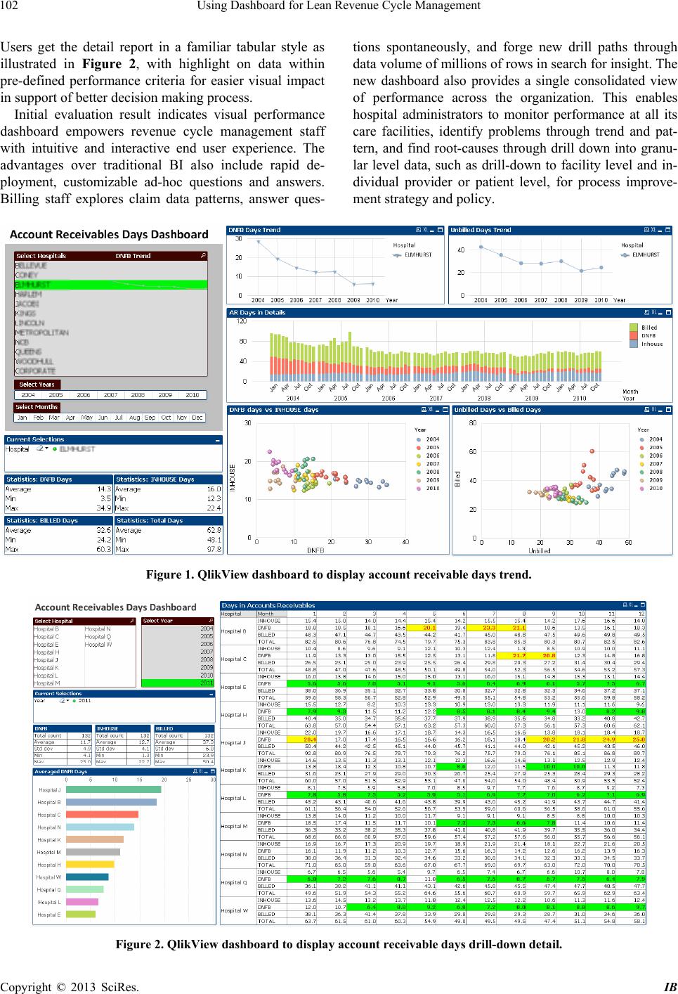 Using Dashboard for Lean Revenue Cycle Management Copyright © 2013 SciRes. IB 102 tions spontaneously, and forge new drill paths through data volume of millions of rows in search for insight. The new dashboard also provides a single consolidated view of performance across the organization. This enables hospital administrators to monitor performance at all its care facilities, identify problems through trend and pat- tern, and find root-causes through drill down into granu- lar level data, such as drill-down to facility level and in- dividual provider or patient level, for process improve- ment strategy and policy. Users get the detail report in a familiar tabular style as illustrated in Figure 2, with highlight on data within pre-defined performance criteria for easier visual impact in support of better d ecision making process. Initial evaluation result indicates visual performance dashboard empowers revenue cycle management staff with intuitive and interactive end user experience. The advantages over traditional BI also include rapid de- ployment, customizable ad-hoc questions and answers. Billing staff explores claim data patterns, answer ques- Figure 1. QlikView dashboard to display account receivable days trend. Figure 2. QlikView dashboard to display account receivable days drill-down detail.  Using Dashboard for Lean Revenue Cycle Management 103 5. Conclusions This paper introduces the emerging visual dashboard tool and presents its value for healthcare providers in trans- forming massive data into valuable information and in- sight for lean revenue cycle improvement. Positive feed- back is received at a large healthcare provider organiza- tion. Visual data discovery enables end users to navigate and interact without limit of predefin ed da ta drill p aths or using preconfigured reports. It helps make the invisible visible and helps front-line staff focus on business rather than data. It could also be used as a revenue enhancing tool through improved billing efficiency. Deploying vis- ual performance dashboard to enterprise scale fosters a culture and environment of transparency and account- ability. It enables the lean initiativ e to continue providing strong and successful process to reduce waste and achieve clinical, operational and financial efficiencies that are measurable and sustainable. We understand the limitation of this paper. It is im- portant to keep visual performance dashboard simple so that they are easy to understand and do not become a new burden to update. While the initial results from our study are promising, there are many potential enhancements in the future. This includes integrating visual dashboard tool with enterprise data governance, interfacing with advanced statistic package, and adding predictive mod- eling. Additional thorough user evaluation with subject matter experts is also needed and will be conducted in the future step. REFERENCES [1] D. Hammer, B. Phillips and T. L. Schmidt, “The Intended and Unintended Consequences of Healthcare Reform,” Healthcare Financial Management, Vol. 64, No. 10, 2010, pp. 50-55. [2] J. Womack, T. J. Daniel, “Lean Solutions: How Compa- nies and Customers Can Create Value and Wealth To- gether,” 1st Edition, Free Press, New York, 2005. [3] M. George, “Lean Six Sigma for Service: How to Use Lean Speed and Six Sigma Quality to Improve Services and Transactions,” 1st Edition, McGraw-Hill, 2003. [4] H. Rosling, “Unveil the Beauty of Statistics,” OECD 2nd World Forum on Statistics, Knowledge and Policy, Is- tanbul, 2007. http://www.viddler.com/v/723d3020. [5] Z. Newitt and B. Robertson, “HFM ToolBox: Key Reve- nue Cycle Metrics,” Healthcare Financial Management, Vol. 61, No. 5, 2007, pp. 105-107. [6] B. Tinnermon, “Revenue Cycle: Time for a Change in Your Revenue Cycle Technology?” Healthcare Financial Management, Vol. 63, No. 3, 2009. [7] S. Few, Now You See It: Simple Visualization Tech- niques for Quantitative Analysis. 1st Edition, Analytics Press, Oakland, California, 2009. [8] D. B. Sommer, R. Sallam and J. Richardson, “Emerging Technology Analysis: Visualization-Based Data Discov- ery Tools,” Gartner Publication ID Number G00213778, 2011. [9] Qlik Tech, http://www.qlikview.com, 2013. Copyright © 2013 SciRes. IB |