Psychology
Vol.05 No.19(2014), Article ID:52114,14 pages
10.4236/psych.2014.519211
Visualizing Random Forest’s Prediction Results
Hudson F. Golino1, Cristiano Mauro Assis Gomes2
1Núcleo de Pós-Graduação, Pesquisa e Extensão, Faculdade Independente do Nordeste, Vitória da Conquista, Brazil
2DepartmentofPsychology, Universidade Federal de Minas Gerais, Belo Horizonte, Brazil
Email: hfgolino@gmail.com, cristianogomes@ufmg.br
Copyright © 2014 by authors and Scientific Research Publishing Inc.
This work is licensed under the Creative Commons Attribution International License (CC BY).
http://creativecommons.org/licenses/by/4.0/


Received 17 October 2014; revised 8 November 2014; accepted 1 December 2014
ABSTRACT
The current paper proposes a new visualization tool to help check the quality of the random forest predictions by plotting the proximity matrix as weighted networks. This new visualization technique will be compared with the traditional multidimensional scale plot. The present paper also introduces a new accuracy index (proportion of misplaced cases), and compares it to total accuracy, sensitivity and specificity. It also applies cluster coefficients to weighted graphs, in order to understand how well the random forest algorithm is separating two classes. Two datasets were analyzed, one from a medical research (breast cancer) and the other from a psychology research (medical student’s academic achievement), varying the sample sizes and the predictive accuracy. With different number of observations and different possible prediction accuracies, it was possible to compare how each visualization technique behaves in each situation. The results pointed that the visualization of random forest’s predictive performance was easier and more intuitive to interpret using the weighted network of the proximity matrix than using the multidimensional scale plot. The proportion of misplaced cases was highly related to total accuracy, sensitivity and specificity. This strategy, together with the computation of Zhang and Horvath’s (2005) clustering coefficient for weighted graphs, can be very helpful in understanding how well a random forest prediction is doing in terms of classification.
Keywords:
Machine Learning, Assessment, Prediction, Visualization, Networks, Cluster

1. Introduction
There is an old Danish phrase that synthetizes the challenge of constructing predictive models in any area of research: It is hard to make predictions, especially about the future ( Steincke, 1948 ). This is an inconvenient facet of the predictive sciences, because a good prediction can improve the quality of our choices and actions, leading to evidence-based decisions. According to Kuhn and Johnson (2013) the main culprits behind the difficulty of making predictions are the inadequate pre-processing of data, the non-appropriate model validation, the naive or incorrect extrapolation of the prediction and the bitter overfitting. In spite of its difficulties, the process of developing predictive models is less painful today than it was in the past, due to the development of algorithms that can lead to high accuracy levels and to the advance of high-speed personal computers to run these algorithms ( Kuhn & Johnson, 2013 ). These algorithms are still subjected to the issues pointed by Kuhn and Johnson (2013) , but they present many advantages over the most classical predictive techniques (James, Tibshirani & Friedman, 2009).
Machine learning is the field providing the majority of the predictive algorithms currently applied in a broad set of areas, from systems biology ( Geurts, Irrthum, & Wehenkel, 2009 ) to ADHD diagnosis ( Eloyan et al., 2012 ; Skogli et al., 2013 ) and education ( Blanch & Alucha, 2013 ; Cortez & Silva, 2008 ; Golino & Gomes, 2014 ; Hardman, Paucar-Caceres, & Fielding, 2013 ). Among the vast number of algorithms available, the classification and regression trees or CART ( Breiman, Friedman, Olshen, & Stone, 1984 ) are some of the most used due to a triplet pointed by Geurts, Irrthum and Wehenkel (2009) : interpretability, flexibility and ease of use. The first item on the triplet regards the understandability of the CART results, since it is a roadmap of if-then rules. James, Witten, Hastie and Tibshirani (2013) point the tree models are easier to explain to people than linear regression, since it mirrors the human decision-making more than other predictive models. The second item on the triplet, flexibility, refers to the applicability of the CART to a wide range of problems, handling different types of variables (nominal, ordinal, interval and ratio), with no assumptions regarding normality, linearity, independency, collinearity or homoscedasticity ( Geurts, et al., 2009 ). CART is also more appropriate than the c statistic to study the impact of additional variables to the predictive model ( Hastie, Tibshirani, & Friedman, 2009 ), being especially relevant to the study of incremental validity. Finally, the third item on the triplet, ease of use, refers to the somehow computational facility of implementing the CART algorithm, to the low number of tuning parameters and to the widely available software and packages to apply it.
In spite of the CART qualities it suffers from two issues: overfitting and variance ( Geurts et al., 2009 ). Since the feature space is linked to the output space by recursive binary partitions, the tree models can learn too much from data, modeling it in such a way that may turn out a sample dependent model. When it becomes sample dependent, in the sense that the partitioning is too suitable to the training set, it will tend to behave poorly in new data sets. The variance issue is exactly a consequence of the overfitting. The predictive error in a training set, a set of features and outputs used to grown a classification tree for the first time, may be very different from the predictive error in a new test set. In the presence of overfitting, the errors will present a large variance from the training set to the test set used. Additionally, the classification and regression trees do not have the same predictive accuracy as the other machine learning algorithms ( James et al., 2013 ).
A strategy known as ensemble can be used to deal with overfitting and variance, and to increase the predictive accuracy of classification and regression trees. In the CART context, several trees can be combined (or ensemble) to perform a task based on the prediction made by every single tree ( Seni & Elder, 2010 ). Among the ensemble models using CART, Random Forest ( Breiman, 2001 ) is one of the most widely applied ( Seni & Elder, 2010 ). In the classification scenario, the Random Forest algorithm takes a random subsample of the original data set (with replacement) and of the feature space to grow the trees. The number of the selected features (variables) is smaller than the number of total elements of the feature space. Each tree assigns a single class to the each region of the feature space for every observation. Then, each class of each region of every tree grown is recorded and the majority vote is taken ( Hastie et al., 2009 ; James et al., 2013 ). The majority vote is simply the most commonly occurring class over all trees. As the Random Forest does not use the entire observations (only a subsample of it, usually 2/3), the remaining observations (known as out-of-bag, or OOB) are used to verify the accuracy of the prediction. The out-of-bag error can be computed as a “valid estimate of the test error for the bagged model, since the response for each observation is predicted using only the trees that were not fit using that observation” ( James et al., 2013 : p. 323). The Random Forest algorithm leads to less overfitting than single trees, and is an appropriate technique to decrease the variance in a testing set and to increase the accuracy of the prediction. However, the Random Forest result is not easily understandable as the result of single CARTs. There is no “typical tree” to look at in order to understand the prediction roadmap (or the if-then rules). Therefore, the Random Forest algorithm is known as a “black-box” approach.
Improving Random Forest’s Result Interpretability Using Visualization Techniques
In order to make the Random Forest’s results more understandable and interpretable, two main approaches can be used: variable importance plots and multidimensional scaling. In the first approach, an importance measure is plotted for each variable used in the prediction. Predictions using random forest usually employ two importance measures: the mean decrease accuracy and the Gini index. The former indicates how much in average the accuracy decreases in the out-of-bag samples when a given variable is excluded from the predictive model ( James et al., 2013 ). The latter indicates “the total decrease in node impurity that results from splits over that variable, averaged over all trees” ( James et al., 2013 : p. 335).
The second approach is a data visualization tool primarily used to identify clusters ( Borg & Groenen, 2005 ; Quach, 2012 ). Multidimensional scaling has a number of methods, being the most widely applied the classical scaling. The classical scaling enables to compare the n observations visually by taking the first two or three principal components of the data matrix provided. In the random forest context, the matrix can be the proximity measures for the n observations of the dataset. As pointed before, the random forest compute a number of trees using a subsample of the predictors and of the participants. The remaining observations, out-of-bag, are used to verify the accuracy of the prediction. Each tree will lead to a specific prediction, and this prediction can be applied in the total sample. Every time two observations, lets say k and j, are in the same terminal node, they receive a proximity score of one. The proximity measure is the total proximity score between any two observations divided by the total number of trees grown.
In spite of being useful to interpret the result of the random forest algorithm, the variable importance measures are not suitable to indicate the quality of the prediction. Variable importance can help only in the identification of each variable’s relevance to the prediction of the outcome. In the multidimensional scaling method, by the other side, the closer the n observations from a class are in a two-dimensional space, and the further from the observations of another class, the highest the quality of the prediction. However, the distance between the points are no direct representation of the algorithm’s accuracy performance. It is a representation of the first two or three principal components’ score making the interpretability of the cases’ distribution not very intuitive. In the current paper we propose an alternative method to improve random forest’s result interpretability that provides a more intuitive plot than the multidimensional scaling plot. Our proposition is to represent the proximity matrix as weighted graphs.
Briefly, a graph (G) is defined as a set of vertices (V) connected by a set of edges (E) with a given relation, or association. A graph can be directed or undirected. A direct graph is a special type of graph in which the elements of E are ordered pairs of V. In other words, in a direct graph the edges have directions, usually represented by arrows. An indirect graph is a graph in which the elements of E is an unordered pairs of V. In an indirect graph, the edges have no directions. Finally, a graph can be unweighted or weighted. In the case of an unweighted graph, the edges connecting the vertices have no weights. The edges just indicate if two vertices are connected or not. In the case of weighted graphs (also called networks), every edge is associated to a specific weight that represents the strength of the relation between two vertices. Vertices can represent entities such as variables or participants from a study. The edges, on the other hand, can represent the correlation, covariance, proximity or any other association measure between two entities.
The representation of relationships between variables (e.g. proximity measures) as weighted edges can enable the identification of important structures that could be difficult to identify by applying other techniques ( Eps- kamp, Cramer, Waldorp, Schmittmann, & Borsboom, 2012 ). In the context of interpreting and understanding a random forest result, the representation of the proximity matrix as a network can facilitate the visual inspection of the prediction accuracy, turning complex patterns in easily understandable images without using any dimension reduction methods. The distance between two nodes in a network became a representation of the nodes’ proximity score. Considering the proximity scores as the average number of times two observations were classified in the same terminal node, the distance turns into a direct representation of the random forest’s performance. This direct representation of the prediction accuracy makes the interpretability of the graph very straightforward. The closer the observations from a class are from each other, and the further they are from the observations of another class, the highest the quality of the prediction. This interpretation of the weighted graph is the same as the interpretation of the multidimensional scale plot. The difference lies in what constitutes the distance in the two-dimensional space. In the multidimensional scale plot the distance between two points is the difference of the principal components’ scores, while in the weighted graph it is the proximity measure itself! So, in the weighted graph approach, the closer two observations are in the two-dimensional space the higher the average number of times they were classified in the same terminal node in the random forest classification procedure. In the same line, the closer all observations from a single class are from each other, the better the predictive accuracy of the model for that class. Therefore, plotting the proximity measure as weighted networks provides a direct representation of the prediction accuracy, which improves the interpretability of the random forest result. Furthermore, the representation of statistical information using networks are more memorable than using common graphs, such as points, bar, lines, and so on ( Borkin et al., 2013 ). The importance of using memorable graphs lies in the increment of visualization effectiveness and engagement they provide, facilitating the communication of research results.
In the next sections, we describe the analysis of two datasets, one from a breast cancer research (N = 699) and the other from an academic achievement research of college students (N = 77). The use of two datasets is justifiable since it enables the comparison of predictive models under different conditions. The breast cancer dataset is used in a number of technical studies in the machine learning and pattern recognition field ( Mangasarian & Wolberg, 1990 ; Wolberg & Mangasarian, 1990 ; Mangasarian, Setiono, & Wolberg, 1990 ; Bennett & Mangasa- rian, 1992 ) and provides a relatively large number of observations from a research area in which the predictive accuracy is generally high (breast cancer diagnosis). The academic achievement dataset, by the other hand, presents a few number of observations from a field in which the predictive accuracy is generally low (educational achievement prediction). In addition, both datasets separates their observations in two classes and provides a number of predictors. So, comparing the visualization techniques in both datasets will help to demonstrate the applicability of our method in predictions made under different conditions.
2. Method
2.1. Datasets
Two datasets are used in the current study. The first one came from a study on breast cancer assessing tumors from 699 patients of the University of Wisconsin Hospitals, available at the MASS package ( Venables & Ripley, 2002 ). The second dataset comes from a paper showing the accuracy of different tree-based models in the prediction of Medicine students’ academic achievement ( Golino & Gomes, 2014 ). This dataset, called Medical Students hereafter, presents data from 77 college students (55% woman) enrolled in the 2nd and 3rd year of a private Medical School from the state of Minas Gerais, Brasil. The dataset contains the score of each participant in 12 psychological/educational tests and scales. Except for those tests evaluating response speed (in milliseconds), the scores in all the other tests were computed as the ability estimate calculated using the Rasch models of the Item Response Theory field. We employ both datasets for three main reasons, as pointed before: 1) they present different sample sizes; 2) there are huge differences in terms of predictive accuracy for each field (breast cancer diagnosis presents higher accuracy than educational achievement prediction, in general); and 3) both deals with classification problems, involving only two classes. With different number of observations and different possible prediction accuracies, it will be possible to compare how each visualization technique behaves in each situation.
2.2. Random Forest Procedure
The random forest will be applied using the random Forest package ( Liaw & Wiener, 2012 ) of the R statistical software ( R Development Core Team, 2011 ). Since our goal is to show a new visualization tool to increase random forest’s result interpretability, we do not split each dataset in training and testing sets, as is usually required. Separating the datasets into training and testing would double the number of plots and analysis, significantly increase the number of pages with no direct benefit for our goal. For each dataset, four different models will be computed, each one with a different number of predictors (mtry parameter: 1 or 3) and trees (ntree parameter: 10 or 1000). The proximity matrix will be recorded in each model, for each dataset.
2.3. Visualization Procedures
Two visualization procedures will be used in each one of the four models fitted, for each dataset. The multidimensional scaling plot will be generated using the ladder plot function of the plotrix package ( Lemon, 2006 ), while the weighted graphs will be plotted using the q graph package ( Epskamp et al., 2012 ). The layout of the weighted graphs will be computed using a modified version of the Fruchterman-Reingold algorithm ( Fruchter- man & Reingold, 1991 ). This algorithm computes a graph layout with the edges depending on their absolute weights ( Epskamp et al., 2012 ), i.e. the stronger the relationship between two vertices, the closest in space it is represented in the network (shorter edges for stronger weights). On the other hand, the weakest the connection between two vertices, the further apart they are represented in the space. The qgraph package also plots the width of the edges and its color intensity according to its weight. So the highest the weight of an edge, the highest its width and the more intense its color. Finally, a Venn-diagram for each group will be plotted to show the 95% confidence region for each class. A confidence region is a multidimensional generalization of a confidence interval, represented by an ellipsoid containing a set of points, or in our case, nodes from a network.
2.4. Indicators of the Prediction Quality: Total Accuracy, Sensitivity, Specificity, Cluster Coefficients for Weighted Networks and Proportion of Misplaced Cases
The quality of the random forest prediction can be checked using total accuracy, sensitivity and specificity. Total accuracy is the proportion of observations correctly classified by the predictive model. It is an important indicator of the general prediction’s quality, but is not a very informative measure of the errors in each class. For example, a general accuracy of 80% can represent an error-free prediction for the C1 class, and an error of 40% for the C2 class. In order to verify within class errors, two other measures can be used: sensitivity and specificity. Sensitivity is the rate of observations correctly classified in a target class, e.g. C1 = low achievement, over the number of C1 observations. Specificity, on the other hand, is the rate of correctly classified observations of the non-target class, e.g. C1 = high achievement, over the number of C2 observations.
In the current paper we introduce a new index of the random forest’s prediction quality, named proportion of misplaced cases (PMC). It can be calculated as follows. In a weighted graph it is possible to represent a 95% confidence region of the nodes for each class using Venn-diagrams. The PMC index is the sum of cases (or observations) from a Ck class that is within the 95% confidence region of the Cw class (represented below as CRw) plus the sum of cases from the Cw that is within the 95% confidence region of the Ck class (represented below as CRk), divided by the sample size. The PMC index can be mathematically written as:
 (1)
(1)
In order to gather additional evidences of the prediction quality, three clustering coefficients for weighted networks will be computed. One of the first clustering measures for weighted networks was proposed by Barrat et al. (2004) , combining topological information of a network with its weights and considering only the adjacent weights of a node ( Kalna & Higham, 2007 ). The Barrat et al. (2004) clustering coefficient has an interesting property discovered by Antoniou and Tsompa (2008) : the clustering measure is independent of the size of the network and of the weights’ distribution, both for a fully connected network and for a not-fully connected one. Onnela et al. (2005) proposed the second weighted clustering coefficient used in the present paper and, contrarily to Barrat et al.’s (2004) measure, take into account the weights of all edges ( Kalna & Higham, 2007 ). The third weighted clustering coefficient to be employed was proposed by Zhang and Horvath (2005) , and is the only relying exclusively on the network weights ( Kalna & Higham, 2007 ). Not surprisingly, both Onnela et al. (2005) and Zhang and Horvath’s (2005) coefficients are almost linearly related to the network weights, i.e. the clustering values increases when the weights’ values increases ( Antoniou & Tsompa, 2008 ). This finding may suggest that both coefficients are more informative of the random forest’s classification performance than Barrat et al.’s (2004) weighted clustering coefficient. The cluster coefficients were calculated using the qgraph package ( Eps- kamp et al., 2012 ). The Wilcoxon Sum Rank test will be calculated to verify if the distribution of the clustering coefficients for each class, in every model from both datasets, were identical or not. In order to verify which clustering coefficient better separated the classes, the Hodges-Lehmann estimator will be employed, since it estimates the median of the difference between the clustering coefficients from a sample of each class. So, the cluster technique presenting the highest Hodges-Lehmann estimator can be considered the best index of class separation.
3. Results
The results are divided into three parts. The first one presents the random forest result and the plots of the breast cancer dataset. The second part shows the random forest result and the plots of the medical students dataset. The third part shows the comparison of total accuracy, sensitivity, specificity, percentage of misplaced cases and clustering coefficients for each one of the four models computed for each dataset.
3.1. Breast Cancer Results
The result of random forest’s model 1, using one variable at each split (i.e. mtry = 1) and ensemble 10 trees to classify benign and malignant breast tumors, shows a total accuracy of 95.08%. The sensitivity of model 1 is 93% and the specificity is 96%. Adding two more predictors at each split (mtry = 3) and holding the number of trees as 10 slightly increases the total accuracy (96%), the sensitivity (94%) and the specificity (97%) in model 2. The same occurs in model 3, which increases the number of trees to 1000 and uses only one variable at each split, resulting in a total accuracy of 97%, in a sensitivity of 98% and in a specificity of 97%. The fourth model held the same number of trees used in model 3 and increases the number of variables used at each split to three. It results in a total accuracy of 97%, in a sensitivity of 96% and in a specificity of 97%. This result can be checked in Table 1.
The multidimensional scale plot (Figure 1) shows quite nicely the separation of the benign (red dots) and the malignant (blue dots) classes. It is possible to see that people with the same class membership are mostly classified in the same terminal nodes. It occurred because the total accuracy, sensitivity and specificity were high and led to a correct prediction of the out-of-bag samples most of the time. As a result, the proximity scores were higher for people with the same class membership, and lower for people with different class membership. When the proximity matrix is plotted using the multidimensional scale plot, it is really easy to visually discriminate two clusters, one composed by the people with benign tumors and the other composed by people with malignant tumors.
In spite of being a powerful tool to visualize the random forest’s prediction performance, the interpretation of the cases’ distribution in each class in the multidimensional scale plot is not straightforward. The multidimensional scale plot first reduces the number of dimensions using principal component analysis of the proximity matrix, and then plot the first two component scores in a two-dimensional plane. The plot generated using the weighted network technique (Figure 2) is much simpler to understand than the multidimensional scale plot. It is easy to verify the separation of the classes, but is also easy to understand the distribution of the cases in each class. The closer two nodes are in the two dimensional space, the higher their proximity score! Following the same line of reasoning, the further two nodes are from each other, the lower their proximity score. Since the proximity scores indicates the average number of times two observations were classified in the same terminal node, the nodes’ distance in the weighted network is a direct representation of the random forest’s performance. Furthermore, no dimension reduction is required, and that is what makes the weighted network representation easier to understand and interpret than the multidimensional scale plot.
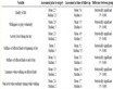
Table 1. Datasets, models, sample size (N), number of trees (ntree), number of predictors (mtry), total accuracy, sensitivity, specificity, proportion of misplaced cases (PMC) and mean clustering coefficients for the entire sample, for the target class only and for the non-target class only.


Figure 1. Multisimensional scale plot of the breast cancer’s random forest proximity matrix.

Figure 2. Weighted network representation of the breast cancer’s random forest proximity matrix.
The Venn-diagram shows the 95% confidence region for each class. There is no interpolation of the confidence region in all models, suggesting a very good separation between the benign and malignant classes. The proportion of misplaced cases (PMC), i.e. the number of cases from the benign class within the 95% confidence region of the malignant class plus the number of cases from the malignant class within the 95% confidence region of the benign class divided by n, was as follows. The PMC in model one is 1.57%, in model two is 1.14%, 0.57% in model three and 0.86% in model four. These values are also displayed in Table 1. The PMC presents a correlation of −0.96 with total accuracy, −0.97 with sensitivity and −0.83 with specificity.
The results of the weighted clustering coefficients for the breast cancer dataset are displayed in Table 1. Considering the values of the entire sample, the Zhang and Horvath’s (2005) coefficient mean value ranges from 0.51 (model three) to 0.66 (model four), while Onnela et al.’s (2005) varies from 0.27 (model three) to 0.62 (model two). The coefficient of Barrat et al. (2004) ranges from 0.72 (model one) to 0.94 (model four). Considering the cluster coefficient mean value for the observations belonging to the target class only (malignant tumor), the Zhang and Horvath’s (2005) coefficient ranges from 0.67 (models one and three) to 0.81 (model four). The Onnela et al.’s (2005) cluster coefficient mean value varies from 0.36 (model three) to 0.69 (model two) and the Barrat et al.’s (2004) mean coefficient ranges from 0.77 (model one) to 0.97 (models three and four). Taking into account only the mean cluster coefficient for the observations belonging to the non-target class (benign tumor), the Zhang and Horvarth’s coefficient varies from 0.22 (model three) to 0.53 (model two). The Onnela et al.’s (2005) mean value varies from 0.09 (model three) to 0.48 (model two) and the Barrat et al.’s (2004) mean coefficient ranges from 0.63 (model one) to 0.88 (model four).
The density distribution of the weighted clustering coefficients for each class is displayed in Figure 3. The distribution of the Zhang and Horvarth’s (2005) weighted clustering coefficients of the benign and malignant classes are non-identical at the 0.05 significance level in model one (W = 98001.5, p-value < 0.001, Hodges- Lehmann = 0.24), in model two (W = 100,447, p-value < 0.001, Hodges-Lehmann = 0.19), in model three (W = 108,013, p-value < 0.001, Hodges-Lehmann = 0.47) and in model four (W = 107,791, p-value < 0.001, Hodges- Lehmann = 0.44).
The same occurs to the distribution of Onnela et al.’s (2005) weighted clustering coefficient of both classes, being non-identical in all four models (WModel 1 = 92,536.5, p-valueModel 1 < 0.001, Hodges-LehmannModel 1 = 0.23; WModel 2 = 96,000.5, p-valueModel 2 < 0.001, Hodges-LehmannModel 2 = 0.22; WModel 3 = 107,907, p-valueModel 3 < 0.001, Hodges-LehmannModel 3 = 0.30; WModel 4 = 106,024, p-valueModel 4 < 0.001, Hodges-LehmannModel 4 = 0.45). Finally, the distribution of Barrat et al.’s (2004) cluster coefficient of both classes are non-identical for every model (WModel 1 = 85,034.5, p-valueModel 1 < 0.001, Hodges-LehmannModel 1 = 0.17; WModel 2 = 84,151, p-valueModel 2 < 0.001, Hodges-LehmannModel 2 = 0.10; WModel 3 = 104,920, p-valueModel 3 < 0.001, Hodges-LehmannModel 3 = 0.14; WModel 4 = 99584, p-valueModel 4 < 0.001, Hodges-LehmannModel 4 = 0.03).
In our results, the Hodges-Lehmann estimator gives the median of the difference between the clustering coefficients from a sample of the benign class and from a sample of the malignant class. By the Hodges-Lehmann estimator, the best weighted clustering coefficient separating the benign and the malignant classes of the breast cancer dataset is the Zhang cluster from model four.
3.2. Medical Students’ Results
As happened with the breast cancer results, the multidimensional scale plots (Figure 4) provides a clear way of inspecting clusters and patterns than the parallel coordinate plots. The cases’ distribution in model two, for example, seems to be a little bit more heterogeneous between classes than in model three or four, which does re-


Figure 3. Density distribution of three weighted clustering coefficients (Zhang, Onnela and Barrat) of the malignant class (blue) and the benign class (red), from models 1 to 4.


Figure 4. Multidimensional scale plots of the medical students’ random forest proximity matrix.
flects the performance of the models. However, due to the accuracy of the models, only by consulting the accu- racy indexes is possible to tell which model is the best one. Model one presents a total accuracy of 70.13%, a sensitivity of 60% and a specificity of 78.58%. Model two shows a worse performance than model one, with a total accuracy of 67.11%, a sensitivity of 61.77% and a specificity of 71.53%. The third model presents a total accuracy of 70.13%, a sensitivity of 62.86% and a specificity of 76.20%, while the fourth model shows a total accuracy of 74.03%, a sensitivity of 65.72% and a specificity of 80.96%.
Again, the plot generated using the weighted network technique (Figure 5) offers a clearer picture than the multidimensional scale plots. It is easy to verify the separation of the classes, to understand the distribution of the cases in each class, as well as to compare the prediction performance between the models. The 95% confidence regions is more superposed in models one and two than in models three and four. The proportion of misplaced cases is equal to 37.66% in model one, 33.76% in model two and 16.88% in models three and four.
Table 1 shows the results of the weighted clustering coefficients for the medical students’ dataset. The Zhang and Horvath’s (2005) mean clustering coefficients of the entire sample ranges from 0.17 (model three) to .40 (model two), while the Onnela et al.’s (2005) varies from 0.27 (model three) to 0.39 (model two). The coefficient of Barrat et al. (2004) ranges from 0.47 (model one) to 0.92 (model four). Taking into consideration the cluster coefficient mean value for the observations belonging to the target class only (low achievement), the Zhang and Horvath’s (2005) ranges from 0.18 (model three) to 0.40 (model two). The Onnela et al.’s (2005) mean coefficient varies from 0.50 (model one) to 0.91 (model four) and the Barrat et al.’s (2004) from 0.77 (model one) to 0.97 (models three and four). Finally, considering only the mean cluster coefficient for the observations belonging to the non-target class (high achievment), the Zhang and Horvarth’s varies from 0.17 (model three) to 0.40 (model two). The Onnela et al.’s (2005) varies from 0.08 (model three) to 0.38 (model two) and the Barrat et al.’s (2004) ranged from 0.45 (model one) to 0.93 (model four).
The density distribution of the weighted clustering coefficients for each class of the medical students dataset is displayed in Figure 6. Only the distribution of the Barrat et al.’s (2005) weighted clustering coefficient of the low and high achievement classes are non-identical at the 0.05 significance level (WModel 3 = 495, p-value Model 3 < 0.05, Hodges-LehmannModel 3 = −0.01; WModel 4 = 466, p-valueModel 4 < 0.01, Hodges-LehmannModel 4 = −0.02). The Barrat et al.’s (2004) coefficient from model four was the best to separate the low and the high achievement classes of the medical students’ dataset according to the Hodges-Lehmann estimator.
3.3. Relating the Indicators of the Prediction Quality
Figure 7 shows the correlation pattern (left) and the p-values (right) of the following variables: total accuracy (T.A), sensitivity (Sns), specificity (Spc), sample size (N), number of trees (ntr), number of predictors (mtr), Zhang cluster (Zh.C), Zhang cluster of the target class (Z.C.T), Zhang cluster of the non-target class (Z.C.N), Onnela cluster (On.C), Onnela cluster of the target class (O.C.T), Onnela cluster of the non-target class (O.C.N), Barrat cluster (Br.C), Barrat cluster of the target class (B.C.T), Barrat cluster of the non-target class (B.C.N) and proportion of misplaced cases (NMC). The correlations were plot using the qgraph package ( Epskamp et al., 2012 ) and the layout was computed through the Fruchterman-Reingold algorithm. The higher the correlations, the closer the variables in the two-dimensional space. Positive correlations are represented by green edges, and negative correlations by red edges. The p-values are also plotted, with different intensity of blue representing different levels of significance.

Figure 5. Weighted network representation of the medical students’ random forest proximity matrix.


Figure 6. Density distribution of three weighted clustering coefficients (Zhang, Onnela and Barrat) of the low achievement class (blue) and the high achievement class (red), from models 1 to 4.

Figure 7. Plot of the quality indicators’ correlation matrix.
The number of predictors are poor and non-significantly related to any other indicators. The correlation between the number of trees and the mean Barrat et al.’s (2004) clustering coefficient for the entire sample, for the target class and for the non-target class are high and significant. When the number of trees in the random forest increases, the weighted clustering coefficient of Barrat et al. (2004) also increases. The Barrat et al. (2004) coefficient is not significantly related to the total accuracy, sensitivity and specificity of the predictive model, but has a negative and significant relation to the proportion of misplaced cases. By its turn, the proportion of misplaced cases has a strong, negative and significant correlation with total accuracy, sensibility, specificity and sample size. The Zhang and Horvath’s (2005) weighted clustering coefficient for the entire sample and for the target class has a strong, positive and significant correlation with total accuracy, sensitivity, specificity and sample size. However, the Zhang and Horvath’s (2005) coefficient for the non-target class is not significantly related to total accuracy, sensitivity or specificity. Finally, Onnela et al.’s (2004) coefficient is not significantly related to the accuracy indexes, but its mean clustering value for the non-target class is strong, negative and significantly related to the number of trees. The correlations are displayed in Table 2.
4. Discussion
In the last decades, the development of algorithms that can lead to high predictive accuracy and the advance of high-speed personal computers to run these algorithms led the data science to a completely new level ( Kuhn & Johnson, 2013 ). Machine learning is the field providing the majority of the predictive algorithms currently applied in a broad set of areas ( Geurts, Irrthum, & Wehenkel, 2009 ; Eloyan et al., 2012 ; Skogli et al., 2013 ; Blanch & Alucha, 2013 ; Cortez & Silva, 2008 ; Golino & Gomes, 2014 ; Hardman, Paucar-Caceres, & Fielding, 2013 ). Among the techniques and algorithms available, the classification and regression trees or CART ( Breiman, Friedman, Olshen, & Stone, 1984 ) is amongst the most used ones ( Geurts, Irrthum, & Wehenkel, 2009 ). However, in spite of the CART qualities it suffers from the two related issues of overfitting and variance ( Geurts et al., 2009 ). Ensemble tree techniques were developed to deal with both issues and to increase the predictive ac-
Table 2. Correlation between sample size (N), number of trees (ntree), number of predictors (mtry), total accuracy, sensitivity, specificity, proportion of misplaced cases (PMC) and mean clustering coefficients for the entire sample, for the target class only and for the non-target class only.
curacy of classification and regression trees, being the random forest ( Breiman, 2001 ) one of the most widely applied ( Seni & Elder, 2010 ). In spite of the random forest’s useful characteristics, its result is not easily understandable as the result of single CARTs. There is no “typical tree” to look at in order to understand the prediction roadmap (or the if-then rules). In order to increase random forests understandability and interpretability variance importance plots and multidimensional scaling plots can be used. The first strategy will unveil how important each predictor is in the classification, given all trees generated. It is of low to no use if one is interested in as- sessing the quality of the prediction. The second strategy is well suited to visually inspect how well the prediction is behaving, in the sense of separating two or more classes. However, the interpretation of the multidimensional scaling plot is not straightforward, since it plots the first two or three principal components’ score of the proximity matrix. Multidimensional scaling plot does not generate a direct representation of the models’ predictive accuracy, and thus makes the interpretability of the cases’ distribution not very intuitive.
When dealing with predictive models, visualization techniques can be a very helpful tool to learn more about how the algorithms operate ( Borg & Groenen, 2005 ; Wickham, Caragea, & Cook, 2006 ), to understand the results ( Quack, 2012 ; Wickham, 2006 ) and to seek patterns ( Honarkhah & Caers, 2010 ). It is also very informative to apply visualization techniques to compare predictions under different conditions by looking how groups are arranged in the space (specially their boundaries) ( Wickham, Caragea, & Cook, 2006 ). Recent researches have shown that the kind of plot used in a research interferes in its comprehension and memorability ( Borkin et al., 2013 ). Borkin and colleagues (2013) showed that representing statistical information using networks are more memorable than using common graphs, such as points, bar, lines, and so on ( Borkin et al., 2013 ). The relevance producing memorable graphs lies in its capacity to increment the visualization effectiveness and engagement, therefore facilitating the results communication.
In the current paper we proposed the representation of the proximity matrix as weighted networks, a new method to improve random forest’s result interpretability. The use of weighted networks as a representation of the relationships between variables enables the identification of important structures that could be difficult to identify using other techniques ( Epskamp et al., 2012 ). This approach is a direct representation of the random forest’s performance, which facilitates the visual inspection of the predictive accuracy, turning complex patterns into easily understandable images without using any dimension reduction methods.
Our results suggest that representing the proximity matrix as networks indeed facilitates the visualization of the random forest classification performance, especially in cases where the accuracy is not very high. The approach we propose also seems to be more intuitive than the multidimensional scaling plot, especially when comparing model performance under different conditions. In the breast cancer dataset, Figure 2 shows that while in models one and two the observations are closer in the space than in models three and for, indicating higher proximity scores, the number of misplaced cases is also higher. This can be seen looking at the colors of the observations within the 95% confidence region for each class. So, it is pretty straightforward to compare the four predictive models, and to conclude that models three and four are better than models one and two. The same analysis is impossible to do in Figure 1, which shows the multidimensional scaling plot. There is no visual clue to determine which model is the best one, in terms of total accuracy, sensibility and specificity. Furthermore, when analyzing the new performance index, proportion of misplaced cases, we can confirm our visual analysis. While model one and two have 1.57% and 1.14% of misplaced cases, models three and four have only 0.57% and 0.86%, respectively. The proportion of misplaced cases presents a very high negative correlation with total accuracy (−0.96) and sensitivity (−0.97), indicating the lower the number of misplaced cases, the higher both indexes.
The same interpretation holds for the medical students’ dataset. While is very difficult to tell which predictive model is the best one by inspecting the multidimensional scale plot in Figure 4, it is easier to do so by inspecting the network in Figure 5. It is very easy to see that the number of misplaced cases is higher in models one and two, than in models three and four. Again, this can be done by looking at the colors of the observations within the 95% confidence region for each class. The visual inspection is confirmed by the performance indexes, since models three and four have higher sensitivity (63% and 66%), and model four have higher total accuracy (74%) and specificity (81%) than the other models. The proportion of misplaced cases differentiates only models one and two from models three and four.
Since we are dealing with weighted networks, computing clustering coefficients for this kind of graph can also be informative. Barrat et al. (2004) presented the first clustering coefficient developed specifically for weighted graphs, and has the nice property of being independent of the size of the network and of the weights’ distribution ( Antoniou & Tsompa, 2008 ). Contrarily to Barrat’s coefficient, the second clustering measure adopted in this paper, proposed by Onnela et al. (2005) take into account the weights of all edges. The only clustering coefficient adopted here that relies exclusively on the network weights is the one proposed by Zhang & Horvath (2005) . Since both Onnela et al. (2005) and Zhang and Horvath’s (2005) coefficients are almost linearly related to the network weights ( Antoniou & Tsompa, 2008 ), we expected that these two clustering measures would be more informative of the random forest’s classification performance than Barrat et al.’s (2004) coefficient.
Our findings suggest that Barrat et al.’s clustering measure is sensitive to the number of trees grown in the random forest procedure, since it presented a strong and significant correlation with the number of trees used (r = 0.87, p < 0.001). The same occurs when the Barrat et al.’s coefficient is used to the measure the clustering of the target classes (r = 0.84, p < 0.01) and of the non-target classes (r = 0.92, p < 0.001). Barrat et al.’s (2005) coefficient is not significantly related to the total accuracy, sensitivity and specificity of the predictive models, and cannot be regarded as an index of the prediction quality. However, it presents a negative and significant relation to the proportion of misplaced cases (r = −0.71, p < 0.05), and can be considered an indicator of the misplacement within the 95% confidence region of the classes: the higher the Barrat value, the lower the proportion of misplacements.
By the other side, Zhang and Horvath’s (2005) weighted clustering coefficient for the entire sample presents a strong, positive and significant correlation with total accuracy (r = 0.86, p < 0.01), sensitivity (r = 0.87, p < 0.05) and specificity (r = 0.82, p < 0.05). It also presents a high and positive correlation with sample size (r = 0.91, p < 0.001). The same scenario occurs for the Zhang and Horvath’s (2005) target class coefficient, since it presented a positive and significant correlation with total accuracy (r = 0.91, p < 0.001), sensitivity (r = 0.92, p < 0.001), specificity (r = 0.87, p < 0.01) and sample size (r = 0.97, p < 0.001). As predicted, Zhang and Horvath’s (2005) coefficient can be considered a good indicator of the prediction quality.
However, unlike we expected, Onnela et al.’s (2004) coefficient was not significantly related to the accuracy indexes (see Table 2). Its mean clustering value for the non-target class was strong, negative and significantly related to the number of trees (r = −0.92, p < 0.01). On the other hand, the indicator we propose, proportion of misplaced cases, have a strong, negative and significant correlation with total accuracy (r = −0.91, p <0.01), sensibility (r = −0.91, p < 0.01), specificity (r = −0.90, p < 0.01). It seems that this new index is a good indicator of the random forest prediction accuracy, since the lower the proportion of misplaced cases within the 95% confidence region in each class, the higher the total accuracy, sensibility and specificity.
5. Conclusion
In sum, the current paper proposed a new visualization tool to help check the quality of the random forest prediction, as well as introduced a new accuracy index (proportion of misplaced cases) that was highly related to total accuracy, sensitivity and specificity. This strategy, together with the computation of Zhang and Horvath’s (2005) clustering coefficient for weighted graphs, can be very helpful in understanding how well a random forest prediction is doing in terms of classification. It adds new tools to help in the accuracy-interpretability trade- off.
Acknowledgements
The current research was financially supported by a grant provided by the Fundação de Amparo à Pesquisa de Minas Gerais (FAPEMIG) to the two authors, as well as by the INEP foundation. The second author is also funded by the CNPQ council.
References
- Antoniou, I. E., & Tsompa, E. T. (2008). Statistical Analysis of Weighted Networks. Discrete Dynamics in Nature and Society, 2008, 16. http://dx.doi.org/10.1155/2008/375452
- Barrat, A., Barthelemy, M., Pastor-Satorras, R., & Vespignani, A. (2004). The Architecture of Complex Weighted Networks. Proceedings of the National Academy of Sciences of the United States of America, 101, 3747-3752. http://dx.doi.org/10.1073/pnas.0400087101
- Bennett, K. P., & Mangasarian, O. L. (1992) Robust Linear Programming Discrimination of Two Linearly Inseparable Sets. Optimization Methods and Software, 1, 23-34. http://dx.doi.org/10.1080/10556789208805504
- Blanch, A., & Aluja, A. (2013). A Regression Tree of the Aptitudes, Personality, and Academic Performance Relationship. Personality and Individual Differences, 54, 703-708. http://dx.doi.org/10.1016/j.paid.2012.11.032
- Borg, I. & Groenen, P. (2005). Modern Multidimensional Scaling: Theory and Applications (2nd ed.). New York: Springer- Verlag.
- Borkin, M. A., Vo, A. A., Bylinskii, Z., Isola, P., Sunkavalli, S., Oliva, A., & Pfister, H. (2013). What Makes a Visualization Memorable? Visualization and Computer Graphics IEEE Transactions, 12, 2306-2315. http://dx.doi.org/10.1109/TVCG.2013.234
- Breiman, L. (2001). Random Forests. Machine Learning, 1, 5-32. http://dx.doi.org/10.1023/A:1010933404324
- Breiman, L., Friedman, J., Olshen, R., & Stone, C. (1984). Classification and Regression Trees. New York: Chapman & Hall.
- Cortez, P., & Silva, A. M. G. (2008). Using Data Mining to Predict Secondary School Student Performance. In A. Brito, & J. Teixeira (Eds.), Proceedings of 5th Annual Future Business Technology Conference, Porto, 5-12.
- Eloyan, A., Muschelli, J., Nebel, M., Liu, H., Han, F., Zhao, T., Caffo, B. et al. (2012). Automated Diagnoses of Attention Deficit Hyperactive Disorder Using Magnetic Resonance Imaging. Frontiers in Systems Neuroscience, 6. http://dx.doi.org/10.3389/fnsys.2012.00061
- Epskamp, S., Cramer, A. O. J., Waldorp, L. J., Schmittmann, V. D., & Borsboom, D. (2012). Qgraph: Network Visualizations of Relationships in Psychometric Data. Journal of Statistical Software, 48, 1-18. http://www.jstatsoft.org/v48/i04/
- Fruchterman, T. M. J., & Reingold, E. M. (1991). Graph Drawing by Force-Directed Placement. Software: Practice and Experience, 21, 1129-1164. http://dx.doi.org/10.1002/spe.4380211102
- Geurts, P., Irrthum, A., & Wehenkel, L. (2009). Supervised Learning with Decision Tree-Based Methods in Computational and Systems Biology. Molecular Biosystems, 5, 1593-1605. http://dx.doi.org/10.1039/b907946g
- Golino, H. F., & Gomes, C. M. A. (2014). Four Machine Learning Methods to Predict Academic Achievement of College Students: A Comparison Study. Revista E-Psi, 4, 68-101.
- Hardman, J., Paucar -Caceres, A., & Fielding, A. (2013). Predicting Students’ Progression in Higher Education by Using the Random Forest Algorithm. Systems Research and Behavioral Science, 30, 194-203. http://dx.doi.org/10.1002/sres.2130
- Hastie, T., Tibshirani, R., & Friedman, J. (2009). The Elements of Statistical Learning: Data Mining, Inference and Prediction (2nd ed.). New York: Springer. http://dx.doi.org/10.1007/978-0-387-84858-7
- Honarkhah, M., & Caers, J. (2010). Stochastic Simulation of Patterns Using Distance-Based Pattern Modeling. Mathematical Geosciences, 42, 487-517. http://dx.doi.org/10.1007/s11004-010-9276-7
- James, G., Witten, D., Hastie, T., & Tibshirani, R. (2013). An Introduction to Statistical Learning with Applications in R. New York: Springer. http://dx.doi.org/10.1007/978-1-4614-7138-7
- Kalna, G., & Higham, D. J. (2007). A Clustering Coefficient for Weighted Networks, with Application to Gene Expression Data. Journal of AI Communications-Network Analysis in Natural Sciences and Engineering, 20, 263-271.
- Kuhn, M., & Johnson, K. (2013). Applied Predictive Modeling. New York: Springer. http://dx.doi.org/10.1007/978-1-4614-6849-3
- Lemon, J. (2006). Plotrix: A Package in the Red Light District of R. R-News, 6, 8-12.
- Liaw, A., & Wiener, M. (2012). Random Forest: Breiman and Cutler’s Random Forests for Classification and Regression. R Package Version 4.6-7.
- Mangasarian, O. L., & Wolberg, W. H. (1990). Cancerdiagnosis via Linear Programming. SIAM News, 23, 1-18.
- Mangasarian, O. L., Setiono, R., & Wolberg, W. H. (1990). Pattern Recognition via Linear Programming: Theory and Application to Medical Diagnosis. In T. F. Coleman, & Y. Y. Li (Eds.), Large-Scale Numerical Optimization (pp. 22-30). Philadelphia, PA: SIAM Publications.
- Onnela, J. P., Saramaki, J., Kertesz, J., & Kaski, K. (2005). Intensity and Coherence of Motifs in Weighted Complex Networks. Physical Review E, 71, Article ID: 065103. http://dx.doi.org/10.1103/PhysRevE.71.065103
- Quach, A. T. (2012). Interactive Random Forests Plots. All Graduate Plan B and Other Reports, Paper 134, Utah State Univesity.
- R Development Core Team (2011). R: A Language and Environment for Statistical Computing. Vienna: R Foundation for Statistical Computing. http://www.R-project.org
- Seni, G., & Elder, J. F. (2010). Ensemble Methods in Data Mining: Improving Accuracy through Combining Predictions. Morgan & Claypool Publishers. http://dx.doi.org/10.2200/S00240ED1V01Y200912DMK002
- Skogli, E., Teicher, M. H., Andersen, P., Hovik, K., & Øie, M. (2013). ADHD in Girls and Boys―Gender Differences in Co-Existing Symptoms and Executive Function Measures. BMC Psychiatry, 13, 298. http://dx.doi.org/10.1186/1471-244X-13-298
- Steincke, K. K. (1948). Farvelogtak: Ogsaaen Tilvaerelse IV. København: Fremad.
- Venables, W. N., & Ripley, B. D. (2002). Modern Applied Statistics with S (4th ed.). New York: Springer. http://dx.doi.org/10.1007/978-0-387-21706-2
- Wickham, H., Caragea, D., & Cook, D. (2006). Exploring High-Dimensional Classification Boundaries. Proceedings of the 38th Symposium on the Interface of Statistics, Computing Science, and Applications―Interface 2006: Massive Data Sets and Streams, Pasadena, May 24-27 2006.
- Wolberg, W. H., & Mangasarian, O. L. (1990) Multisurface Method of Pattern Separation for Medical Diagnosis Applied to Breast Cytology. Proceedings of the National Academy of Sciences of the United States of America, 87, 9193-9196.
- Zhang, B., & Horvath, S. (2005). A General Framework for Weighted Gene Co-Expression Network Analysis. Statistical Applications in Geneticsand Molecular Biology, 4. http://dx.doi.org/10.2202/1544-6115.1128