Journal of Environmental Protection
Vol.10 No.04(2019), Article ID:91648,12 pages
10.4236/jep.2019.104028
Increases in Mortality for All Causes and All Cancers Combined before and after Startup of a Nuclear Power Plant in New Jersey, USA
Joseph Mangano, Janette Sherman
Radiation and Public Health Project, New York, NY, USA

Copyright © 2019 by author(s) and Scientific Research Publishing Inc.
This work is licensed under the Creative Commons Attribution International License (CC BY 4.0).
http://creativecommons.org/licenses/by/4.0/


Received: March 4, 2019; Accepted: April 6, 2019; Published: April 9, 2019
ABSTRACT
The Salem/Hope Creek nuclear plant in southern New Jersey is one of just four U.S. plants with three large reactors (all others consist of one or two). These reactors started operations in 1976, 1980, and 1986 and routinely released toxic radioactive gases and particles into the environment. Only a single study has been performed by federal officials on cancer near nuclear plants―a study now 30 years old. A review of official mortality data using four-year periods shows the Salem County cancer death rate was consistently just below that of other New Jersey counties up to the mid-1980s. However, from 1983-1986 to 2015-2017, the county rate soared from −5.4% below the rest of the state to +32.6% above. The county/state mortality ratio for all causes also increased rapidly in these periods, from +0.6% above to +28.4% above the state. Salem now has the highest cancer death rate, and the 2nd highest total death rate of any New Jersey county. Had the 1983-1986 county-state ratios not changed in the following 31 years, 3493 fewer deaths (1018 of them from cancer) would have occurred among Salem County residents. The lack of any apparent etiologies that could have caused such a dramatic and unexpected change, plus the fact that the Salem/Hope Creek reactors are aging, corroding, and more prone to leaking radionuclides, emphasizes the immediate need for more studies of this type, and the inclusion of local health as a crucial factor in public decisions on the plant’s future.
Keywords:
Radiation, Nuclear Power, Nuclear Reactors, Radioactivity, Cancer

1. Introduction
The introduction of nuclear power as a means of generating electricity in the 1950s has added a new set of harmful man-made chemicals into the environment. In the United States, with 98 nuclear reactors producing about 19 percent of the nation’s electricity as of early 2019, the issue of measuring any decline in health status is raised [1] . Despite the large number of reactors operating over decades, the U.S. federal government has only produced one health study in populations living near nuclear plants, a 1990 review of cancer mortality. The study was only done after Senator Edward Kennedy raised the issue to the National Institutes of Health [2] .
The federal National Cancer Institute could not conclude whether the addition of radioactivity in the environment was or was not linked to cancer mortality. The fact that only reactors that started operations before 1982 were studied means that many of today’s operating reactors were excluded or just several years of post-startup data were used. Despite the Institute’s recommendation that further analyses should be conducted, no federal study has been performed in the nearly three decades since then [3] . With 49 of 98 reactors operating more than 40 years―the original period regulators permitted electric companies to operate and many more approaching the 40-year mark, it indicates studies are needed near the plethora of aging and corroding reactors.
Most U.S. nuclear plants consist of 1 or 2 reactors. Only four plants operate three reactors (Browns Ferry, Alabama; Oconee, South Carolina; Palo Verde, Arizona; and Salem/Hope Creek, New Jersey). While Palo Verde has the greatest capacity of any U.S. nuclear plant at 4341 megawatts electrical, the fact that these reactors began operating much later than most plants means the three-reactor plant with the second largest capacity (Salem/Hope Creek, with 3363) has possibly produced the most radioactivity of any operating U.S. nuclear plant [4] .
One relative indicator of how much radioactivity has been produced by nuclear plants is the amount of radioactivity stored as nuclear waste. At the end of 2010, Salem had the 22nd greatest amount of such waste of 72 U.S. nuclear plants, a total of 216,050,800 curies. The current number is considerably greater, and Salem/Hope Creek’s ranking is higher. By contrast, the estimated 150,000,000 curies were released from the catastrophic meltdown at Chernobyl [5] . Although the waste includes several dozen radionuclides that decay slowly, about 90% of the waste is made up of three chemicals: Cesium-137, Plutonium-241, and Strontium-90.
The purpose of this analysis will be to review trends in cancer mortality near the Salem/Hope Creek nuclear plant, following the manner that the National Cancer Institute took in 1990. In addition to cancer, mortality trends for other causes of death will be explored.
2. Methods and Materials
Salem/Hope Creek consists of adjoining Salem units 1 and 2, and Hope Creek just five miles away. The reactors, which began operating in 1976, 1980, and 1986 [1] , are located on the Delaware River, in Salem County, in the southwest portion of New Jersey. The county is 331.9 square miles in size, indicating virtually all county residents live within 15 miles of the reactors means Salem will be chosen as the “study” area (most likely to expose its residents to radioactivity), and its mortality patterns and trends compared with those for the other 20 counties in New Jersey.
A demographic comparison of Salem County and New Jersey is given in Table 1 [6] .
There appears to be no distinct pattern suggesting whether Salem County has a higher or lower risk of cancer mortality than the state of New Jersey. A mostly rural and small-town area of 62,792 residents, Salem has lower percentages of Asians, college graduates, household income, and a higher percent living in poverty―each suggesting a more vulnerable population. Conversely, it has higher percentages of Caucasians, and a lower percentage of Hispanics and foreign-born―each suggesting a less vulnerable population. The plant is located just 18 miles from Wilmington Delaware and 30 miles from Philadelphia Pennsylvania, geographically proximate to major medical centers that treat cancer.
The U.S. Centers for Disease Control and Prevention has made data available on the Internet on all U.S. deaths for each year in the 50-year period 1968 to 2017 [7] . These data can be analyzed by age, race, gender, cause of death, state, county, and other demographic measures. Because 50 years represents an unusually long period for a health data base, the ease in accessing it, and the fact that it incorporates periods before and after the startup of the three reactors at Salem/Hope Creek, the Centers for Disease Control and Prevention will be the data source in this review. In addition, using data on mortality trends matches the choice of the National Cancer Institute in its 1990 study.
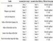
Table 1. Demographic comparison Salem County and New Jersey.
Also similar to the National Cancer Institute, mortality for all cancers combined will be presented, grouping the data by four-year period of death (the National Cancer Institute used five-year periods). The only three-year periods will include 1968-1970 (the earliest data available) and 2015-2017 (the most recent data available).
The rate of deaths per 100,000 persons (all ages), adjusted to the 2000 U.S. standard population, will be the measure of mortality employed in this review. Age-adjustment is a long-employed statistical method used in epidemiology to facilitate true comparisons between groups, to avoid bias such as the highest mortality rates consistently occurring in areas heavily populated by the elderly. Two sets of findings will be presented, namely 1) all-cause mortality, as radioactivity can harm various body systems, [8] and 2) all cancers combined, as the carcinogenic properties of radioactivity are well-recognized.
Mortality rate data will be accompanied by Salem County’s rank in the state. As New Jersey consists of 21 counties, a ranking of #1 signifies the highest rate in the state, while a ranking of #21 indicates the lowest rate in the state.
The test of whether differences in mortality rates between county and state are statistically significant will use 95% confidence intervals. All data on confidence intervals, age-adjusted death rates, number of deaths, and populations are automatically calculated with the Centers for Disease Control and Prevention data base.
3. Results
3.1. Mortality for All Cancers
Table 2 and Figure 1 present age-adjusted mortality for all malignant cancers combined for each four-year period from 1968 to 2017.
For each of the periods from 1968-1970 to 1983-1986, the cancer mortality rate for Salem County remained slightly below the rate for all other New Jersey counties, varying between −0.1% and −5.4%. These differences were not statistically significant. Of the 21 New Jersey counties, the Salem rate varied from 10th highest to 17th highest.

Figure 1. % Salem county is +/− other new jersey deaths from all cancers combined, by 4-year periods, 1968-2017. Number of deaths/100,000 population, adjusted to 2000 U.S. standard.
Table 2. Mortality, all cancers combined Salem County vs. all other NJ by four-year periods, 1968-2017.
*County rate is significantly different than other New Jersey at p < 0.05 (borderline significant for 1995-1998). Rates = annual cancer deaths per 100,000 population, adjusted to 2000 U.S. standard population. Malignant cancer codes are 140-209 (1968-1978); 140-208 (1979-1998); C00-C97 (1999-2017). Source: U.S. Centers for Disease Control and Prevention. https://wonder.cdc.gov. Rank: 1 = highest rate of any county in the state, 21 = lowest rate of any county in the state.
After 1986, a dramatic change was observed. In the four years after 1983-1986, the Salem rate rose from −5.4% below to just −0.5% below other New Jersey. Thereafter, the Salem rate exceeded that of the other New Jersey counties for each period. The excesses increased steadily, until reaching 32.6% above the rest of the state in 2015-2017. The county rate was significantly higher than the rest of the state for each period after 1990. In six of seven most recent four-year periods, Salem county had the 1st or 2nd highest cancer mortality rate of the 21 counties. The number of cancer deaths per year among Salem County residents has increased from about 110 per year in 1970 to about 170 per year at present.
Table 3 shows the Salem County cancer mortality rate, compared to other New Jersey counties, for each gender, race, ethnic group, age group, and the four most common types of cancer, for the most recent 10-year period (2008-2017).
For the 10-year period 2008-2017, the Salem County cancer mortality rate was significantly greater than the other New Jersey counties for
- All persons (+25.2% higher)
- Males (+32.1%) and females (+17.9%)
- White non-Hispanics (+19.0%) and black non-Hispanics (+16.3%)
- Ages 25 - 44 (+84.2%), 45 - 64 (+31.6%), and 65 or over (+20.8%)
- Lung (+43.2%), female breast (+18.1%), male prostate (+57.4%), colorectal (+20.3%)
Table 3. Mortality, all cancers combined Salem County vs. all other NJ, 2008-2017 by gender, race, age, and cancer type.
*County rate is significantly different than other New Jersey at p < 0.05 at (borderline for black non-Hispanic, female breast, and colorectal). + = insufficient data to generate rates. Codes are C33-C34 (lung/bronchus/trachea); C50 (F breast); C61 (M prostate); C18-C20 (colorectal). Source: U.S. Centers for Disease Control and Prevention. https://wonder.cdc.gov. Rank: 1 = highest rate of any county in the state, 21 = lowest rate of any county in the state.
In each of the above categories, the Salem rate was the highest of any New Jersey county, except for white non-Hispanics (2nd highest), black non-Hispanics (2nd highest), and age 45 - 64 (3rd highest).The number of deaths among white Hispanics (18) and persons age 0 - 24 (6) were too small to facilitate a significance analysis.
3.2. Mortality for All Causes
Table 4 and Figure 2 present age-adjusted mortality for all causes combined for each four-year period from 1968 to 2017.
From 1968-1970 to 1983-1986, the percent that the Salem County death rate exceeded the 20 other New Jersey counties dropped steadily, from +9.3% to +0.6%; the Salem County rate fell from the 3rd highest to the 11th highest rate (out of 21 county) in the state. After 1986, this trend reversed. A steady rise in the county vs. state excess occurred, until it reached a high of 28.4% in 2015-2017, the most recent period. In the last six periods, after 1994, Salem County’s mortality rate has ranked 1st, 2nd, or 3rd of New Jersey counties.
Table 5 shows the Salem County all-cause mortality rate, compared to other New Jersey counties, for each gender, race, ethnic group, age group, and the four most common types of cancer, for the most recent 10-year period (2008-2017).
Table 4. Mortality, all causes combined Salem County vs. all other NJ by four-year periods, 1968-2017.
*County rate is significantly different than other New Jersey at p < 0.05. Rates = annual cancer deaths per 100,000 population, adjusted to 2000 U.S. standard population. Source: U.S. Centers for Disease Control and Prevention. https://wonder.cdc.gov. Rank: 1 = highest rate of any county in the state, 21 = lowest rate of any county in the state.
Table 5. Mortality, all causes combined Salem County vs. all other NJ, 2008-2017 by gender, race, and age.
*County rate is significantly different than other New Jersey at p < 0.05. Source: U.S. Centers for Disease Control and Prevention. https://wonder.cdc.gov. Rank: 1 = highest rate of any county in the state, 21 = lowest rate of any county in the state.
For the 10-year period 2008-2017, the Salem County all-cause mortality rate was significantly greater than the other New Jersey counties for

Figure 2. % Salem county is +/− other New Jersey deaths from all causes combined, by 4-year periods, 1968-2017. Number of deaths/100,000 population, adjusted to 2000 U.S. standard.
- All persons (+24.7% higher)
- Males (+25.7%) and females (+23.1%)
- White non-Hispanics (+17.5%), black non-Hispanics (+23.8%), and white Hispanics (+34.6%)
- Ages 0 - 24 (+49.0%), 25 - 44 (+64.8%), 45 - 64 (+43.0%), and 65 or over (+17.2%)
In each of the above categories, the Salem rate was the 2nd highest of any New Jersey county, except for black non-Hispanics (1st highest), white Hispanic (3rd highest), and age 0 - 24 (3rd highest). Elevated rates in Salem County were statistically significant in each category, as the numbers of deaths are relatively large (currently, over 700 Salem County residents die each year).
4. Discussion
The analysis of trends and current patterns of mortality in Salem County has revealed distinct patterns, both for all causes combined and for all cancers combined.
Through the late 1960s and continuing through all the 1970s to the mid-1980s, the county consistently showed all-cause death rates insignificantly above the rest of the state, which improved from +9.3% above to a low of +0.6% above in 1983-1986. The death rate for all cancers combined during this time also reached a low of −5.4% in 1983-1986.
However, beginning in 1987, the all-cause mortality rate in the county, compared to the state steadily increased, as did the all-cancer mortality rate. Rates continue to rise, peaking in the most recent period of 2015-2017. Table 6 shows the percentages that Salem County rates exceed that of the other 20 New Jersey counties; it also calculated an “excess death” total for all causes and all cancers―calculated as the difference between the actual number of deaths minus the “expected” number, based on the presumption that 1983-1986 county/state ratio (+0.6% for all causes, −5.4% for all cancers) would not change.
The “excess” number of deaths among Salem County residents in the 31-year period 1987-2017 was 3493, of which 1018 were cancer deaths. These excesses
Table 6. Excess age-adjusted mortality rate all causes and all cancers combined Salem County vs. all other NJ, 1987-2017.
Ex: Excess deaths for all causes, 1991-1994 = (county/state ratio for 1991-1994 ? county/state ratio for 1983-1986) × 1991-1994 deaths: (8.1% - 0.6%) × 2721 = 204. Source: U.S. Centers for Disease Control and Prevention. https://wonder.cdc.gov.
are about 16% of all county deaths for all causes, and 20% of all cancer deaths. With county/state ratios having reached highs in the most recent period, it is very likely that excess deaths will increase in the future.
The obvious issue raised in this report is that of etiology; that is, what factor(s) caused such a dramatic and unexpected rise in Salem death rates compared to the rest of the state. This question is not easily answered, as potential factors accounting for trends in death rates are multiple, and often cannot be identified.
Addressing the mortality trends of the past three decades in Salem County requires identification of potential causes that could not account for such trends. Commonly analyzed factors include changes in demographic makeup within the county, changes in access to medical care, and changes in living conditions.
The fact that both cancer and all-cause mortality have increased simultaneously in Salem County suggests a potential common cause, and further may suggest a deterioration in the health care system, and health services performance indicators should be reviewed. Still, an excess deterioration in Salem County’s system, compared to the state of New Jersey, would have to be demonstrated to support the health care system as a factor in the rising county/state mortality ratios.
A review of data shows no obvious differences in trends between Salem County and the rest of New Jersey. Similar demographic trends were experienced; Hispanic and black proportions of the population rose; male/female ratios and age-specific distribution remained essentially unchanged. No differences in trends in geographic access to medical care were obvious between county and state, nor were financial access to services. Finally, trends in living conditions (poverty, housing, food consumption, and unemployment) were similar for both state and county.
While many environmental toxins exist, trends in most are likely no different in Salem County. In fact, since the county’s population remained essentially unchanged during the 50 year period studied, and most county residents lived in rural areas or small towns, no new industry that could account for such a huge rise in the mortality gap with the state can be proposed―with the exception of the startup of three large nuclear reactors, which routinely release carcinogenic radioactivity into the environment, and into human bodies through breathing and the food chain.
The fact that the reactors began operating in 1976, 1980, and 1986 raises the question of why sharp mortality increases did not occur immediately after the startup of the first reactor. Instead, the change first can be detected by a small rise in the late 1980s (11 - 14 years after the startup of Salem unit 1), followed by large and continuing increases thereafter. The known latency between exposure and cancer manifestation (plus the latency between diagnosis and death) leads us to suggest that radioactive exposures could account for at least some of the gap between plant startup and mortality increases [9] .
Findings interact with previous reviews, which have identified similar trends to those identified here. For example, one article focused on cancer incidence in Sacramento County, California USA, site of the Rancho Seco nuclear plant, which closed in 1989. The county/state ratio from the last two years of plant operation (1988-1989) were compared with those of the following 20 years (1990-2009). The ratio after shutdown was consistently lower than before shutdown, leading to the estimate of 4319 fewer actual cancer cases versus expected, i.e., a continuation of the 1988-1989 ratio [10] . These similar findings lend greater credibility to the theory that Salem County increases in cancer mortality are due at least in part to continuing radioactive exposures from nuclear plant releases.
Exposure levels to nuclear plant emissions are impossible to calculate with precision. There are many separate radionuclides that are emitted; some have long half-lives while others decay rapidly; there is no steady emission pattern by time period; and the directions that gases and particles take once in the environment vary. Measuring levels of radioactivity in bodies of local residents would help, but only one known such study in the U.S. exists―an analysis of Strontium-90 in 5000 baby teeth [11] . Still, even relatively low doses of radiation exposure such as those of routine emissions from reactors, are known to cause damage to human health; a blue ribbon panel’s most recent report reviewed hundreds of studies and concluded radiation takes a linear, no-threshold dose/response in health (no threshold meaning hazards exist even at very low doses [9] .
Appropriate actions following this new knowledge include the need that government experts in health and the environment to engage in public discussions of the relationship between radioactive emissions from Salem/Hope Creek and local health patterns. Periodic studies of health trends and patterns near plants are merited, as this report only reviewed mortality (not incidence) for two measures of health (all-cause mortality and all-cancer mortality).
A second follow up to this report is the dissemination of results among public elected and regulatory officials, who are mandated to maintain the safety of New Jersey residents, along with the public at large. The discovery of distinct trends that were previously unknown, more than three decades after they began, indicates that additional studies such as this should be conducted by officials. Finally, as Salem unit 1 has operated over 40 years, and Salem 2 will soon reach this milestone (the original legally-allowed period granted by government to operate), health patterns and trends should be a standard component in any public discussion and decision on the future of the Salem/Hope Creek plant.
Comparable efforts should be made near other operating nuclear plants. With 116 million Americans living within 50 miles from a nuclear power plant, the Salem situation should be seen as part of a national issue, not just a local one [12] .
Conflicts of Interest
The authors declare no conflicts of interest regarding the publication of this paper.
Cite this paper
Mangano, J. and Sherman, J. (2019) Increases in Mortality for All Causes and All Cancers Combined before and after Startup of a Nuclear Power Plant in New Jersey, USA. Journal of Environmental Protection, 10, 488-499. https://doi.org/10.4236/jep.2019.104028
References
- 1. http://www.nrc.gov/ (Number of U.S. Nuclear Reactors)
- 2. Kennedy, E.M. (2009) Letter to James Wyngaarden, January 7, 1988. Retrieved from the National Institute of Health Archives, Bethesda MD, June 22.
- 3. Jablon, S., Hrubec, Z., Boice, J.D. and Stone, B.J. (1990) Cancer in Populations Living Near Nuclear Facilities. National Cancer Institute, NIH Pub. No. 90-874. U.S. Government Printing Office, Washington DC.
- 4. Tichler, J., Doty, K. and Lucadamo, K. (1987) Radioactive Materials Released from Nuclear Power Plants: Annual Reports, 1970-1987. NUREG/CR-2907. Brookhaven National Laboratory, Upton, NY.
- 5. Alvarez, R. (2011) Spent Nuclear Fuel Pools in the US: Reducing the Deadly Risks of Storage. Institute for Policy Studies, Washington DC. https://ips-dc.org/wp-content/uploads/2011/05/spent_nuclear_fuel_pools_in_the_US-final.pdf
- 6. U.S. Census Bureau. Population and Housing Unit Estimates. https://www.census.gov/program-surveys/popest/data/tables.2016.html
- 7. U.S. Centers for Disease Control and Prevention. Compressed Mortality File: Underlying Cause of Death. https://wonder.cdc.govmortSQL.html
- 8. Yablokov, A.V., Nesterenko, V.B. and Nesterenko, A.V. (2009) Chernobyl: Consequences of the Catastrophe for People and the Environment. New York Academy of Sciences, New York.
- 9. Committee to Assess Health Risks from Exposure to Low Levels of Ionizing Radiation. (2006) Health Effects of Exposure to Low Levels of Ionizing Radiation: BEIR VII, Phase 2. National Academy Press, Washington DC.https://www.nap.edu/read/11340/chapter/1
- 10. Mangano, J.J. and Sherman, J.S. (2013) Long-Term Local Cancer Reductions Following Nuclear Plant Shutdown. Biomedicine International, 4, 3-16.
- 11. Mangano, J.J., Gould, J.M., Sternglass, E.J., Sherman, J.D. and McDonnell, W. (2003) An Unexpected Rise of Strontium-90 in U.S. Deciduous Teeth in the 1990s. Science of the Total Environment, 317, 37-51. https://doi.org/10.1016/S0048-9697(03)00439-X
- 12. Dedman, B. (2011) Nuclear Neighbors: Population Rises Near US Reactors. NBC News, April 14. http://www.nbcnews.com/id/42555888/ns/us_news-life/t/nuclear-neighbors-population-rises-near-us-reactors/#.WYKLJr4gOM8