American Journal of Plant Sciences
Vol.08 No.03(2017), Article ID:74191,15 pages
10.4236/ajps.2017.83035
Improved Representation of Biological Information by Using Correlation as Distance Function for Heatmap Cluster Analysis
Axel Tiessen1, Edgar A. Cubedo-Ruiz1, Robert Winkler2
1Department of Genetic Engineering, Cinvestav Irapuato, Irapuato, Mexico
2Department of Biochemistry and Biotechnology, Cinvestav Irapuato, Irapuato, Mexico

Copyright © 2017 by authors and Scientific Research Publishing Inc.
This work is licensed under the Creative Commons Attribution International License (CC BY 4.0).
http://creativecommons.org/licenses/by/4.0/


Received: November 7, 2016; Accepted: February 14, 2017; Published: February 17, 2017
ABSTRACT
Heatmap cluster figures are often used to represent data sets in the omic sciences. The default option of the frequently used R heatmap function is to cluster data according to Euclidean distance, which groups data mainly to their numerical value and not to its relative behaviour. The disadvantage of using the default clustering dendrograms of R is demonstrated. Instead, a script is provided that uses correlation as distance function, which better reveals biologically meaningful information. This optimized script was used to detect heterotic groups in Vitamaize hybrids (purple maize with high nutraceutical value). A field trial with different genetic combinations was performed through an agricultural phenomics approach (holistic evaluation of the phenotype). The grain yield data and other phenotypic variables were represented through heatmap figures. In the data set of Mexican tropical maize germplasm, at least three heterotic groups were detected, in contrast to only two heterotic groups reported earlier in temperate yellow maize from USA and Europe. This optimized script for heatmap correlation bicluster can also be used to better represent metabolomic fingerprints and transcriptomic data sets.
Keywords:
Clusters, Corn, Dendogram, Grain Yield, Heterosis, Hybrid Vigour, Plant Breeding, Phenotyping, Pearson Correlation Coefficient, Zea mays

1. Introduction
The bidirectional linkage between the genotype and the phenotype is one of the central challenges of experimental research in biological systems. To better understand the complexity of living organisms, the omic sciences such as genomics [1] , transcriptomics [2] [3] , proteomics [4] , metabolomics [5] [6] [7] , and phenomics [8] are continuously developing new technologies that generate a large amount of digital data from nucleic acids, proteins, and metabolites. Bioinformatic [9] , chemometric [10] , cell fractionation [11] , and biostatistical methods [12] are optimized in parallel, to automatize data mining, so that biological meaningful conclusions can be drawn from the vast amounts of numbers and letters. Raw data from the omic experiments need to be analysed and converted into figures, models, and other visual representations to be shared among the scientific community. The holistic measurement of the phenotype of a crop plant such as maize or rice is the main objective of agricultural phenomics, also called field-omics [13] . Currently, yield and phenotypic data obtained by public breeding institutions such as Centro Internacional de Mejoramiento de Maiz y Trigo (CIMMYT) and the International Rice Research Institute (IRRI) are mostly provided as numbers within large tables in spreadsheet format. Numerical field trial data of phenomic experiments need to be converted into adequate charts to better visualize the major environmental and genetic effects [14] [15] .
One of the most powerful types of figures for that purpose is heatmap biclusters. These can be produced in the statistical programming environment R [16] , which is widely used in the scientific community of genomics. Heatmaps can summarize data from large transcriptomic [2] and metabolomic experiments [17] . The data from rows and columns can be rearranged automatically employing different clustering algorithms [18] . Generated dendrograms demonstrate the relationships between groups in rows and columns. Since heatmaps have not yet been used for agricultural phenomics, we tested the algorithms for plant breeding and other heterogenic phenotypic data types. The default parameters of R heatmap function produced a graph that is not congruent with the real biological context. Thus, we created an R script that uses correlation as a distance measure for clustering and tested this procedure in several scenarios and data sets that are typical of plant research, molecular breeding, and biochemical phenotyping.
Heterosis in plants is reflected by the fact that plants from the F1 generation (cross between two parents A × B) have much more vigour and produce higher grain yield than the parental homozygous lines A and B. Heterosis in crop plants such as maize is caused by genetic [19] [20] and epigenetic factors [21] , both with additive and non-additive effects (e.g. overdominance). Heterotic vigour of corn provides the economic basis of a billion dollar business for selling hybrid seeds with agrochemicals in a package [22] . Breeding programs of modern corn varieties in Europe and USA usually consider only two heterotic groups, the northern flint and the southern dent types [23] . Inbred lines of these two heterotic groups are sexually crossed in order to produce a commercial F1 hybrid [24] . For example, the line B73 has typically been crossed with the line Mo17 resulting in a hybrid with larger cobs and higher grain yield [25] .
Mexico is a centre of genetic diversity of maize and many other vegetative species [26] . Numerous Mexican corn varieties with different phenotypic properties, such as grain colour, cob size, and biochemical profile are available in the gene pool [27] . Therefore, it can be expected that heterotic patterns in tropical and subtropical maize are different and not limited to only two groups such as in Europe and the USA.
In an effort to produce more nutritious corn for human consumption, the Vitamaize breeding program of the department of genetic engineering of CINVESTAV Irapuato has developed several tropical maize varieties that have grains with higher levels of antioxidants such as anthocyanins, phenols, and carotenes. Through sexual breeding (non-transgenic approach), inbred lines were generated that have dark purple grain colour. We started the work with the following questions: Are the default clustering parameters of R heatmaps adequate to represent the data from phenomic experiments? Could an optimized R script better reveal the heterotic pattern of tropical Vitamaize? How many heterotic groups can be found in a small set of twelve inbred Vitamaize lines?
2. Methods
2.1. Biological Materials: Vitamaize Lines and Hybrids
Our research group developed, through a non-transgenic approach (sexual breeding), several new varieties of tropical purple corn. We started with Mexican landraces of purple colour (Xoxocotla and Tepalcingo) as donor parents and elite homocygotic lines from the subtropical and tropical breeding program of CIMMYT as recurrent parents. Near isogenic lines (NILs) were obtained by allele introgression, through repetitive backcrossing of purple corn to recurrent parents (white and yellow elite lines from CIMMYT). For example, the Vitamaize lines VM311, VM321 and VM451 were generated as the corresponding NILs from CML311, CML321 and CML451 from CIMMYT. Backcrossing was done for 4 - 6 generations and selfings were continued for 3 - 5 further generations. In each generation, segregating seeds were carefully screened (non-destructively) for colour, revealing the profile of biochemical compounds such as anthocyanins, polyphenols, and carotenes. Fifty-two inbred lines were obtained that had dark purple grain colour, and twelve entries were selected for the genetic experiment and phenomic evaluation. Female lines were planted in rows and sexually crossed with pollen of 3 male tester lines (VM311, VM321 and VM451) to generate enough seeds of the 36 hybrids. A replicated field trial was established in a tropical environment at sea level (Rancho La Esperanza near Puerto Vallarta, Mexico) during the spring-summer season of 2014. Agronomic management was standard for the field station (drip irrigation every week, fertilization with 100 kg + 400 kg of urea per ha, application of pesticides against insects and fungi when needed). Grain yield of the 36 Vitamaize hybrids was measured for 8 replicate plots distributed across a homogenous field and the average calculated as tons/ha.
2.2. Heatmap Bicluster Graphs
A heatmap is a visual representation of numerical data where the individual values are represented as colors or grayscale. Large numerical values are usually represented by dark squares and smaller values by lighter squares. It is a 2D display of data from two independent and one dependent variable (3 dimensional data). Heatmap bicluster figures combine the heatmap display with a specific reordering by a dendrogram tree. Results from a cluster analysis are displayed by permuting the rows and the columns of the heatmap to place similar values near each other [28] . The matrix data can be rearranged automatically with different clustering methods [18] . The relationships between groups of rows and columns are shown by the dendrogram branches. Heatmaps biclusters have not been previoulsy used for agricultural phenomics. Therefore algorithms for plant breeding and phenotypic experiments had to be developed and validated. An R script was created that uses the correlation coefficients as a distance measure for clustering. Comparisons are made with the graphs that are generated by the default parameters of R heatmap function.
2.3. Script for Generating a Simulated Data Matrix
#individual ABC data series 50 data points each
A = runif (50) × 10; B = runif(50) × 10 + 3; C = runif(50) × 10 + 18
#Build a data frame with 6 columns
datam = data.frame (A100 = A + 100, B100 = B + 100, C100 = C + 100, A200 = A + 200, B200 = B + 200,C200 = C + 200)
datam = as.matrix (datam)
#simulated CDE data series with both negative and positive correlation
C = runif (50) × 10; D = runif(50) × 10 + 5; E = runif(50) × 10 + 10
dataPNC = data.frame (C1 = C + 100, D1 = D + 100, E1 = E + 100, C2 = C + 150, D2 = D + 150, En = 100-E)
dataPNC = as.matrix (dataPNC)
2.4. Script for Generating Correlation Graphs
#Function to put histograms on the diagonal. Add-in to pairs function
panel.hist = function(x, ...) {
usr = par("usr"); on.exit(par(usr))
par(usr = c(usr[1:2], 0, 1.5) )
h = hist(x, plot = FALSE)
breaks = h$breaks
nB = length(breaks)
y = h$counts; y = y/max(y)
rect(breaks[-nB], 0, breaks[-1], y, col="cyan", ...)}
#Function to put R2 values and p values in the upper panels. Add-in to pairs function
panel.cor2 = function(x, y, digits=2, prefix="", cex.cor) {
usr = par("usr"); on.exit(par(usr))
par(usr = c(0, 1, 0, 1))
r = abs(cor(x, y, use = "pairwise.complete.obs"))
r2 = r*r
txt = format(c(r2, 0.123456789), digits = digits) [1]
txt = paste(prefix, txt, sep="")
if(missing(cex.cor)) cex.cor = 0.8/strwidth(txt)
text(0.5, 0.5, txt, cex = cex.cor)
modelo=summary(lm(x~y))
valorP=signif(modelo$coefficients [8] , digits = digits)
text(0.7, 0.2, valorP)}
2.5. Script for Figure 1 and Figure 2
#Figure 1(a): boxplot
boxplot(datam, col = 8, las = 2)
#Figure 1(b): Correlation plot
Pairs (datam, lower.panel = panel.smooth, upper.panel = panel.cor2, diag.panel = panel.hist, gap = 0, main = "Correlations")
#default heatmap with Euclidean distance. Figure 2(a) scaled by column
hv <- heatmap(datam, col = gray(24:0/24), scale="col", main="colscaled")
#default heatmap with Euclidean distance. Figure 2(b) scaled by row
hv <- heatmap(datam, col = gray(24:0/24), scale="row", main="rowscaled")
2.6. Script for Heatmap Clustering with Correlation as Distance
#definition of function for distance based on R value (both negative and positive)
cor.dist<- function(x){ as.dist(1 -cor(t(x), use="pairwise.complete.obs"))}
#definition of function for distance based on R2 value (only positive)
cor2.dist <- function(x){ as.dist(1- cor(t(x), use="pairwise.complete.obs")^2)}
2.7. Differences between the Correlation Measures
The previously defined functions cor.dist and cor2.dist are both based on linear correlation (Pearson coefficient). The difference is that the cor2.dist function provides only positive values, whereas cor.dist provides both negative and positive values. The function cor2.dist produces a distance rage from 0 to 1, whereas the cor.dist produces a distance range from 0 to 2, with the maximal distance being for samples with R = −1. The consequence is that samples with a high negative correlation will be separated more strongly than samples with zero correlation when using the cor.dist function for clustering. On the contrary, the cor2.dist function will cluster samples with negative R = −1 together with positive R = 1.
The function cor2.dist is useful for mathematical purposes, but the cor.dist function is more adequate to reflect biological reality. A sample that behaves with negative correlation is mathematically similar, but biologically and chemically it is the total opposite and should be clustered far apart from the other. The choice of either R or R2 as distance measure depends on the experimental question to be addressed. For most applications of agricultural phenomics, for the majority of plant phenotypic traits, we recommend using the cor.dist function.
2.8. Script for Figure 3 and Figure 4
#correlation plot. Figure 3(a)
pairs(dataPNC, lower.panel=panel.smooth, upper.panel=panel.cor2, diag.panel=panel.hist, gap=0, main="Correlations")
#default heatmap. Figure 3(b)
hv <- heatmap(dataPNC, col = gray(24:0/24), scale="none", main="default")
#heatmap with cor2.dist Figure 3(c)
hv <- heatmap(dataPNC, distfun=cor2.dist, col = gray(24:0/24), scale="none", main="R2 cor2.dist")
#heatmap with cor.dist Figure 3(d)
hv <- heatmap(dataPNC, distfun=cor.dist, col = gray(24:0/24), scale="none", main="R cor.dist")
#heatmap with optimized distance measure based on R2 correlation. Fig. 4A scaled by column
hv <- heatmap(datam, distfun=cor2.dist, col = gray(24:0/24), scale="column", main="Cor2Distcol ")
#heatmap with optimized distance measure based on R2 correlation. Fig. 4B scaled by row
hv <- heatmap(datam, distfun=cor2.dist, col = gray(24:0/24), scale="row", main="Cor2Distrow")
2.9. Script for Heatmap Correlation Using Vitamaize Data (Figure 5)
#import data. Copy Table 1 with column titles and row names into clipboard.
data=read.table(file="clipboard", header=T, sep="\t", na.strings = ".")
datam=as.matrix(data[,-1]) #remove row names and convert to numerical matrix
rownames(datam)=data[,1] #define rownames on first imported column
#non-scaled default heatmap. Figure 5(a)
hv <- heatmap(datam, col = gray(24:0/24), scale="none", main="default ")
#non-scaled heatmap with optimized distance measure based on negative and positive R values. Figure 5(b)
hv <- heatmap(datam, distfun=cor.dist, col = gray(24:0/24), scale="none", main="R cor.dist")
3. Results and Discussion
3.1. Figures Produced with Simulated Data Demonstrate the Suitability of the Default Option Parameters for Each Experimental Purpose
Data graphs can be used to support different scientific conclusions from the same set of experimental results. In order to reveal the strengths and weaknesses of default heatmap figures, we produced a small data set, consisting of a data matrix of six samples and fifty simulated data points in arbitrary units. A boxplot figure best demonstrated that samples A100, B100, and C100 had a higher median value than samples A200, B200, and C200 (Figure 1(a)). A plot figure produced by our optimized script using the pair function demonstrated that the A, B, and C data series did not correlate to each other (Figure 1(b)). However, sample A100 correlated perfectly only to A200 (R2 ≈ 1), B100 to B200 and C100 to C200, respectively (Figure 1(b)).
The heatmap function of R with the default procedure for clustering (based on Euclidean distance) produced two figures (Figure 2). We implemented grayscale coding to indicate the numerical value of each data point, with darker colour representing higher units. Depending on the selected scaling option, the figures look different despite representing identical data (Figure 2). Nevertheless, the hierarchical clusters of the heatmaps scaled by column (Figure 2(a)) or by row (Figure 2(b)) are both identical. The default clustering function groups the six samples in two big nodes (Figure 2). Samples A100, B100 and C100 are grouped together and clearly separated from samples A200, B200 and C200 (Figure 2). The dendrogram branches according to intensity of the colour (Figure 2(b)) and not because of the relative behaviour of the data (Figure 1(a)). The vertical dendrogram (on top) follows the colour according to rowwise scaled data (Figure 2(b)), whereas the horizontal dendrogram (on the left) follows the colour according to columnwise scaled data (Figure 2(a)). This clearly demonstrates that the default clustering function reflects the numerical values rather than the cor-

Figure 1. Distribution plots of a simulated data matrix. Three independent groups were simulated so that the numerical values were either near to 100 or to 200, thus creating six samples (A100, B100, C100, A200, B200, C200). Sample A100 had a mean value close to that of B100 and C100, whereas sample A200 had a mean value close to B200 and C200. However, the A, B, and C data series did not correlate between each other. Sample A100 correlated only to A200 (B100 to B200 and C100 to C200). (a) Boxplots of the simulated data series. (b) Panel of correlation plots. Fifty individual data points are shown in the lower panels. The R2 correlation value and p value are given in the upper panels.

Figure 2. Heatmaps with the default clustering method of R (Euclidean distance). (a) Default heatmap with the option scale by column. (b) Default heatmap with the option scale by row. In both panels it can be seen that the upper cluster branches in two major nodes. Samples A100, B100, C100 cluster separately from samples A200, B200, and C200. This clustering reflects the absolute numerical values rather than the correlation across data points (see Figure 1).
relation among the data series (compare to Figure 1(b)).
A more appropriate heatmap can be prepared when using our optimized R script instead (Figure 3). The cor2.dist function uses the R2 value of correlation as a distance measure to construct the hierarchical cluster dendrogram. The heatmap correlation groups the six samples correctly in three big nodes (Figure 3) and not in two nodes as demonstrated previously with the default R options (Figure 2).
In this optimized heatmap sample A100 correctly clusters together with A200 and is clearly discriminated from B100 and all other samples (Figure 3), as one would expect from the data, in stark contrast to the clustering presented in Figure 2(b). The graphs of Figure 3 are better suited for experiments from biological systems since they better reflect the correlation among the data series regardless of the median value of the numerical units (Figure 1(a)).
Evidently, Figures 1-3 are very different from each other, despite having being prepared with an identical set of simulated data. Each figure allows drawing a different sort of conclusion, some better suited for mathematical purposes and others better suited for chemical or biological questions. The default dendogram (Figure 2) groups samples according to the absolute value as shown in a boxplot (Figure 1(a)), whereas the optimized heatmap (Figure 3) clusters samples according to the relative behavior of the data as shown in the correlation plots (Figure 1(b)).
In many instances of biological research (e.g. in molecular breeding and yield experiments), it is more appropriate to avoid scaling at all. Agronomic data and

Figure 3. Heatmaps with an optimized clustering method. (a) Optimized heatmap with the option ‘scale by column’. (b) Optimized heatmap with the option “scale by row”. In both panels the upper dendrogram correctly branches into three nodes. This clustering reflects the correlation across the data series regardless of the absolute numerical values (see Figure 1).
breeder results need to be represented “as is” in the figure, without manipulation by any type of normalization or transformation algorithm to enable synchronous comparison of values across rows and across columns. If one applies any type of scaling or normalization, meaningful comparisons are strictly limited either among rows only or among columns only (compare Figure 3(a) and Figure 3(b)).
3.2. Heatmap Clustering for Biological Scenarios That Include Negative Correlation
In a dataset with both positive and negative correlation, the choice of the distance function had a major effect on the clustering results (Figure 4). For example, inthe simulated dataPNC matrix (see methods), the heatmap dendograms looked very differently from each other, depending on the option parameters (compare panels in Figure 4). The default parameters of the heatmap function groups samples C1 and C2 tightly together (Figure 4(b)), despite having zero correlation to each other (Figure 4(a)). This demonstrates that the default heatmap (Figure 4(b)) was the worst and had no biological meaning considering the data point distribution (see Figure 4(a)). The best dendogram was obtained with the cor.dist function by which sample E1 was clustered most far apart from sample En (Figure 4(d)). The cor.dist function is more adequate to reflect biological reality since a sample that behaves with negative correlation is mathematically similar, but biologically and chemically it is the total opposite (samples belong to different groups and branches). Therefore, it is advisable to use the cor.dist function for agricultural phenomics and for plant breeding.

Figure 4. Heatmaps of simulated data with both positive and negative correlation. (a) Panel of correlation plots. R2 values and p values are given in the upper panels. (b) Heatmap with default clustering (Euclidean distance). (c) Heatmap with cor2.dist function that uses only positive R2 values. In this case, samples E1 and En were grouped together, similarly as C1 and C2 were also grouped. (d) Heatmap with cor.dist function that uses negative and positive R values. In this case, sample E1 is clustered very far apart from sample En since it correlates negatively (it displays the total opposite behaviour).
3.3. Heatmap Clustering with Correlation Better Reveals Heterotic Groups in Vitamaize Hybrids
In order to measure heterosis and hybrid vigour in several Vitamaize varieties, we performed a genetic experiment by crossing all twelve inbred lines (females) to three tester lines as males: VM311, VM321 and VM451. We phenotypically evaluated the resulting thirty-six F1 hybrids in a field trial in a tropical environment (Puerto Vallarta, Mexico). After harvest, grain yield was measured for each plot individually and averaged for each hybrid combination (Table 1).
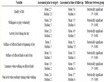
Table 1. Grain yield of thirty-six Vitamaize hybrids evaluated during the spring-summer season 2014 by field trial in Puerto Vallarta, Mexico. Data is given in tons/ha and represents the average of eight replicate plots distributed across a homogenous field experiment (n = 8).
Most lines expressed a higher heterosis when crossed to one male line than to the other two. For example, VM311 crossed to itself (VM311a) resulted in low yield (Table 1). It expressed no heterosis as expected, since this hybrid is equivalent to an inbred line. However, crosses VM311 × VM321 and VM311 × VM451 demonstrated increased productivity. The same effect may be observed for the line MzATFW1211, which crossed best with VM321 and VM311 but poorly with VM451. A similar effect was observed for the line MzATFW641, which crossed best with VM321 but poorly with VM451 and VM311 (Table 1).
The two hybrids with the highest grain yield were VM321 × VM311 and VM451 × VM311 indicating that the line VM311 worked well as male parent rather than as female parent. The line VM451 worked both well as female as male parent, since the crosses VM451 × VM311 and MzATFW112 × VM451 had also good yield (Table 1).
In order to genetically classify the inbred lines, the data matrix of grain yield was used to prepare two heatmap figures without scaling (Figure 5). The default clustering parameters of R (Euclidean distance) produced the first heatmap (Figure 5(a)) that grouped the samples (female lines) in many branches of different lengths.
In contrast, the optimized R script that uses the R value of correlation (both negative and positive correlation) produced a heatmap that grouped the samples differently (Figure 5(b)). In this second heatmap, three mayor branches of female lines appeared, which corresponded to the genotypes that better crossed with either VM311, VM321, or VM451. This outcome revealed the heterotic pattern of general combining ability (GCA) and specific combining ability (SCA) (genetic complementation).

Figure 5. Heatmaps of grain yield across Vitamaize hybrids. The darker the colour, the higher the yield in ton/ha. (a) Heatmap with default clustering (Euclidean distance). (b) Heatmap with clustering according to correlation (positive and negative R values). The female lines are shown in the rows, whereas the 3 male tester lines are shown in the columns. The colour coding of the female lines correspond to the heterotic grouping.
The cluster dendrogram in Figure 5(a) has no biological meaning besides grouping samples by the average yield, whereas cluster groups in Figure 5(b) elegantly revealed an important biological feature, which is the genetic correspondence to a specific heterotic group. Default clustering of R heatmaps (Figure 5(a)) revealed mathematical proximity of the numerical values of grain yield, whereas the optimized heatmap based on correlation (Figure 5(b)) better represented genetic patterns of heterosis in those twelve Vitamaize lines.
This information is further useful as a tool to continue and expand the breeding program by intercrossing lines of the same heterotic group, to improve their per se performance, and to cross them among complementary heterotic groups. It is expected that this procedure will generate a hybrid with high yield and improved nutritional quality (antioxidants) that can be commercially released to farmers.
Maize varieties and inbred lines from temperate regions belong to a strict pattern of two heterotic groups, which facilitates hybrid breeding programs, since a line from group A is always crossed to a line from group B in order to generate a commercial hybrid. Either A × B or B × A are crossed, depending of the choice of the female and male lines. In comparison, tropical maize germplasm such as the Vitamaize hybrids were classified into three groups by the heatmap correlation function (Figure 5(b)). The existence of at least three heterotic groups opens many more breeding possibilities to generate F2 hybrids. Different types of three way F2 hybrids are possible such as A × B/C, A × C/B, B × A/C, B × C/A, C × A/B, or C × B/A. The occurrence of three heterotic groups in tropical germplasm may explain the fact that in Mexico three way hybrids are the predominant form of released commercial varieties, whereas in temperate regions maize lines are classified as flint or dent (one way F1 hybrids are much more common.
Further phenomic experiments will be performed with tropical germplasm to optimize the genotypes for production. The numerical data matrices should to be analyzed with optimized data mining algorithms and visualization tools in order to better explain the complex link between genotype and phenotype in a worldwide crop plant such as maize. Our optimized script for heatmap correlation bicluster is not only is useful for agricultural phenomics, but also to improve the interpretation of other omic sciences, such as metabolomic fingerprints [29] [30] and transcriptomic data sets [2] .
4. Conclusion
The program environment R allows efficiently analyzing a vast amount of data from omic experiments. Heatmap cluster figures are powerful tools to summarize large data matrices. Many users with chemical and biological background are unaware of the advantages/disadvantages of different clustering algorithms available in R. The challenge for experimental scientists is to carefully select and adjust the function parameters in order to produce figures that support meaningful biological conclusions. The default parameters of R heatmaps based on Euclidean distance were chosen for mathematical purposes, but they are not adequate for the representation of biological experiments in the omics fields. We provide a short R script based on correlation (either R or R2 values) that allow plotting optimized heatmap dendrograms. This procedure was suitable to classify samples according to phenotypic or genetic traits. The script can be used to prepare meaningful heatmap figures for molecular breeding programs, but it can also be applied for data matrices obtained from transcriptomic and/or metabolomic experiments [31] of any biological system.
Acknowledgements
We acknowledge funding by CONACYT and SAGARPA. We also thank support from CINVESTAV and the National Laboratory Plan TECC.
Cite this paper
Tiessen, A., Cubedo-Ruiz, E.A. and Winkler, R. (2017) Improved Representation of Biological Information by Using Correlation as Distance Function for Heatmap Cluster Analysis. American Journal of Plant Sciences, 8, 502-516. https://doi.org/10.4236/ajps.2017.83035
References
- 1. Mochida, K. and Shinozaki, K. (2010) Genomics and Bioinformatics Resources for Crop Improvement. Plant and Cell Physiology, 51, 497-523.
https://doi.org/10.1093/pcp/pcq027 - 2. Masclaux-Daubresse, C., Clement, G., Anne, P., Routaboul, J.M., Guiboileau, A., Soulay, F., et al. (2014) Stitching Together the Multiple Dimensions of Autophagy Using Metabolomics and Transcriptomics Reveals Impacts on Metabolism, Development, and Plant Responses to the Environment in Arabidopsis. Plant Cell, 26, 1857-1877.
https://doi.org/10.1105/tpc.114.124677 - 3. Hirai, M.Y., Yano, M., Goodenowe, D.B., Kanaya, S., Kimura, T., Awazuhara, M., et al. (2004) Integration of Transcriptomics and Metabolomics for Understanding of Global Responses to Nutritional Stresses in Arabidopsis thaliana. Proceedings of the National Academy of Sciences of the United States of America, 101, 10205-10210.
https://doi.org/10.1073/pnas.0403218101 - 4. Usadel, B., Schwacke, R., Nagel, A. and Kersten, B. (2012) GabiPD—The GABI Primary Database Integrates Plant Proteomic Data with Gene-Centric Information. Frontiers in Plant Science, 3.
- 5. Tohge, T., de Souza, L.P. and Fernie, A.R. (2014) Genome-Enabled Plant Metabolomics. Journal of Chromatography B—Analytical Technologies in the Biomedical and Life Sciences, 966, 7-20.
https://doi.org/10.1016/j.jchromb.2014.04.003 - 6. Palmer, L.J., Dias, D.A., Boughton, B., Roessner, U., Graham, R.D. and Stangoulis, J.C.R. (2014) Metabolite Profiling of Wheat (Triticum aestivum L.) Phloem Exudate. Plant Methods, 10.
- 7. Lisec, J., Schauer, N., Kopka, J., Willmitzer, L. and Fernie, A.R. (2006) Gas Chromatography Mass Spectrometry-Based Metabolite Profiling in Plants. Nature Protocols, 1, 387-396.
https://doi.org/10.1038/nprot.2006.59 - 8. Furbank, R.T. and Tester, M. (2011) Phenomics—Technologies to Relieve the Phenotyping Bottleneck. Trends in Plant Science, 16, 635-644.
https://doi.org/10.1016/j.tplants.2011.09.005 - 9. Bylesjo, M., Eriksson, D., Kusano, M., Moritz, T. and Trygg, J. (2007) Data Integration in Plant Biology: The O2PLS Method for Combined Modeling of Transcript and Metabolite Data. Plant Journal, 52, 1181-1191.
https://doi.org/10.1111/j.1365-313X.2007.03293.x - 10. Yu, Y.J., Xia, Q.L., Wang, S., Wang, B., Xie, F.W., Zhang, X.B., et al. (2014) Chemometric Strategy for Automatic Chromatographic Peak Detection and Background Drift Correction in Chromatographic Data. Journal of Chromatography A, 1359, 262-270.
https://doi.org/10.1016/j.chroma.2014.07.053 - 11. Geigenberger, P., Tiessen, A. and Meurer, J. (2011) Use of Non-Aqueous Fractionation and Metabolomics to Study Chloroplast Function in Arabidopsis. Methods Molecular Biology, 775, 135-160.
https://doi.org/10.1007/978-1-61779-237-3_8 - 12. Sriyudthsak, K., Iwata, M., Hirai, M.Y. and Shiraishi, F. (2014) PENDISC: A Simple Method for Constructing a Mathematical Model from Time-Series Data of Metabolite Concentrations. Bulletin of Mathematical Biology, 76, 1333-1351.
https://doi.org/10.1007/s11538-014-9960-8 - 13. Alexandersson, E., Jacobson, D., Vivier, M.A., Weckwerth, W. and Andreasson, E. (2014) Field-Omics-Understanding Large-Scale Molecular Data from Field Crops. Frontiers in Plant Science, 5, 286.
- 14. Colmsee, C., Mascher, M., Czauderna, T., Hartmann, A., Schluter, U., Zellerhoff, N., et al. (2012) OPTIMAS-DW: A Comprehensive Transcript-Omics, Metabolomics, Ionomics, Proteomics and Phenomics Data Resource for Maize. BMC Plant Biology, 12, 245.
https://doi.org/10.1186/1471-2229-12-245 - 15. Schauer, N. and Fernie, A.R. (2006) Plant Metabolomics: Towards Biological Function and Mechanism. Trends in Plant Science, 11, 508-516.
https://doi.org/10.1016/j.tplants.2006.08.007 - 16. R Core Team (2013) R: A Language and Environment for Statistical Computing. R Foundation for Statistical Computing, Vienna.
- 17. Riedelsheimer, C., Lisec, J., Czedik-Eysenberg, A., Sulpice, R., Flis, A., Grieder, C., et al. (2012) Genome-Wide Association Mapping of Leaf Metabolic Profiles for Dissecting Complex Traits in Maize. Proceedings of the National Academy of Sciences of the United States of America, 109, 8872-8877.
https://doi.org/10.1073/pnas.1120813109 - 18. Verbanck, M., Le, S. and Pages, J. (2013) A New Unsupervised Gene Clustering Algorithm Based on the Integration of Biological Knowledge into Expression Data. BMC Bioinformatics, 14, 42.
https://doi.org/10.1186/1471-2105-14-42 - 19. Hochholdinger, F. and Hoecker, N. (2007) Towards the Molecular Basis of Heterosis. Trends in Plant Science, 12, 427-432.
https://doi.org/10.1016/j.tplants.2007.08.005 - 20. Chen, Z.J. (2010) Molecular Mechanisms of Polyploidy and Hybrid Vigor. Trends in Plant Science, 15, 57-71.
https://doi.org/10.1016/j.tplants.2009.12.003 - 21. Groszmann, M., Greaves, I.K., Fujimoto, R., Peacock, W.J. and Dennis, E.S. (2013) The Role of Epigenetics in Hybrid Vigour. Trends in Genetics, 29, 684-690.
https://doi.org/10.1016/j.tig.2013.07.004 - 22. Troyer, A.F. (1996) Breeding Widely Adapted, Popular Maize Hybrids. Euphytica, 92, 163-174.
https://doi.org/10.1007/BF00022842 - 23. Tracy, W.F. and Chandler, M.A. (2006) The Historical and Biological of Basis of the Concept of Heterotic Patterns in Corn Belt Dent Maize. In: Lamkey, K.R. and Lee, M., Eds., Plant Breeding: The Arnel R. Hallauer International Symposium, Blackwell Publishing, Ames, 219-233.
https://doi.org/10.1002/9780470752708.ch16 - 24. Soengas, P., Ordas, B., Malvar, R.A., Revilla, P. and Ordas, A. (2006) Combining Abilities and Heterosis for Adaptation in Flint Maize Populations. Crop Science, 46, 2666-2669.
https://doi.org/10.2135/cropsci2006.04.0230 - 25. Stojakovic, M., Ivanovic, M., Bekavac, G. and Stojakovic, Z. (2010) Grain Yield of B73 x Mo17-Type Maize Hybrids from Different Periods of Breeding. Cereal Research Communications, 38, 440-448.
https://doi.org/10.1556/CRC.38.2010.3.14 - 26. Mir, C., Zerjal, T., Combes, V., Dumas, F., Madur, D., Bedoya, C., et al. (2013) Out of America: Tracing the Genetic Footprints of the Global Diffusion of Maize. Theoretical and Applied Genetics, 126, 2671-2682.
https://doi.org/10.1007/s00122-013-2164-z - 27. Prasanna, B.M. (2012) Diversity in Global Maize Germplasm: Characterization and Utilization. Journal of Biosciences, 37, 843-855.
https://doi.org/10.1007/s12038-012-9227-1 - 28. Sneath, P.H.A. (1957) The Application of Computers to Taxonomy. Journal of General Microbiology, 17, 201-226.
https://doi.org/10.1099/00221287-17-1-201 - 29. Gao, W., Sun, H.X., Xiao, H.B., Cui, G.H., Hillwig, M.L., Jackson, A., et al. (2014) Combining Metabolomics and Transcriptomics to Characterize Tanshinone Biosynthesis in Salvia Miltiorrhiza. BMC Genomics, 15, 73-86.
- 30. Garcia-Flores, M., Juarez-Colunga, S., Garcia-Casarrubias, A., Trachsel, S., Winkler, R. and Tiessen, A. (2015) Metabolic Profiling of Plant Extracts Using Direct-Injection Electrospray Ionization Mass Spectrometry Allows for High-Throughput Phenotypic Characterization According to Genetic and Environmental Effects. Journal of Agricultural and Food Chemistry, 63, 1042-1052.
https://doi.org/10.1021/jf504853w - 31. Witt, S., Galicia, L., Lisec, J., Cairns, J., Tiessen, A., Araus J.L., et al. (2012) Metabolic and Phenotypic Responses of Greenhouse-Grown Maize Hybrids to Experimentally Controlled Drought Stress. Molecular Plant, 5, 401-417.
https://doi.org/10.1093/mp/ssr102