Open Journal of Genetics
Vol.3 No.2(2013), Article ID:33620,14 pages DOI:10.4236/ojgen.2013.32016
Honesty, power and bootstrapping in composite interval quantitative trait locus mapping
![]()
Department of Biological Sciences, Northern Arizona University, Flagstaff, USA
Email: Philip.Service@nau.edu
Copyright © 2013 Philip M. Service. This is an open access article distributed under the Creative Commons Attribution License, which permits unrestricted use, distribution, and reproduction in any medium, provided the original work is properly cited.
Received 17 October 2012; revised 1 April 2013; accepted 1 May 2013
Keywords: Composite Interval Mapping; QTL Cartographer; Selective Genotyping; Power; Bootstrap; Permutation Test; False Discovery Rate
ABSTRACT
In a typical composite interval mapping experiment, the probability of obtaining false QTL is likely to be at least an order of magnitude greater than the nominal experiment-wise Type I error rate, as set by permutation test. F2 mapping crosses were simulated with three different genetic maps. Each map contained ten QTL on either three, six or twelve linkage groups. QTL effects were additive only, and heritability was 50%. Each linkage group had 11 evenlyspaced (10 cM) markers. Selective genotyping was used. Simulated data were analyzed by composite interval mapping with the Zmapqtl program of QTL Cartographer. False positives were minimized by using the largest feasible number of markers to control genetic background effects. Bootstrapping was then used to recover mapping power lost to the large number of conditioning markers. Bootstrapping is shown to be a useful tool for QTL discovery, although it can also produce false positives. Quantitative bootstrap support—the proportion of bootstrap replicates in which a significant likelihood maximum occurred in a given marker interval—was positively correlated with the probability that the likelihood maxima revealed a true QTL. X-linked QTL were detected with much lower power than autosomal QTL. It is suggested that QTL mapping experiments should be supported by accompanying simulations that replicate the marker map, crossing design, sample size, and method of analysis used for the actual experiment.
1. INTRODUCTION
Composite interval mapping [1] is frequently used to locate genes that influence quantitative phenotypes. How good is the typical analysis: that is, how powerful is it, and how honest is it? In the case of quantitative trait locus (QTL) mapping, we want an analysis that maximizes our ability to detect QTL. We also want an honest analysis—defined as one that detects only true QTL. Honesty and power are conflicting goals. In this paper, I use simulated crosses with three different genetic maps to assess the honesty and power of a common QTL mapping design (F2 intercross) as analyzed by composite interval mapping. I show that the conflict between honesty and power can emerge in unexpected ways. I argue that many, perhaps almost all, interval mapping analyses have produced false positive results: that is, they are not very honest. I suggest a general strategy to improve honesty, and to recover some of the power lost in doing so.
It is widely appreciated that typical QTL mapping studies have modest power to detect QTL of small to moderate effect [2,3]. Strategies for increasing power are well-known and include increasing the sample size of recombinant genotypes, selective genotyping [4], and using recombinant inbred lines (RIL). The last strategy works by effectively increasing heritability, because phenotypes can be measured on many individuals of each recombinant genotype. Less attention has been paid to the problem of false positives. In a typical analysis, a likelihood map is evaluated with respect to a significance threshold that is set by many random permutations of the genotypic and phenotypic data. Likelihood maxima that exceed the threshold significance level are taken to be QTL. It appears to be generally assumed that the frequency of false positives is equivalent to the nominal Type I error rate. That is, if a permutation test is used to establish a 5% experiment-wise Type I error rate, then there is only a 5% probability that any given experiment will detect one or more false positives.
Commonly, permutations are done by randomizing phenotypes over intact multilocus marker genotypes under the assumption of complete exchangeability [5]. This is sometimes referred to as the “standard” permutation scheme. Alternative schemes have been proposed for special cases. For example, Zou et al. [6] show that naïve application of the standard permutation method to a particular experimental design (RIL) can lead to grossly inflated Type I error rates, that is, high false positive frequencies. However, relatively little attention has been given to the effectiveness of permutation tests for controlling Type I error rates in the case of intercross mapping populations (e.g., F2) when there are multiple linked QTL, and when composite interval mapping is used for analysis. The simulated map used by Churchill and Doerge [5] to illustrate the “standard” permutation scheme included only two unlinked QTL. They stated that “further work is needed on the problems of modeling QTL effects, especially with regard to the multiple QTL detection problem” (my emphasis added). Doerge and Churchill [7] proposed two sequential permutation procedures in which each subsequent step is conditioned on already known (or inferred) QTL. The main purpose of their modified permutation methods is to increase the likelihood that QTL of small effect will be detected: that is, to reduce the Type II error rate and increase power. They simulated a map with four linkage groups and three QTL, two of which were linked. Single-marker t-tests, not composite interval mapping, were used to detect QTL. They appear to have obtained a relatively high number of false positive results with the larger of their two sample sizes (their Table 4), but no specific suggestions were made for addressing that problem. Li et al. [8] is an exception to the general rule of ignoring the problem of false positives when there are multiple linked QTL. In a series of simulated backcrosses in which they used the “standard” permutation method to set significance thresholds in the context of composite interval mapping, they observed a spectacularly high false positive frequency, in some instances more false positives than true QTL (see their Figure 4(B)). But, again, the thrust of their investigation was to find a method to increase power rather than honesty, and little consideration was given to methods to reduce the number of false positives.
The balance between honesty and power is the balance between Type I and Type II errors. Lander and Kruglyak [9] argued that stringent control of experiment-wise Type I error rates in whole-genome scans results in low power to detect linkage associations that are present, thus potentially missing important information. They proposed a classification scheme for reporting linkage between markers and traits in which the strength of evidence for linkage was inversely proportional to the (nominal) experiment-wise Type I error rate. As an alternative to the classification scheme of Lander and Kruglyak, Weller et al. [10] proposed that analysis should focus on controlling the false discovery rate (FDR), rather than on controlling the experiment-wise Type I error rate to some arbitrary level, such as 5%. They defined the FDR as the proportion of significant tests that are false positives. FDR-control methods do not seek to minimize the number of false positives. Rather, their purpose is to increase power while controlling the expected proportion of false positives at some specified level, say 20% of all putative QTL. Weller et al. [10] present QTL mapping simulations in which power is high, as is the likelihood that one or more false positives are obtained, but in which false positives are a relatively small proportion of all putative QTL. Following on Weller et al. [10], there has been considerable debate about the appropriate way to define and control false discovery rates in genetic analyses (e.g., [11]). FDR-control methods have been applied to QTL mapping in swine [12] and dairy cattle [13], but have not been widely used. This may be because of complexity, and lack of suitable software. Also, FDR-control methods do not appear to have been evaluated in the context of composite interval mapping as implemented by QTL Cartographer.
QTL Cartographer [14,15] is a free software package that implements several interval mapping models, and has been commonly used for published studies. The QTL Cartographer package also includes a program that performs “standard” permutations of the data. When using composite interval mapping, the investigator can specify several options for the analysis: the number of markers that are to be used to control for genetic background effects (i.e., QTL outside the interval currently being tested); the method used to select those markers; and the “window size” for excluding markers that are used to control genetic background. In the absence of informed guidelines, the choice of options is haphazard, at best. Frequently, the options chosen are not specified in published works or, when they are, there is often no justification for the values chosen. Simulation results (Figure 7 of [8]) and anecdotal evidence (e.g., [16,17]) indicate that different option settings can produce very different likelihood maps. How are we to choose the “best” settings and produce the “best” map?
I suggest a stepwise approach to interval mapping in which the initial analysis maximizes honesty while sacrificing power. This first-stage analysis emphasizes control of genetic background effects. We can be more confident that QTL detected in this initial analysis are true QTL: for some genetic maps at least, the realized experi-mentwise Type I error rate can approach the nominal error rate that is implied by permutation analysis. Bootstrapping can then be used in a subsequent analysis to detect additional QTL, but at the cost of increasing the likelihood of false positive results. Bootstrapping has been advocated as a method for estimating confidence intervals for QTL location [18-20]; and although the capability is included within QTL Cartographer, bootstrapping seems not to have been widely used in QTL mapping studies. Here, in addition to using bootstrapping to estimate confidence intervals for QTL location, I show that it can also be used, with caution, to “discover” QTL that are not revealed in the first stage of analysis.
2. MATERIALS AND METHODS
2.1. Crosses
Crosses were simulated with programs written in C by the author (available upon request). I used a standard F2 mapping design. Inbred parental lines were fixed for alternative QTL alleles, and additive allelic effects on the phenotype were all in the same direction within parental lines. Three different genetic maps consisting of three, six, or twelve linkage groups (Map-3, Map-6, and Map-12, respectively) were simulated (Table 1). Each chromosome had 11 evenly spaced markers (10 centimorgan [cM] intervals), and each map contained 10 QTL (autosomal and X-linked) with additive effects only (no dominance and no epistasis). QTL were deliberately placed on each map to control their number and spacing on each chromosome. In no case were QTL placed in adjacent marker intervals, and in only one case where two QTL separated by a single interval. Effects of each QTL ranged from approximately 1.3% to 26.3% of the total additive genetic variance. F2 phenotypes were generated by summing the additive effects of QTL, and then adding a random normally-distributed environmental deviation that was scaled to produce 50% heritability (so that individual QTL effects ranged from approximately 0.7% to 13.2% of total phenotypic variance). Simulated populations were dioecious with XX-XY sex determination, with chromosome 1 being the X chromosome. There were no Y-linked QTL.
I choose to use selective genotyping because it increases power to detect QTL [4,21]. Total F1 and F2 population sizes ranged from 1000 to 10,000 individuals; and sample sizes ranged from 250 to 1000, evenly divided between the upper and lower tails of the phenotypic distributions (Table 2). Phenotype and marker genotype data for selectively sampled F2 individuals were formatted for input to QTL Cartographer (qtlcart.cro format). “Non-genotyped” individuals were excluded from the mapping analysis.
One experiment was repeated with crosses simulated by the Rcross module of QTL Cartographer. I did this in order to verify that my results were not influenced by peculiarities of my own simulation program, or due solely to selective genotyping. Data sets simulated by Rcross differed from mine in that the population was monoecious (without sex chromosomes), and they were not selectively genotyped.
2.2. QTL Mapping
All mapping was done with the Unix release of QTL Cartographer version 1.17d. Marker maps were prepared in the format (qtlcart.map) that is used by QTL Cartographer. I used the defined maps, rather than maps estimated from the simulated cross data, such as might be made by Mapmaker/EXP [22,23]. The Zmapqtl module
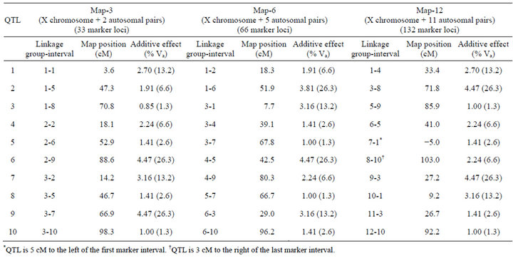
Table 1. Genetic maps. All maps have 11 markers per chromosome with 10 centimorgan (cM) intervals between markers.
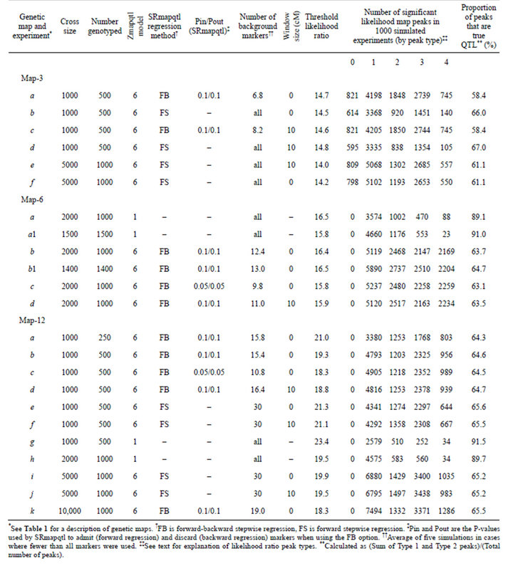
Table 2. Mapping experiments and likelihood ratio peaks by type. Results of 1000 simulated crosses for each map and experiment.
of QTL Cartographer was used to produce likelihood maps. I used the Model 1 and Model 6 options in Zmapqtl. Both models implement composite interval mapping. They differ in that Model 1 uses all markers to control genetic background effects, whereas Model 6 is intended to be used with a subset of conditioning background markers that are selected by the SRmapqtl module. For Model 6, I used both the forward stepwise and forward-backward regression methods for selecting background markers, and used varying P-values for accepting and retaining markers in the regression models. Zmapqtl Model 6 also requires that the user specify the maximum number of background markers and the window size to be used in the analysis. The window is used to exclude nearby markers from the set of markers used to control background effects. For example, suppose the interval currently being tested for QTL is between markers at positions 30 and 40. If the window size is 10 cM, then any markers between positions 20 - 30 and 40 - 50 will be excluded from the set of background markers. The intent is to prevent the effect of a QTL in the interval being tested from being “disguised” by a nearby background marker that may also be in strong linkage disequilibrium with the QTL. The output from Zmapqtl includes several different likelihood ratio test statistics (hypothesis tests). In this paper, I report only results for the overall test for a QTL, referred to as H3/H0 [15].
Threshold levels for assessing the significance of likelihood map peaks were set by “standard” permutation tests that were done with Unix shell scripts based on the Permute.csh script that is provided with the QTL Cartographer package. For each mapping analysis (i.e., each combination of cross size, sample size, genetic map, and SRmapqtl and Zmapqtl options), 500 permutations were done for each of five different simulated crosses. Final threshold levels were obtained by averaging the likelihood ratio values corresponding to the experiment-wise 95th percentile for each set of permutations. Thus, the nominal Type I experiment-wise error rate was 5%.
Each mapping analysis was performed on 1000 simulated crosses. It would have been prohibitively time consuming to repeat the permutation analysis for each of the 1000 data sets. Therefore, I used the mean threshold significance levels that were based on permutations of five data sets, as described. In practice, there was little variation in threshold significance levels obtained from the five replicate crosses that were permuted. The Eqtl module of QTL Cartographer was used to extract significant likelihood map peaks from each of the 1000 replicates for each mapping analysis.
2.3. Assessment of Map Honesty
Likelihood map peaks that exceeded the significance threshold for each analysis were assigned to five categories. Type 1 peaks correspond to QTL assigned to the proper marker interval. Type 2 peaks correspond to QTL assigned to an interval next to the correct interval. In order for a peak to be classified as Type 2, there could not also have been a Type 1 peak in an adjacent interval. Type 1 and 2 peaks are taken to represent “true” or honest QTL. They define the power of the mapping analysis.
A common problem in interval mapping is the presence of shadow or “shoulder” likelihood peaks. These are maxima that occur in intervals that do not contain a QTL, but are on either side of an interval that does contain a QTL and that also has a significant likelihood peak. It might be expected that the likelihood ratio associated with a shadow peak will be lower than the ratio for the neighboring “true” peak. That expectation will be evaluated. Shadow peaks are classed as Type 3. Both Type 2 and Type 3 peaks occur in intervals next to intervals with QTL. They differ in that Type 3 peaks are always adjacent to Type 1 peaks, whereas Type 2 peaks are never adjacent to Type 1 peaks. Significant likelihood peaks that were not adjacent to an interval with a QTL were classed as Type 4. Type 4 peaks are considered here to be unambiguously false QTL. Type 3 peaks are also misleading in that they suggest the presence of two different QTL in neighboring intervals. Because I constrained the genetic maps to not have QTL in adjacent intervals, Type 3 peaks may also be considered false QTL in the context of these simulations. Likelihood peaks that could not be assigned to Types 1-4, were Type 0. In practice, Type 0 peaks occurred only in the analysis of Map-3 which had a pair of QTL that were separated by a single interval: Peaks that occurred in the intervening interval were ambiguous.
2.4. Bootstrapping
For each of the three maps that were simulated, 15 crosses (out of 1000 analyzed for a particular cross and sample size and set of Zmapqtl parameters) were non-randomly selected for bootstrap analysis. In each case, I chose five simulated crosses that resulted in likelihood maps with a relatively high incidence of faults (Type 4 and Type 3 peaks); five crosses that had low power to detect QTL but were not otherwise problematic; and five crosses that correctly identified a relatively high number of QTL and were generally free of faults. For convenience, I refer to these as “fault-prone”, “low power”, and “high power” data sets, respectively. One thousand bootstrap samples of each data set were interval mapped in exactly the same manner as the “actual” data (i.e., with the same likelihood ratio significance threshold, same option choices for Zmapqtl, etc.). Bootstrap analysis was automated with shell scripts based on the Bootstrap.csh script that is distributed with QTL Cartographer.
The results of each bootstrap analysis were summarized graphically in a manner that is superficially similar to a likelihood map. In this case, however, the horizontal axis denotes marker intervals rather than map positions, and the vertical axis represents the frequency of significant likelihood peaks that occurred in each marker interval, summed over 1000 replicate bootstraps (Figure 1). These “bootstrap maps” are multimodal and each mode (above a threshold frequency) was evaluated for correspondence to a QTL. Modes were classified in the same way as likelihood map maxima; except that there was no
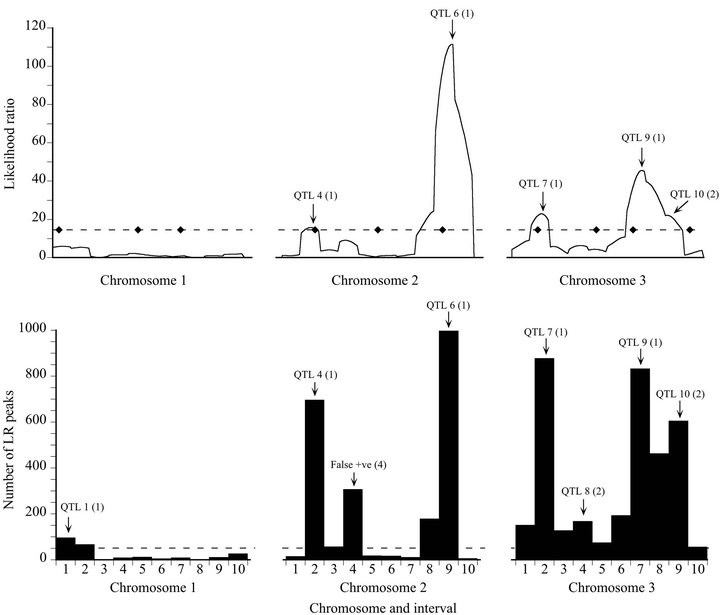
Figure 1. Likelihood (top) and bootstrap (bottom) maps for a representative high power replicate of the Map-3b experiment (replicate #208). Likelihood map maxima (top) and bootstrap distribution modes (bottom) are labeled to indicate associated QTL or artifacts: The number in parentheses is the peak type (see Materials and Methods). The broken line on the likelihood map indicates the experiment-wise threshold value established by permutation test. The diamonds on that line indicate the true positions of the QTL. The broken line on the bootstrap map is the arbitrary threshold of 50 replicates below which bootstrap map modes are disregarded.
such thing as a Type 3 (shadow) mode because, except in the case of equal frequencies, it is not possible for two consecutive intervals of a frequency distribution to both be modal. The mean and standard deviation of map position was computed for each modal interval, using all significant likelihood peaks that occurred within that interval over the 1000 bootstrap analyses.
3. RESULTS
3.1. Honesty (False Positives)
In most cases, and especially when using SRmapqtl to select background markers, the false positive rate far exceeded the nominal 5% experiment-wise error rate (50 replicates with one or more falsely significant likelihood ratio peaks per 1000 simulated experiments) (Table 2). That was true even when the false positive rate was measured only by Type 4 peaks. Larger sample sizes increased the number of false positives (e.g., compare Map-3 experiment d vs e; and Map-12 experiment a vs b). The false positive rate also differed among the three simulated maps, although comparisons are problematic. For a given sample size, and when using all markers to control genetic background, Map-12 gave the fewest false positives and Map-3 the most. That seems reasonable given that all Map-12 QTL were on separate linkage groups, whereas Map-3 had 3-4 QTL per linkage group (Table 1).
The number of false positive likelihood peaks was strongly dependent on, and inversely proportional to, the number of markers used to control genetic background effects (Table 2). When all markers were used to control background, the false positive rate, as measured by Type 4 peaks, approached or bettered the nominal 5% experiment-wise error rate, especially for Map-6 and Map-12 (e.g., Map-6 experiment a, and Map-12 experiments g and h). When SRmapqtl was used to select background markers, the false positive rate by Type 4 peaks often approached, and sometimes exceeded, one per simulated experiment. The false positive rate was especially high for Map-6 (>2 Type 4 peaks per simulated cross) when the number of markers used to control genetic background was ≤13 (Map-6 experiments b, b1, c, and d). Type 4 peaks were non-randomly distributed: most frequently they were two intervals removed from QTL of large effect. For example, for Map-3 experiment b, all 140 Type 4 peaks occurred in intervals 1-10 (interval 10 on chromosome 1) and 2-4, each of which is two intervals from QTL in 1-8, and 2-2 and 2-6. Similar results were obtained for other experiments with Map-3, and with Map-6 and Map-12. One exception occurred for Map-6 experiment a: 57 of 88 Type 4 peaks occurred at the right end of chromosome 1 (X chromosome), which was four intervals from the nearest QTL (Table 1). Evidence suggests that this anomaly is due to X-linkage. A similar bias was not observed for Map-6 experiment a1, in which chromosome 1 was an autosome.
The number of Type 3 (shadow) peaks always exceeded the number of Type 4 peaks (Table 2). As was the case for Type 4 peaks, the number of Type 3 peaks increased with sample size, was greatest for Map-3 and least for Map-12, and was inversely proportional to the number of background markers. However, even when all markers were used to control genetic background, the number of Type 3 peaks was about an order of magnitude greater than 50 per 1000 simulated crosses (e.g., Map-3 experiment b, Map-6 experiment a, and Map-12 experiment h). Type 3 peaks were most likely to be associated with QTL of large effect. For example, for Map-3 experiment b, 84.7% of the Type 3 peaks were associated with QTL 6 or 9, each of which accounted for 26.3% of the additive genetic variance (Table 1). Similar results were obtained for other maps and experiments.
For most QTL that had companion shadows, the shadow peak was usually lower than the true peak (i.e., the peak in the correct interval). This suggests that it is possible to make an educated guess about which of a pair, or triplet, of adjacent peaks identifies the correct marker interval. However, every mapping experiment will be different, and even within experiments there may be differences among the QTL. For example, for Map-3 experiment b, seven QTL had 10 or more shadow peaks over the 1000 simulated crosses. For six of those seven, the true peak was higher than the shadow peak more than 50% of the time (from 99.7% of the time for QTL 6 to 59.1% for QTL 5). However, for QTL 10, in only 1/61 cases (=1.6%) was the true peak higher than its shadow. QTL 10 is in the right—most interval (interval 10) of chromosome 3. It is a QTL of small effect and is located three intervals away from a locus of large effect, QTL 9 (Table 1). That raises the possibility that many of the peaks obtained in interval 9 were actually Type 4 peaks attributable to QTL 9, rather than shadows of QTL 10 (and rather than Type 2 peaks associated with QTL 10, which would also occur in interval 9). Incorrect characterization of the peaks in interval 9 is further supported by the anomalously high power of the analysis to detect QTL 10 in Map-3 (Table 3), given its small effect (Table 1). For Map-6 and Map-12, it was also generally true that shadow peaks were lower than their associated true (Type 1) peaks (data not shown).
Within the scope of these experiments, the window size used for Model 6 of Zmapqtl, and the regression method and Pin/Pout values used by SRmapqtl had little effect on the false positive rate (e.g., Map-3 experiment a vs c, Map-6 experiment b vs c, and Map-12 experiment b vs c vs d).
3.2. Power
The power to detect QTL, as measured by Type 1 and Type 2 peaks, was inversely proportional to the number of markers used to control genetic background effects (Table 2). When all markers were used to control background, the power to detect autosomal QTL that accounted for less than 3% of the phenotypic variance was generally low (Map-3 experiment b, Map-6 experiments a and a1, Map-12 experiments g and h) (Table 3). When SRmapqtl was used to select a subset of conditioning markers, power to detect QTL of small effect was considerably higher (e.g., Map-6 experiment b vs a, and Map-12 experiment c vs g) (Table 3). As expected, power increased with experiment size (e.g., Map-3 experiment e vs d, Map-12 experiment h vs g) (Table 2). When a restricted set of markers was used to control background and at least 1000 individuals were genotyped, power was very good: autosomal QTL that accounted for 3% or more of the phenotypic variance were detected 100% of the time in some experiments (Map-6 experiments b, b1, and c; Map-12 experiments i and k) (Table 3).
The anomalously high power to detect QTL 10 on Map-3, which accounted for only 0.7% of the phenotypic variance (Tables 1 and 3), was perhaps due to mischaracterization of peaks in interval 3-9 as Type 2 rather than as Type 4, as previously discussed. Type 2 peaks were taken to indicate QTL 10, whereas Type 4 peaks would have been false positives from the strong QTL 9 which was located in interval 3-7. In fact, for Map-3 experiment b, Type 2 peak support for QTL 10 outweighed Type 1 support by 559 to 62 in 1000 simulated crosses, as would be expected if Type 2 peaks were really mischaracterized Type 4 peaks.
X-linked QTL were detected with much lower power than autosomal QTL (Table 3). That is presumably a result of the absence of X chromosome crossing over in F1 males and hemizygosity of F2 males.
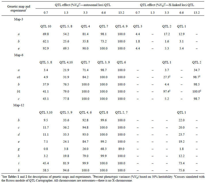
Table 3. QTL effects and power to detect QTL. For example, for Map-3, experiment a, QTL 5 and 8 each accounted for 1.3% of Vp and were detected in 54.2% of simulated crosses.
3.3. Rcross Simulations
Crosses simulated with the Rcross module of QTL Cartographer yielded essentially the same results as crosses simulated with my own programs, except for analysis of chromosome 1 (Tables 2 and 3: compare Map-6, experiments a1 vs a, and b1 vs b). Rcross treated chromosome 1 as an autosome, and so had greater power to detect QTL on chromosome 1 (Table 3, Map-6 experiments a1 vs a, and b1 vs b).
3.4. Bootstrap Analyses
Map-3 experiment b, Map-6 experiment a, and Map-12 experiment h were chosen for bootstrap analysis because they yielded some of the best interval mapping results for each map, as measured by a relatively low incidence of false positives (Table 2). I illustrate the bootstrap analysis using representative results for one high power, one low power, and one fault-prone simulated cross for Map- 3, together with their corresponding likelihood maps (Figures 1-3). For Map-3, bootstrap map modes that had a frequency greater than or equal to an arbitrarily chosen threshold of 50 were evaluated for corresponddence to QTL.
For the high power data set, the bootstrap map revealed two more QTL than the likelihood map (QTL 1 and QTL 8), at the expense of generating one false positive result (Figure 1). Although QTL 4 barely exceeded the significance threshold on the likelihood map, it had strong bootstrap support: it exceeded the threshold like-
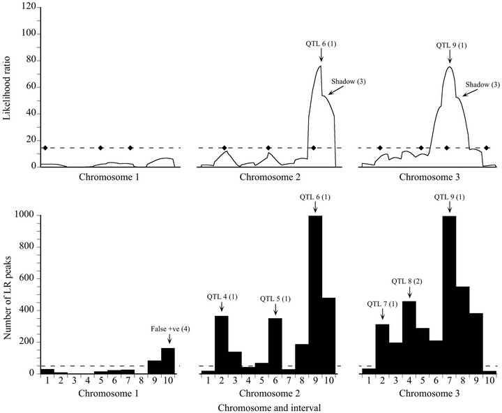
Figure 2. Likelihood (top) and bootstrap (bottom) maps for a representative low power replicate of the Map-3b experiment (replicate #486). See Figure 1 caption for explanation.
lihood ratio in the same interval in 697 out of 1000 bootstrap samples (69.7% support). Although there was a maximum on the likelihood map that corresponded to QTL 8, it was only about half the threshold value, and would not have been given serious consideration as a true QTL. However, it was supported by 16.8% of the bootstrap samples, albeit placed in an adjacent interval (Type 2 mode). QTL 10 was more clearly revealed by the bootstrap map than by the likelihood map, although in both cases assigned to the wrong interval.
For the low power data set, bootstrapping revealed four additional QTL, three of which were placed in the correct interval (Type 1 modes) and one in an adjacent interval (Type 2 mode) (Figure 2). All four appeared as sub-threshold peaks on the likelihood map. The minimum bootstrap support for these additional QTL was 31.2%. Bootstrapping also generated one false positive (16.2% support). The likelihood map also had two shadow maxima (Type 3 peaks). These appear simply as lower frequency neighbors to Type 1 modal intervals on the bootstrap map.
The likelihood map for the fault-prone data set had 11 significant maxima: five QTL (two Type 2), four shadows (Type 3), one false positive (Type 4), and one indeterminate peak (Type 0) that was in the interval between QTL 8 and 9 (Figure 3). The bootstrap map yielded eight QTL (minimum bootstrap support 12.0%), and one false positive (62.4% support). Four of the QTL were assigned to intervals next to the correct ones. In this instance, bootstrapping “lost” one of the QTL on the likelihood map (QTL 10), while revealing four QTL not on the likelihood map (QTL 1, 2, 4, and 5), for a net gain of three. The bootstrap procedure eliminates shadow peaks in general, and in this case all three QTL that had shadows on the likelihood map (two shadows for QTL 6) were placed in the correct interval by bootstrap map mode.
After brief inspection, I set the bootstrap support threshold at 200 (20%) for analysis of Map-6 experiment b and Map-12 experiment h. Considering all 45 bootstrapped data sets, bootstrapping revealed an additional 2.6 QTL (Type 1 and Type 2), on average (Table 4). That represents an increase in power from 47.1% to 73.1%. In general, bootstrap map modes placed QTL in the same interval as did the likelihood map. Of the 170
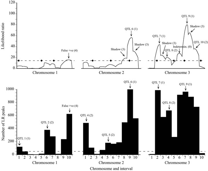
Figure 3. Likelihood (top) and bootstrap (bottom) maps for a representative fault-prone replicate of the Map-3b experiment (replicate #345). See Figure 1 caption for explanation.
correctly placed QTL on the 45 likelihood maps, only five were moved to an adjacent interval on the bootstrap maps. In each of those five cases, there was also a shadow peak on the likelihood map: so these are actually instances in which a shadow peak (Type 3) “captured” a Type 1 peak and converted it to a Type 2 bootstrap mode. On the other hand, one Type 2 QTL (of 42) on the likelihood maps was moved to the correct interval by bootstrapping.
Because it is impossible for two bootstrap map modes to occur in adjacent intervals, bootstrapping resolves Type 3 peaks (shadows) on the likelihood maps into either Type 1 or Type 2 modes. Of the 32 Type 3 likelihood ratio peaks in these 45 data sets, 27 were subsumed by their neighboring Type 1 peaks when bootstrapped, and thus were correctly resolved as Type 1 modes. The five incorrectly resolved Type 3 peaks were those just mentioned in the preceding paragraph. Type 3 peaks were more likely to be incorrectly resolved on the bootstrap map if their likelihood ratios were greater than the ratios of their partner Type 1 peaks: all three such pairs were incorrectly resolved. On the other hand, of the 29 pairs in which the Type 1 likelihood ratio was greater than that of its shadow, only two were incorrectly resolved. Thus, bootstrapping did a good job of “choosing” between true QTL peaks and shadows on the likelihood maps.
The number of false positives increased as a result of bootstrapping: on average, there was slightly more than one additional Type 4 peak per data set. Increasing the thresholds for bootstrap support would have decreased the false discovery rate (sensu [10]), as expected (Table 5), and also reduced power. For Map-12 experiment h, about half the bootstrap modes with frequencies between 200 - 399 were false positives (Table 5). That suggests that a more appropriate threshold value for that experiment might have been 300, rather than 200. On the other hand, a threshold of only 10 (1% support) would have worked quite well for Map-3 experiment b: perhaps because with that map—10 QTL distributed over 30 intervals—there were only three intervals that could possibly have produced Type 4 bootstrap modes. At the other extreme, for Map-12, with 10 QTL and 120 intervals, many intervals were candidates for Type 4 modes. It is worth noting that a few false positive Type 4 modes had
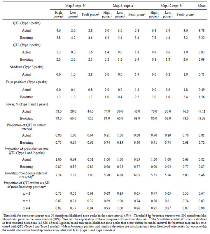
Table 4. Comparison of analyses of actual and bootstrapped samples for three categories of simulated crosses. Each table entry (except the rightmost column) is the mean of five simulated crosses. The bootstrap analysis of each simulated cross is based on 1000 bootstrap samples.
very high bootstrap support, e.g., >60% (Table 5). Also, bootstrapping did not “correct” Type 4 peaks on the likelihood map: For only one of these 45 data sets was the number of Type 4 bootstrap modes less than the number of Type 4 likelihood ratio peaks.
The nominal “confidence interval” widths for QTL position ranged from 5.55 to 7.80 cM (Table 4). Because they are based only on likelihood ratio peaks that occurred within modal bootstrap intervals, they underestimate the true 95% confidence intervals for some QTL.
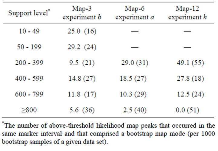
Table 5. Level of support for bootstrap map modes and false discovery rate. Percent of bootstrap modes that were false positives (Type 4) as a function of support level. Number in parentheses is the total number of bootstrap modes with the indicated level of support, summed over 15 bootstrapped data sets for each map (see text).
However, this procedure avoids the difficulty of decideing exactly which and how many likelihood ratio peaks in the bootstrapped data are to be included in the calculation of the confidence interval for a given QTL. And when the modal bootstrap interval included the true QTL position (Type 1 mode), this “confidence interval” worked reasonably well for Map-3 and Map-6: It included the true QTL position about 90% of the time. It did not work as well for Map-12 (approximately 82% inclusion), perhaps because two of the ten QTL on that map were outside any marker interval. When the “confidence interval” was doubled in size (±4 SD), it included the true QTL position about 88% of the time on average, regardless of whether the modal bootstrap interval included the true QTL position (Table 4).
4. DISCUSSION
Different genetic maps and different experiment sizes will inevitably yield different mapping power and different levels of honesty. There are limits to the extent that we can generalize from the experimental design, experiment sizes, and the three maps simulated here. Nevertheless, under the assumption that honesty is an important consideration in composite interval mapping, the present simulations suggest a useful strategy. First, as many markers as feasible should be used to control genetic background effects. Significant likelihood peaks obtained in such an analysis have a relatively high probability of being true QTL—the realized experiment-wise Type I error rate based on Type 4 peaks may approach, or even be less than, the nominal rate established by permutation tests; and will be much, much lower than the rate obtained when only a limited set of markers are used to control background. This procedure can also greatly reduce the frequency of problematic shadow (Type 3) peaks. Second, the mapping analysis should be repeated on a large number of bootstrapped data sets. The resulting bootstrap maps (frequency distributions) can reveal additional QTL, and will also give bootstrap support levels for “new” QTL as well as those that appear on the likelihood map of the actual data set. Bootstrapping will also give approximate confidence intervals for QTL location. Third, mapping experiments should be supported by an extensive set of simulations. That is, using the same marker map, crossing design, and mapping population size as for the actual experiment, several different QTL maps should be simulated and bootstrapped. Such simulations would provide useful information about the power and honesty of the particular experiment under analysis, and give some guidance for setting bootstrap support thresholds. The mapping strategy proposed here is similar in intent to the classification scheme proposed by Lander and Kruglyak [9] and to the FDR-control methods proposed by Weller et al. [10] and others. All three approaches attempt to give a quantitative, or at least relative, measure of the confidence that significant marker–phenotype associations are “real”. In the present case, higher levels of bootstrap support are correlated with lower false discovery rates (Table 5).
These results show very clearly that the usefulness of permutation tests for setting likelihood ratio significance thresholds depends critically on the number of markers used to control genetic background. On reflection, this is not surprising. The permutation procedure, which randomizes phenotypes over multilocus marker genotypes, is simulating the null hypothesis in which there are no QTL anywhere in the genome. We should expect that the threshold likelihood ratio will be most valid if the interval mapping procedure tries to mimic a situation in which there are no QTL outside of the interval currently being tested. This is most nearly approximated when all markers are used to control background, i.e., Zmapqtl Model 1 (see also [1]). The power that is lost by using a large number of background markers is mostly, if not completely, regained by bootstrapping; with the bonus that we also obtain the level of bootstrap support for each putative QTL, which is positively correlated with the probability that a bootstrap map mode is a true QTL (Table 5).
It is interesting, and disconcerting, that the number of false positives increased with mapping population size, at least for Map-3. I suggest that that result arises from interactions between the marker and QTL maps that cannot be completely controlled by interval mapping (at least as implemented by QTL Cartographer). That suggestion is supported by the fact that false positives (Type 4 peaks) were strongly non-randomly distributed on all three maps (see Results). Increasing experiment size does increase the power to detect QTL, as expected. However it does not provide much, if any, protection against false positives (Table 2), and may actually increase the “power” to detect false positives that arise from interactions between marker and QTL maps.
Li et al. [8] suggest a modification of composite interval mapping based upon the method for selecting and using background markers. They showed that their method, called inclusive composite interval mapping (ICIM), had better power to detect QTL and a lower false positive rate than composite interval mapping as implemented by QTL Cartographer (Zmapqtl Model 6), at least for the maps and crossing design that they simulated. Under ICIM, only a subset of all possible markers is used to control background effects, as is the case with Zmapqtl Model 6. Comparisons between Li et al. [8] and the current study are problematic because different maps and crossing designs were used in the two studies, they did not use selective genotyping, and false positives were defined differently. However, with a map that included 10 QTL distributed over six linkage groups, each 150 cM long with 16 evenly-spaced markers, they obtained more than three false positive likelihood peaks per simulated cross (their Figure 4 and their Table 5). Their map corresponds most closely with Map-6 of this study, and their false positive frequency was similar to that obtained in this study when only a subset of conditioning markers was used (Table 2, Map-6 experiments b, b1, c, and d), and was much greater than was obtained in this study when all markers were used to control background effects (Map-6 experiments a and a1).
I used selective genotyping throughout these simulations, except where the Rcross module of QTL cartographer was used to generate simulated crosses. Selective genotyping produced essentially the same results as complete genotyping of somewhat larger samples (Tables 2 and 3, Map-6 experiments a1 vs a, and b1 vs b). The present results show that selective genotyping is appropriate for use with composite interval mapping. Furthermore, conclusions about the effectiveness of the “standard” permutation procedure for setting experimentwise Type I error rates do not appear to be affected by selective genotyping. The one respect in which the nonselectively-genotyped simulations generated by Rcross did differ from the selectively-genotyped simulations was in regard to power to detect QTL on chromosome 1. As I have already argued, that result is most likely due to the fact that Rcross treated chromosome 1 as an autosome, rather than as an X chromosome.
It is apparent from these simulations that the power to detect QTL is much lower for X-linked than for autosomal loci, at least in an F2 intercross mapping design. This fact does not seem to be widely appreciated, but has important implications for species with chromosomal sex determination, particularly when one of the sex chromosomes accounts for a significant portion of the total genome, as is the case with Drosophila melanogaster. Noor et al. [24] simulated QTL mapping specifically with the D. melanogaster genome. They also found lower power to detect X-linked than autosomal QTL. However, they attributed the “small X-effect” to the fact that the D. melanogaster X chromosome has a lower density of genes per centimorgan than do the two major autosomes. My results suggest that it is a much more general phenomenon.
Based on the results of this study and those of Li et al. [8] it seems likely that false QTL are a common feature of composite interval mapping studies that have used Zmapqtl Model 6 of QTL Cartographer. The false positive frequency may be much, much higher than the nominal experiment-wise Type I error rate that is established by the usual permutation tests. In some cases, it may be argued that a high number of false positives is an acceptable trade-off for higher power to detect true QTL. Alternatively, I suggest a protocol that proceeds from more stringent (better control of Type I error) to less stringent analyses, that includes bootstrapping as a means of QTL discovery, and that provides quantitative bootstrap support for putative QTL. It would be extremely useful if QTL mapping experiments were accompanied by at least a modest set of simulations. Those simulations should reproduce the crossing design, marker map, sample sizes, and mapping analysis that are used in the actual experiment under consideration. Although in principle an open-ended project, it would probably suffice to simulate only two or three different QTL maps on the known marker map; or a single QTL map but with different degrees of additive, dominance and epistatic effects. The simulations would provide much more insight into the probable power and honesty of the analysis of the experimental data than can any generalizations based on this or other studies. For relatively simple situations, the necessary programs and shell scripts for simulations are already included within the QTL Cartographer package. More complicated situations, such as chromosomal sex determination or lack of crossing over in one sex, will require additional software.
5. ACKNOWLEDGEMENTS
This work was supported by contract number 0176 from the Arizona Biomedical Research Commission. Work on this project was started while the author was on sabbatical leave in the Department of Biology, University of Washington, Seattle, WA. I thank especially Ray Huey and Tom Daniel of that department. At Northern Arizona University, I thank Larry MacPhee and Rich Posner for providing access to a number of computers. From North Carolina State University, Chris Basten gave advice on installing and running QTL Cartographer on my computers.
REFERENCES
- Zeng, Z.-B. (1994) Precision mapping of quantitative trait loci. Genetics, 136, 1457-1468.
- Beavis, W.D. (1995) The power and deceit of QTL experiments: Lessons from comparative QTL studies. Proceedings of the Forty-ninth Annual Corn and Sorghum Industry Research Conference ASTA, Washington, 252- 268.
- Curtsinger, J.W. (2002) Sex-specificity, lifespan QTLs, and statistical power. Journal of Gerontology. Series A, Biological Sciences and Medical Sciences, 57, B409- B414. doi:10.1093/gerona/57.12.B409
- Darvasi, A. and Soller, M. (1992) Selective genotyping for determination of linkage between a marker locus and a quantitative trait locus. Theoretical and Applied Genetics, 85, 353-359. doi:10.1007/BF00222881
- Churchill, G.A. and Doerge, R.W. (1994) Empirical threshold values for quantitative trait mapping. Genetics, 138, 963-971.
- Zou, F., Xu, Z. and Vision, T. (2006) Assessing the significance of quantitative trait loci in replicable mapping populations. Genetics, 174, 1063-1068. doi:10.1534/genetics.106.059469
- Doerge, R.W. and Churchill, G.A. (1996) Permutation tests for multiple loci affecting a quantitative character. Genetics, 142, 285-294.
- Li, H., Ye, G. and Wang, J. (2007) A modified algorithm for the improvement of composite interval mapping. Genetics, 175, 361-374. doi:10.1534/genetics.106.066811
- Lander, E. and Kruglyak, L. (1995) Genetic dissection of complex traits: Guidelines for interpreting and reporting linkage results. Nature Genetics, 11, 241-247. doi:10.1038/ng1195-241
- Weller, J.I., Song, J.Z., Heyen, D.W., Lewin, H.A. and Ron, M. (1998) A new approach to the problem of multiple comparisons in the genetic dissection of complex traits. Genetics, 150, 1699-1706.
- Benjamini, Y. and Yekutieli, D. (2005) Quantitative trait loci analysis using the false discovery rate. Genetics, 171, 783-790. doi:10.1534/genetics.104.036699
- Lee, H., Dekkers, J.C.M., Soller, M., Malek, M., Fernando, R.L. and Rothschild, M.F. (2002) Application of the false discovery rate to quantitative trait loci interval mapping with multiple traits. Genetics, 161, 905-914.
- Bennewitz, J., Reinsch, N., Guiard, V., Fritz, S., Thomsen, H., Looft, C., Kühn, C., Schwerin, M., Weimann, C., Erhardt, G., Reinhardt, F., Reents, R., Boichard, D. and Kalm, E. (2004) Multiple quantitative trait loci mapping with cofactors and application of alternative variants of the false discovery rate in an enlarged granddaughter design. Genetics, 168, 1019-1027. doi:10.1534/genetics.104.030296
- Basten, C.J., Weir, B.S. and Zeng, Z.-B. (1994) Zmap— A QTL cartographer. In: Smith, C., Gavora, J.S., Benkel, B., Chesnais, J., Fairfull, W., Gibson, J.P., Kennedy, B. W. and Burnside, E.B., Eds., 5th World Congress on Genetics Applied to Livestock Production: Computing Strategies and Software, Organizing Committee, 5th World Congress on Genetics Applied to Livestock Production, Guelph, 65-66.
- Basten, C.J., Weir, B.S. and Zeng, Z.-B. (2003) QTL cartographer, version 1.17. Department of Statistics, North Carolina State University, Raleigh.
- Leips, J. and Mackay, T.C.F. (2000) Quantitative trait loci for life span in Drosophila melanogaster: Interactions with genetic background and larval density. Genetics, 155, 1773-1788.
- Forbes, S.N., Valenzuela, R.K., Keim, P. and Service, P.M. (2004) Quantitative trait loci affecting life span in replicated populations of Drosophila melanogaster. I. Composite interval mapping. Genetics, 168, 301-311. doi:10.1534/genetics.103.023218
- Visscher, P.M., Thompson, R. and Haley, C.S. (1996) Confidence intervals in QTL mapping by bootstrapping. Genetics, 143, 1013-1020.
- Lebreton, C.M. and Visscher, P.M. (1998) Empirical nonparametric bootstrap strategies in quantitative trait loci mapping: Conditioning on the genetic model. Genetics, 148, 525-535.
- Bennewitz, J., Reinsch, N. and Kalm, E. (2002) Improved confidence intervals in quantitative trait loci mapping by permutation bootstrapping. Genetics, 160, 1673-1686.
- Lynch, M. and Walsh, B. (1998) Genetics and analysis of quantitative traits. Sinauer Associates, Inc., Sunderland.
- Lander, E.S., Green, P., Abrahamson, J., Barlow, A., Daley, M.J., Lincoln, S.E. and Newburg, L. (1987) Mapmaker: an interactive computer package for constructing primary genetic linkage maps of experimental and natural populations. Genomics, 1, 174-181. doi:10.1016/0888-7543(87)90010-3
- Lincoln, S., Daley, M. and Lander, E. (1992) Constructing genetic maps with Mapmaker/Exp 3.0. 3rd Edition, Whitehead Institute, Cambridge.
- Noor, M.A.F., Cunningham, A.L. and Larkin, J.C. (2001) Consequences of recombination rate variation on quantitative trait locus mapping studies: Simulations based on the Drosophila melanogaster genome. Genetics, 159, 581- 588.