Advances in Internet of Things
Vol.3 No.1(2013), Article ID:27425,12 pages DOI:10.4236/ait.2013.31002
Comprehensive Study on the Basis of Eye Blink, Suggesting Length of Text Line, Considering Typographical Variables the Way How to Improve Reading from Computer Screen
1Department of Computer Science and Software Engineering, University of Swat, Saidu Sharif, Pakistan
2Institute of Business and Computer Mgt Sciences, Department of Computer Science, Agriculture University, Peshawar, Pakistan
Email: muzammilkhan86@uswat.edu.pk, khush0186@gmail.com
Received December 15, 2012; revised January 22, 2013; accepted February 3, 2013
Keywords: Readability; Text Line Length; Understandability; Appearance; Eye Blink; Typographical Variable; Reading from Screen
ABSTRACT
The advent and extensive use of computer and increasing development of different technologies it is important to increase the awareness of issues related to the electronic text or text presentation on computer screen. The usage of web shows the importance of usability and readability of the web applications or sources provide by the web and web textual contents. Web application fails to encounter the user’s requirements in effective manner specially related to textual information, because the designers are unaware from some of the important factors effecting readability, reading from the screen. In this regard, this study is the continuation of the previous work that has been done for the improvement of readability, to handle the readability issues on the basis of Eye Blink for male participants and female participants. To achieve general recommendations for suitable or optimum length of text line for all type of users on the bases of eye blink. Basically during reading from the computer screen focus losses at two positions, when eye blink in the middle of text line and when text line ends. The study specifies suitable length of text line on the basis of Eye Blink, assuming three typographical variables i.e. font style, font color, font size, and with white background, which improve the overall readability or reading from computer screen. The study also shows two important things the degree of understandability and the degree of attractive appearance of different combination.
1. Introduction
Regarding reading from computer screen i.e. electronic text and reading from the paper, there exist two schools of thought. One school of thought firmly belief that paper based reading will never be replaced by any electronic text, and as an argument they mention different scenarios like reading news paper in the bus, on the beach, and reading magazine in the bed etc. Garland [1] summed up some of the potential uses of electronic text. The second school of thought really thinks that the electronic text has enormous potential to replace or to compete paper based reading. This thinking based on different perspective like ease of storage and retrieval, flexibility of structure and saving natural resources are key motivation and it is the matter of habit as well. Ted Nelson [2] arose a question, when and how we can present things on the screen, and how can we make it great. This article is not to present the dominancy of one medium over the other or replace electronic text by paper but a try to cover the question how we can make it great, easy and naturally perceivable, efficient for the readers when they are reading from the computer screen.
In present era of technology, plethora of information are available, in this fast and busy life people want and wish to get the desire information as easy as possible. The usage of computer and internet increases day by day, today online reading from computer systems become more common. According to Google data centre June 2006, about 900 million computer users exist in the world [3]. According to Internet World States, internet users in the world distributions in the world 2011 are 2,095,006,005, which are approximately 2100 million or 2 billions [4]. It means a large population use internet to get the desire information easily, cheaply, and accurately.
Though information readily available, and Internet is the source which provides information with comfort and almost with no cost, but these content is not up to the mark. As huge part of the information is consists of textual data, it is difficult and tedious to spend a lot of time in front of computer because user facing a lot of problems during reading from computer screen, can call as readability problems. During reading from the computer screen, usability of the web contents must be consider with significance and should not be ignored. Typography plays a major role in the web contents usability, many studies exist regarding typography, standards has been deduce after different studies for soft copy and hard copy. Web usability is an approach to make web sites easy to use for an end user, non specialized web user, without any specialized training, and without having any pre knowledge. Keep it in mind that huge amount of information are access through World Wide Web and Web browsers. There is an urgent need to increase our knowledge about the usability or readability factors influence reading from computer screen. Few problems create inefficiency and keep users away from online reading for long time. One of the main problem that act as a huddle in reading from computer screen is Eye Strain, focus loss during reading, brain fog, and headache etc. These problems are interrelated, the focus is to reduce the focus loss during reading and hence eye strain become less or to get large time to get tired. During reading from the screen users become tired after some time and get bored. It may involve many reasons but this study and the previous studies specifies suitable Length of Text Line with special relationship to Eye Blink on the basis of font style, font size, font color and background color. The study reduces the problem caused by reading and increase readability that will ultimately lead to efficiency and comfort.
The structure of the paper is as follow. First the document describes the focus area and importance. Second section describes how to deal with the problem and approach that solve the problem. Third section introduces related work. Next section includes methods and procedures, analysis, facts and figure about experiment, lastly conclude the whole work and future work.
2. Reading from Computer Screen
Reading from computer screen initiates many problems like eyestrain, a feeling of being unable to focus on the screen that is focus losses again and again, confusion, attention deficit/brain fog, irritability, headache, neck pain, dizziness (faintness), queasiness (vomiting), or an uncomfortable feeling down through the chest. These problems prevent users from online reading or reading from computer screen [5]. This list of problems is directly associated with eye, and why not, as eye is the main source of perceiving objects, images etc and also plays a vital role in reading from computer screen, paper pages or other readable materials. These problems are instigating as;
• Using computer at a fixed and set distance for a long continuous period of time. Even if a person has more than adequate focusing ability, focusing at a set distance continuously can fatigue the lens that cause many other problems.
• Reading or working at very close distances from the screen. This requires much more focusing and leads to more rapid fatigue or tiredness.
Actually eyestrain not damage eye or cause any vision loss. However, it can be very uncomfortable and lead to a loss of productivity when reading. Anyone who uses a computer can take measures to reduce eye discomfort [6]. Another important limitation is slow reading from computer screen as compare to reading from paper, in this regard A. V. Kak 1981, Muter et al. 1982, Wright et al. 1983, Gould et al. 1984, and Smedshammar et al. 1989 produced experimental findings during silent reading from screen and deduce that reading from the screen is significantly slower as compare to reading from the paper. Figures vary according to means of calculation and experimental design but the evidence suggests a performance discrepancy of 20% and 30% when reading from the screen [7,9]. The people don’t like to read online because it is time consuming as compared to the reading from the paper. Reading from the paper is 25% slower than reading from the paper [10]. Among various issues regarding reading one of the major issues is focus loss during reading. During reading the human losses focus or concentration or accommodation at two positions that is when line breaks and when eye blink. When we are reading, during reading we blink our eye to make our eye relax (a natural process) then we loss the focus or concentration from the fix position (from the word we are reading) all the involve muscles relaxes from the contraction form. Then when we start reading again the muscles goes in contraction form to get focus. In same way when the line breaks and we sweep from the end of the line to the beginning of next line we lost our focus and the eye muscles goes from contraction to rest and then from rest to concentration. If this process happens as many times the eye become tired and then will cause many problems. 10% of the retina center is called the macula. This is responsible for your sharp vision, your reading vision. The peripheral retina is responsible for the peripheral vision [11]. During focus loss many eye muscles are involved, that discussed in detail in [12,13].
The main objective of the study is how to improve the reading capability or productivity during reading or electronic text from computer screen. This can be achieve by making the eye muscles less stress during reading, and make the text naturally perceivable for human eye. The main issue that is addressed in this study is focus, means the mentioned problems can be overcome up to some extent by decreasing the process of focus loss and focus gain during reading, that protect eye from stress and fatigue which lead to many other problems. As focuses loss at two positions i.e. when eye blinks & when line breaks, if the length of text line is so adjust that convert two focus losses to one, means that when human eye blink naturally then the line should be end which will lead to convert maximum focus losses to minimum focus losses. The reduction of focus losses will protect eyestrain and indirectly all other relevant problems, the efficiency and readability will increase. Blinking, function and anatomy of blinking discussed in detail in [12,13].
3. Related Work
Large volume of material accessible from the World Wide Web or through web browser, there is an urgent need to increase our knowledge of factors influencing reading from screen. Web usability is an approach to make web sites easy to use for an end-user, without any specialized training. For this purpose a lot of work has been done till now since 1880. Before the evolution of computer system these experiment been done on printed media, but afterwards the efforts transformed towards online reading or reading from computer screen as well. This section contained literature about length of text line, text layout, blinking and blink rate.
3.1. Line Length
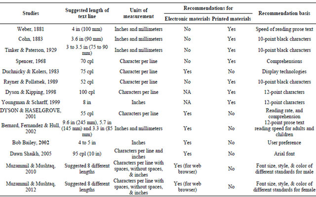
Weber, 1881, suggested that an ideal line length is 4 inches i.e. 100 millimeters. The study investigates the influence of line length on the speed of reading prose text. He stated further that the maximum never should exceed 6 inches or 150 mm. The same year Javel (1881) reported that line lengths should be no longer than 3.6 inches or 90 mm [14]. These recommendations were for book, magazine and newspaper publishers, and assumed the use of 10-point black characters typeset on white paper.
Cohn, 1883, confirmed that 3.6 inches or 90 mm was the best length of text line, and that 4 inches or 102 mm was the longest tolerable line length for printed media and assumed 10-point black characters typeset on white paper [15].
Tinker & Paterson, 1929, found that line lengths between 3 inches and 3.5 inches or from 75 to 90 mm yielded the fastest reading performance Using 10-point black type on white paper. These recommendations were for Printed materials [16].
Spencer, 1968, proposed that the number of characters should not be exceeded from 70 characters per line, these recommendations also for printed materials or for hard copy. These recommendations had been analyzed on the bases of reading rate and comprehensions [17].
Jackson & McClelland, 1979, analyze and measure the reading rate for effective reading performance on the bases of users or readers comprehension. These authors multiplied reading rate by the comprehension score to produce their index. However, they do acknowledge that multiplication may not be the optimal formula, as sacrificing comprehension for very fast reading may exaggerate reading ability [18].
Duchnicky & Kolers, 1983, found an affect reading rate for reading from screen and suggested appropriate Line length for text line, and specified that line length should be about 75 characters per line. The study has been done on the base of studying different display technologies [19].
Masson, 1985, study says that the effect of line length on reading rate may be dependent upon the overall reading speed, means how fast a reader can read, as speeding up reading may result in different patterns of eye movements. Masson has reviewed research on the characteristics of naturally fast readers and found that “super readers” make fewer fixations during reading from the printed materials and also from the computer screen [20].
Rayner & Pollatsek, 1989, deduce that Tinker’s work identified an optimal line length of 52 characters per line. The trade-off between two opposing factors that are: If line lengths are too long, the return sweeps to the beginning of the next line are difficult. If the lines are too short, readers cannot make use of much information in each fixation [21].
Dyson & Kipping, 1998, Kipping et al used different display technologies and suggest in their study that 4-inch line length of text line produced the slowest reading rate and the 7.3 inch line length produced the fastest but the user prefer 4 inch or 102 mm line length. These experiments are done with using 12-point type font size. The study further identifies the reading rate improves if characters per line increased [22].
Youngman & Scharff, 1999, according to Youngman and Scharff 8 inch line length of text line elicited the fastest speed as compare to the line of 4 inches or 6 inches text line lengths. They used 12-point type for font size [23].
DYSON & HASELGROVE, 2001, a medium line length of 55 characters per line appears to support effective reading at normal and fast speeds. The investigation was made on three effecting factors that are; comprehension, reading rate and scrolling patterns [24].
Bernard, Fernandez & Hull, 2002, had participants read 12 point prose text with line lengths of 9.6 inches or 245 mm, 5.7 inches or 145 mm and 3.3 inches or 85 mm. the study found no significant differences on average reading speed for the different line lengths. Their adult subjects preferred the two shorter line lengths [25].
Bob Bailey, 2002, users tend to read faster if the line lengths are longer up to 10 inches. If the line lengths are too short, means around 2.5 inches or less then it may impede rapid reading. Users prefer lines that are moderately long in length that is 4 to 5 inches [26].
Dawn Shaikh, 2005, presented a news article in 35, 55, 75, or 95 characters per line on a computer monitor and examined the longest line length of 95 characters per line or 10 inches resulted in the fastest reading speed [27].
MUZAMMIL & MUSHTAQ, 2010, 2012, suggested different text line lengths for three variables on the bases of eye blink during reading from computer screen in two different studies for male and female. The study concluded if the text for reading is provided in the given length it can reduce eye strain and enhance reading capabilities from the computer screen. The experimental setup was explained i.e. equipment, participants, material for experiment, the collection of data procedures, and then explain three main major factors that’s must be consider during reading. Previous study presents eight different combinations from the combination of three given variables for experiment, i.e. Font color, style and size. Understandability, appearance, and line length on the bases of eye blink were three major factors that were considered. According to Muzammil et al. combination “Verdana, 10, Black” and “Verdana, 10, Green” are best, when consider clarity and appearance. The experiment has been done for male participants only. Both of these studies [12,13] are compared, analyze and deduce overall conclusions in this article.
The following Table 1 summarizes the literature that has been done regarding length of text line. Acronyms for Table 1; Characters per line: cpl, Inches: in, Millimeters: mm.
3.2. Text Layout
J. Nielsen, 2000, uses colors with high contrast between the text and the background. Optimal legibility requires black text on white background and so-called positive text. White text on a black background and called it as negative text. Negative text is considered to be equally good, but has no proof [10]. Richard and Hanna provide systematic approach to prove Nielsen statement [28]. Bradley Wilson, Times are the most popular body font that is 29%, then Palatino 13%, Garamond 8% and the rest fonts 50%. The font sizes that are normally used are, Average 9.99, Median 10, Largest 12 and Smallest 8.5 [29]. City of Seattle Web Presentation and Accessibility Standards Version 2.5 are; the minimum font size for basic page body text will be or appear equal to Verdana 10 points. All page body text will be black. All page body text will be presented in Verdana font [29]. Mushtaq Raza, 2007, Preliminary mean analysis of the fonts revealed that font type Time New Roman is the most readable, conveyed personality Business like and first preference of the participants as compared to Courier New, Arial and Bradley [30].
Table 1. Comparison of different studies.
3.3. Blinking and Blink Rate
The analysis of the eye movement in reading is blinks, when readers close their eyes. Blinking rate increases with increasing reading time, resulting in high data losses, especially for older adults or reading impaired subjects [31]. Spontaneous blink rate was significantly larger in women than in men (19 vs. 11 blinks per minute); older women blinked more frequently than younger women. Eyelid displacement was greater in young than in older subjects [32]. When eyes are focused on an object for an extended period of time, such as when reading, blinking rate decreases up to about 3 - 4 times per minute [33].
4. Methods and Procedures
4.1. Variables
There are many factors that can affect reading from computer screen. For example typographic aspects of text i.e. font size, font style, foreground color (font color), background color, reader reading speed, comprehension, display technology, user preferences etc. Consider individual factor for implementation from these factors may, may not be that beneficial for improving reading from computer screen. Therefore it will be more effective to consider maximum factors; likewise this study presumes at different steps.
4.2. Study Variables
As this study focus on length of text line on the bases of eye blink so analysis the factors those directly affects e.g. typographic related factors i.e. font size, font style, font color, and background color. The focus here on two type of standards that is standards for printed materials and web standards [34].
The study involves:
• Typographical Variable.
• Fonts size.
• 10 points.
• 12 points.
12 point and 10 point character size has been consider for experiments because being taken in different studies and 10 points size for Verdana font is Web Presentation and Accessibility Standard for web page body text [34, 35].
• Font face.
• Verdana.
• Time New Roman.
Verdana is Web Presentation and Accessibility Standards Version 2.5 [34], and Time New Roman showed promising results regarding readability, conveyed personality, business likeness and general preferences in [30].
• Color combination (foreground and background).
• Black and white.
• Green and white.
Black text is easily visible or readable on white background because this combination has high contrast and is called positive text [10], green text on white background is consider because human eye has natural tendency for green color and the rays are converges on retina without eye lens adjustment that may not cause eye fatigue [36].
• User.
• User between 20 to 40 years old.
The accessible population for the study is considered within the mention range.
• Medical Factors that affect reading from the screen.
This study is based on eye blink which is affected by different reasons, e.g. Environmental factors can indirectly affect eye blink such as humidity, temperature and pollutants etc., and cognitive factors such as speaking, memorizing, mental arithmetic, focused reading, concentration etc [33,37].
4.3. Equipment
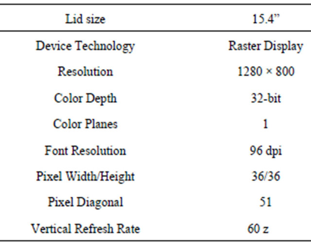
A Intel(R) Core(TM)2 Duo CPU T5750 @ 2.00 GHz, 1995 MHz Laptop, model “Dell Studio 1535” has been use for the experiments and data collection, with the following properties.
4.4. Participants
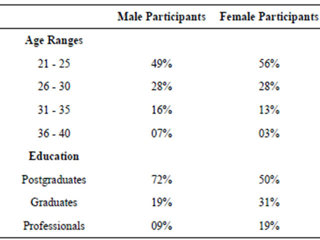
Seventy Five (75) volunteers were considered for experiments, out of 75 participants, 43% or 57% were male and 32% or 43% were female participants. All the participants were having correct vision, means with no disabilities. Participant’s categorization on the bases of age and education are summarized in the following Table 2.
4.5. Data Collection Environment
The data has been collected in the month of August. The temperature were around 30 degree centigrade (30˚), weather were dry. All the data are taken in under normal room light and the users are sat 24 to 28 inches away
Table 2. Participants categorization on the bases of age and education.
from the screen, means that follow the safety precautions that should follow during using computer. The text provide for experiment in “Internet Explorer” web browser.
4.6. Experimental Material
Web page is designed with 8 different paragraphs with different typographical properties or each paragraph is a combination of different typographic parameters. The contents of the each paragraph is provided according to the comprehension (level of education) of each user, the length is so adjust that the users did not get bore during reading. The composition of each paragraph is given in the following passage.
Short hands: Font Style, Font Size, Font Color.
Paragraph 1: Time New Roman, 10, Black.
Paragraph 1 has 5 lines on average, and contains 41 words on average.
Paragraph 2: Time New Roman, 12, Black.
Paragraph 2 has 6 lines on average, and contains 36 words on average.
Paragraph 3: Verdana, 10, Black.
Paragraph 3 has 6 lines on average, and contains 33 words per line on average.
Paragraph 4: Verdana, 12, Black.
Paragraph 4 has 6 lines on average, and contains 27 words per line on average.
Paragraph 5: Time New Roman, 10, Green.
Paragraph 5 has 5 lines on average, and contains 40 words per line on average.
Paragraph 6: Time New Roman, 12, Green Paragraph 6 has 6 lines on average, and contains 37 words per line on average.
Paragraph 7: Verdana, 10, Green.
Paragraph 7 has 6 lines on average, and contains 32 words per line on average.
Paragraph 8: Verdana, 12, Green.
Paragraph 8 has 6 lines on average, and contains 28 words per line on average.
In simple words each paragraph is around 5 to 6 lines and the length of each line is around 10.5 inches. The designed web page is presented to each user or participant. Each paragraph is the combination of different parameters, means that each paragraph has one parameter different than all other paragraphs. This textual material is provided in Internet Explorer Web browser.
4.7. Data Collection Procedure
Data collection is one of the tricky and important part of this study, because the identification of correct blink location is utmost significant in order to find out the correct length of text line for different combinations as mention in the previous section. So the process is advanced in the following stepwise manner.
• The reader is educated how to read the paragraphs and positioned in such a way that to collect data correctly.
• During reading video has been taken from the reader when he/she is reading from the computer screen, but they kept unaware from it in order to get natural blink of eye during reading and to analyze the video keenly.
• After the video has been taken, the process is explained to the reader, the purpose of the study being explained and why the paragraph being read by them with such constrains.
• Questioner has been conducted in order to collect information about the different combinations, information means usability, understandability and readability of different combinations.
• Questioner: A questioner contains of 16 questions, 8 about “to find out the degree of understandability or clarity of words in the paragraph based on fonts’ style and size”. And
• 8 about “to find out the degree of pleasant appearance or good-looks of the paragraph based on fonts’ style and size”.
• A thorough discussion has been done with the reader about each question, their feeling and view about each paragraph. Then conclusion was deduced.
• Each video analyzed carefully in order to find out the suitable length of Text Line on the bases of Eye blink for each combination, through which the maximum focus losses is replaced by fewer one.
• The values are put in EXCEL tool and the Results are deduced in the form of Charts and Tables to get better understanding.
5. Results and Analysis
The central purpose of this study is to suggest suitable length of text line on the basis of eye blink, but beside that the two most important factors are understandability of the textual material and how attractive these combinations are. This section explains these three things considering typographical variables.
5.1. Clarity and Understandability
The user is asked to rate the paragraph, on the basis of “the degree of understandability/clarity of words in the paragraph based on fonts’ style and size”. It is a subjective judgment which very difficult to formulize and empirically analyze, but thorough and hard work is done for the deduction of results.
Average perception that were deduce from the reader during discussion on each paragraph.
Paragraph 1 with combination “Time New Roman, 10, Black” is too small, looking to much condense, difficult to read and required to come closer to the computer screen.
Paragraph 2 with combination “Time New Roman, 12, Black” is a bit easier to read than the first combination but the words are looking attached to each other. The words are looking shaky, means unstable.
Paragraph 3 with combination “Verdana, 10, Black” is Clearer, Understandable and very much easier to read as compare to the previous two paragraphs.
Paragraph 4 with combination “Verdana, 12, Black” is also clear and easy to read but it is observe that the user lost correct line when the finish one and starting next line it may be because the lines are looking very close. During discussion it is observed that the readers get bored during reading such large font size of textual materials.
Paragraph 5 with combination “Time New Roman, 10, Green” is too much difficult to read because there is not high contrast between background and Text color, the words are too small and looking very condensed plus the green color font is looking very sharp with white background.
Paragraph 6 with “Time New Roman, 12, Green” combination is difficult to read because small, low contrast and looking unstable.
Paragraph 7 with “Verdana, 10, Green” combination is ok and is clear than the paragraph 5 and 6, observing that the readers have positive approach towards this combination.
Paragraph 8 with “Verdana, 12, Green” combination is ok but looking a bit larger, unattractive and same problem as in paragraph 4.
Table 3 Description: Column with column head “paragraph” represents the paragraph provided with different typographical combination.
Columns 2 & 3 represent the subjective judgment averages obtained in [7,8]. Where the Questionnaire is evaluated, then the user’s data is converted from qualitative data into quantitative data for better understanding and comparison. For the conversion of qualitative measures into quantitative measure, Categories are assigned to some numeric values, that as Excellent = 0.6, V-Good = 0.5 … V-Bad = 0.1 and then each numeric value is multiplied by the number of user’s chosen option respectively. That is;
0.6 × X1 + 0.5 × X2 + 0.4 × X3 + 0.3 × X4 + 0.2 × X5 + 0.1 × X6 = Average.
Where Xx is the number of user select the respective category/choice.
Average for male and average for female column are generated because the study involves different number of males and female participants in respective studies and needs to have same effects on the average of different combination text line for improve reading. The averages for columns 4-6 are calculated by standard mathematical formula.
The Table 3 and Figure 1 show the understandability and clarity for each combination, specified in each paragraph for both genders. The overall average in the Table 3 shows the clarity of each combination and in chart the BAR height shows the clarity of each paragraph. Each
Table 3. Understandable measures.
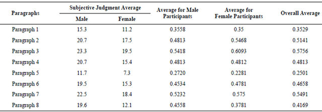
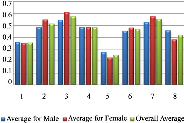
Figure 1. Graphical display of entries for understandability.
combination can be ranked in the order as paragraphs 3, 7, 2, 4, 6, 8, 1 & 5. The combination in paragraph 3 “Verdana, 10, Black” and paragraph 7 i.e. “Verdana, 10, Green” showed the most promising results in terms of understandability and clarity which is one of the essences of reading.
5.2. Look and Feel “Appearance”
Another very important measurement of reading from the screen is appearance or good look of the textual information that is to be presented. The analyses contain fifty percent of questions regarding appearance of each combination. The users were asked to rate the different combination on the basis of “the degree of pleasant appearance or good-looks of the paragraph based on fonts’ style and size”.
Average perception that were deduce from the reader during discussion on each paragraph.
Paragraph 1 with combination “Time New Roman, 10, Black” is looking very nice but not comfortable; the text is not easy to read.
Paragraph 2 with combination “Time New Roman, 12, Black” is looking very much nice and nice to read. Observed that the user like the chemistry of the font. Most of the users like the font style.
Paragraph 3 with combination “Verdana, 10, Black” is very much simple and very stable and much comfortable, enjoying reading.
Paragraph 4 with combination “Verdana, 12, Black” is looking boring, irritating, very simple and extra large.
Paragraph 5 with combination “Time New Roman, 10, Green” is appearing nice but too much uncomfortable, looking shaky and flashy because the white background has less contrast with green foreground, therefore reading this combination is more irritating.
Paragraph 6 with “Time New Roman, 12, Green” combination is very nice in appearance comparing to other combinations.
Paragraph 7 with “Verdana, 10, Green” combination is ok and fair enough.
Paragraph 8 with “Verdana, 12, Green” combination is ok but looking a bit larger, unattractive and boring.
Table 4 Description: Table 4 shows facts and figures for attractiveness and good look of each combination. Column with column head “paragraph” represents the paragraph provided with different typographical combination. Columns 2 & 3 represent the subjective judgment averages obtained in [7,8]. Where the Questionnaire is evaluated, then the user’s data is converted from qualitative data into quantitative data. For the conversion of qualitative measures into quantitative measure, Categories are assigned to some numeric values, that as Excellent = 0.6, V-Good = 0.5 … V-Bad = 0.1 and then each numeric value is multiplied by the number of user’s chosen option respectively. That is;
0.6 × X1 + 0.5 × X2 + 0.4 × X3 + 0.3 × X4 + 0.2 × X5 + 0.1 × X6 = Average.
Where Xx is the number of user select the respective category/choice.
Average for male and average for female column are generated because the study involves different number of males and female participants in respective studies and needs to have same effects on the average of different combination text line for improve reading. The averages for columns 4, 5 & 6 are calculated by standard mathematical formula.
The Table 4 and Figure 2 show the measures about the appearance or look and feel for each combination, specified in each paragraph for both genders. The overall average values in the Table 4 and in chart the BAR height shows the attractiveness level of each combination. Each combination can be ranked in the order as paragraphs 2, 6, 7, 3, 4, 8, 1 & 5. The combination in paragraph 2 “Time New Roman, 12, Black” and paragraph 6 i.e. “Time New Roman, 12, Green” showed the most promising results for appearance.
Table 4. Measures for appearance.
5.3. Length of Text Line on the Bases of Eye Blink
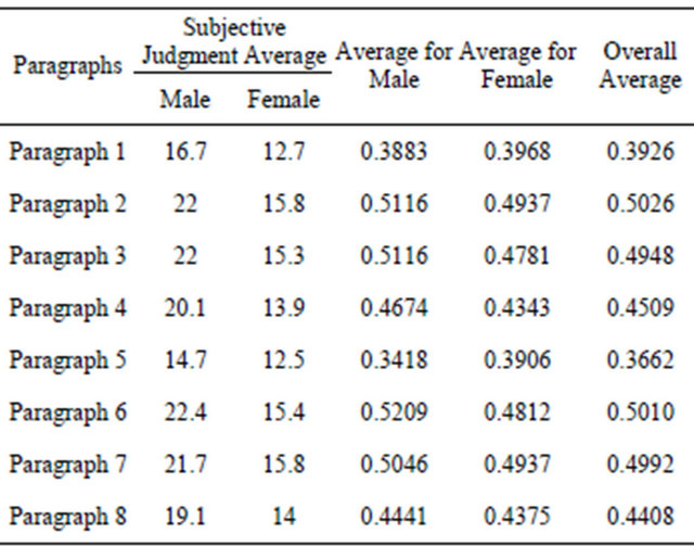
The studies in [7,8] and the comparison presenting in this studies revolving around the concepts of length of text line on the based on eye blink during reading from computer screen, considering different typographical variables font size, style and color while some of the direct and indirect variable is considered as constant. The length of Text line was calculated for each Blink, average it for every paragraph for both the genders. The length is measured in three different units that are Characters per Line without spaces, Characters per line with spaces and length in Inches per line as shown in the subsequent Table 5.
The Table 5 shows length of text line in three different measurable units which is explained below.
Character per line without spaces means that the number of spaces are not considered in suggested length of text line. The character per line with spaces means that the spaces are counted with characters where (±5 or ±7) means the number of spaces vary in range of 10 spaces per line that is 93 (±5) means 88 to 98 and 133 (±7) means 126 to 140. The length per line in C/L without spaces and Length per line in inches give us exact measure than the C/L with spaces.
Figure 3 shows length of line as Character per Line without spaces (spaces are not counted) for each combination of parameters. The paragraph 3 (Verdana, 10, Black) accommodate 116 characters per blink which is greater than all other combinations for both the genders and the overall result confirmed that the combination in paragraph 3 is most efficient. The combination in paragraph 7 and paragraph 2 accommodate 114 and 111 characters per blink respectively and so on.
Figure 4 shows the number of characters per line with spaces for one natural eye blink. The length is same as in above Figure 4 but not precise and accurate like other units because the number of spaces varies up to ±5 or ±7 spaces per line and depends upon the words used.
Figure 5 shows length of text line of each combination in inches. As the length of paragraph 4 is longest one but it does not means that it is more efficient than other paragraphs because the number of words are less than from paragraphs 3, 7 & 2 because the size is bigger which increase the length of text line but accommodate less words.
6. Conclusions
Reading electronic text or textual material from computer screen considered more difficult than the paper text because of many reasons discus in Section 2. the crucial part is how to improve reading from the screen, the study suggest that the parameters involve in the text presentation must be use in a way which is easy and comfortable to the human eye naturally and according the human psyche. This study focus typographically parameters that closely related to the textual material i.e. Font size, style, color and background color in order to improve efficiency during reading while some of the parameters discus in the future work Sections 4.2 & 2.
The explanation for the legibility of moderate line
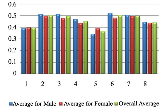
Figure 2. Graphical display of entries for appearance.
Table 5. Length of text line on the bases of eye blink for male, female and average.
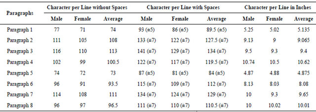
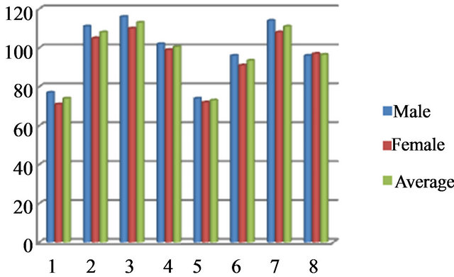
Figure 3. Length of text line based on eye blink character per line without space.
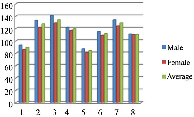
Figure 4. Length of text line based on eye blink character per line with spaces.
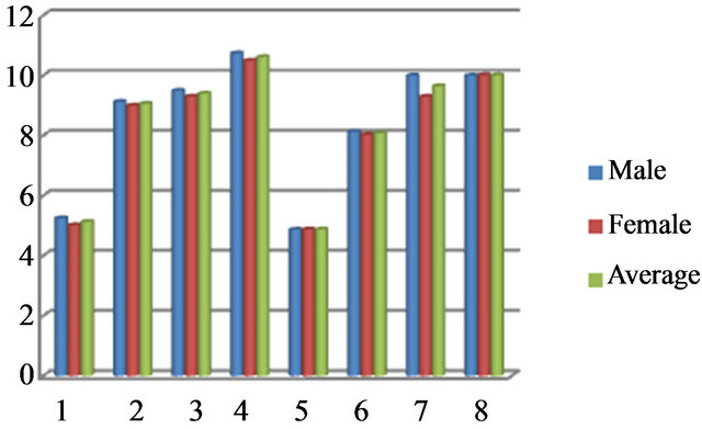
Figure 5. Length of text line based on eye blink character per line (in inches).
length is that it is the outcome of a trade-off between two opposing factors. One; if line lengths are too long, the return sweeps to the beginning of the next line are difficult. Second; if the lines are too short, readers cannot make use of much information in each fixation [22].
The study compare the studies in [12,13] done for both the “male and female” genders. Focus of the study is to suggest suitable length of text line for web page or online reading, while keeping Eye forefront. On the bases of eye blink suggest the suitable length of text line considering different typographical variables i.e. font style, font color, and font size with white background. This scrutinize illustrate three important things about various combination of standards. One; the length of text line on the bases of eye natural blink for female, second; understandability or clarity, third; the good attractive appearances of the combinations. The study suggested the Length of Text Line in three units of different standards combinations. Presenting these text materials for reading through internet or generally from computer screen in the suggested line length will deduce the problems of causing reading, by converting maximum focus losses to minimum ones. The study proves that “paragraph 3”; the combination “Verdana, 10, Black” shows overall promising results for efficient line length, understandings, and for attractiveness. The combinations in paragraph 2 and paragraph 7 are the competitive combinations showing good results in all three aspects. These recommendations serve materials that study online or from computer screen, for example Thesis, e books, research papers etc. In simple words, during designing electronic text for reading from computer screen, the recommendations should be considered for different combinations to achieve maximum efficiency.
7. Future Work
As computer technologies are improving so rapidly and the use of computer system is increasing in parallel. So it is the demand of present era to facilitate computer user with easy and comfortable web contents whether its images, layouts, or textual information. The main source of conveying knowledge to general user of computer is textual information through online reading or reading from computer screen.
Online reading is affected by different reasons.
Typographic variables.
These are the most influential factors that directly affect online reading (handle in this study).
Foreground and background text colors.
There are two type of text display i.e. Positive text; black text on white background and Negative text; white text on black background. Beside these two combinations there may be some more comfortable combination also exist but the selection of these combination should be on the bases of “which combination is naturally suitable to human eye and produce less eye strain and increase productivity and efficiency” during reading from computer screen. High contrast may not be the optimum criteria for the selection of these two colors.
Medical Factors that affect reading from the screen.
The study is based on eye blink which is affected by different reasons, e.g. Environmental factors can indirectly affect eye blink such as humidity, temperature and pollutants etc, and cognitive factors such as speaking, memorizing, mental arithmetic, focused reading, concentration.
In simple words in the selection of any solution the main source of human perception i.e. eye should be kept forefront, think which solution will naturally support human eye and psyche.
REFERENCES
- K. Garland and Associates, “Designers: 20 Years Work and Play 1962-82,” Garland, 1982
- T. Nelson, “The Secret of Human Life,” 1987.
- Google Data Center vs. Microsoft Infrastructure, 2006. http://dondodge.typepad.com/the_next_big_thing/2006/06/google_data_cen.htm
- Internet World States, “World Internet Users and Population Statistics,” 2012. http://www.internetworldstats.com/stats.htm
- R. Conrad, “Computer Screens, TV’s and Flicker Sensitivity,” Subliminal Flicker Part I.
- Pasadena Eye Associates, “Frequently Asked Questions”. www.pasadenaeye.com/faqs.html
- A. V. Kak, “Relationships between Readability of Printed and CRT-Displayed Text,” Proceeding of Human Factors Society, 25th Annual Meeting, Vol. 25, No. 1, 1981, pp. 137-140.
- R. S. Kruk and P. Muter, “Reading Continuous Text from Video Screen,” Proceeding of Human Factors, Vol. 26, No. 3, 1984, pp. 339-3345.
- Smedshammar, et al., “Why Is the Difference in Reading Speed When Reading from VDUs and from Paper Bigger for Fast Readers then for Slow Readers?” WWDU 1989, 2nd International Scientific Conference, Montreal, 1-4 May 1989.
- J. Nielsen, “Designing Web Usability: The Practice of Simplicity,” New Riders Publishing, Indianapolis, 2000, p. 420.
- Bradley Wilson Readability First at wilsonbrad@aol.com
- M. Khan, M. Raza and N. Rashid, “Appropriate Length of Text Line with Special Relationship to Eye Blink to Reduce Maximum Focus Loss,” International Conference on Internet Computing, Las Vegas, 12-15 July 2010, pp. 97-102.
- M. Khan and M. Raza, “Suitable Length of Text Line on the Bases of Eye Blink for Reducing Maximum Focus Losses,” International Journal of Computer Applications, Vol. 37, No. 8, 2012, pp. 15-21
- A. Weber, “Ueber die Augenuntersuchungen in Den Hoheren Schulen zu Darmstadt,” Abtheilung fur Gesunheitspflege, Marz, 1881.
- H. Cohn, “Die Hygiene des Auges in den Schulen, Leipzig. [See Tinker and Paterson, 1929],” 1883.
- Tinker and D. G. Paterson, “Studies of Typographical Factors Influencing Speed of Reading: Length of Line,” The Journal of Applied Psychology, Vol. 13, No. 3, 1929, p. 205.
- M. A. Tinker, “Legibility of Print,” Iowa State University Press, Ames, 1968.
- M. D. Jackson and J. L. Mcclelland, “Processing Determinants of Reading Speed,” Journal of Experimental Psychology, Vol. 108, No. 2, 1979, pp. 151-181.
- R. L. Duchanicky and P. A. Kolers, “Readability of Text Scrolled on Visual Display Terminals as a Function of Window Size,” Vol. 25, No. 6, 1983, pp. 683-692.
- M. E. J. Masson, “Rapid Reading Processes and Skills,” In: G. E. Mackinnon and T. G. Waller, Eds., Advances in Theory and Practice, Vol. 4, Academic Press, Orlando, 1985, pp. 183-230.
- K. Rayner and A. Pollatsek, “The Psychology of Reading,” Lawrence Erlbaum, Hillsdale, 1989.
- M. Dyson and G. J. Kipping, “The Effects of Line Length and Method of Movement on Patterns of Reading from Screen,” Visible Languages, Vol. 32, No. 2, 1998, pp. 150-181.
- M. Youngman and L. Scharff, “Text Width and Margin width Influences on Readability of GUIs,” 1998.
- M. C. Dyson and M. Haselgrove, “The Influence of Reading Speed and Line Length on the Effectiveness of Reading from Screen,” Department of Typography & Graphic Communication, The University of Reading, Reading, 2001.
- M. Beernard, M. Fernandez and S. Hull, “The Effects of Line Length on Children and Adults’ Online Reading Performance,” Usability News, 2002.
- B. Bailey, “Optimal Line Length: Research Supporting How Line Length Affects Usability,” 2002.
- A. D. D. Shaikh, “The Effects of Line Length on Reading Online News,” Usability News, 2005. http://psychology.wichita.edu/surl/usabilitynews/72/LineLength.htm
- R. Hall and P. Hanna, “The Impact of Web Page TextBackground Color Combinations on Readability, Retention, Aesthetics, and Behavioral Intention,” Behavior & Information Technology, Forthcoming, Vol. 23, No. 3, 2004, pp. 183-195. doi:10.1080/01449290410001669932
- City of Seattle Web Presentation and Accessibility Standards Version 2.5: Revised by Internet Board, Approved by the Technology Board, January 2009. Originally Approved 2003 by the Web Governance Board and the Business Management Council.
- M. Raza, SZABIST Islamabad Pakistan, “Perception of Participants about Font’s Readability, Style, Youthfulness and Fun, Business Likeness and General Preference,” The 2008 International Conference on Semantic Web and Web Services.
- “Reconstruction of Eye Movements during Blinks,” MaxPlanck-Institut für Physik Komplexer Systeme, Nöthnitzerst.
- Spontaneous Blinking in Healthy Persons, “An Optoelectronic Study of Eyelid Motion,” Functional Anatomy Research Center (FARC), Università degli Studi, Milano.
- L. E. Ebite, T. C. Ozoko and A. O. Eweka, “Rate of Blinking among Medical Students in Delta State Nigeria: Is the Eyelid a Polygraph?” The Internet Journal of Ophthalmology and Visual Science, Vol. 6, No. 2, 2009. doi:10.5580/27aa
- Standard font size. http://www.ixda.org/node/19341
- L. F. Bacher, “Factors Regulating Eye Blink Rate in Young Infants,” Optometry and Vision Science, Vol. 87, No. 5, 2010, pp. 337-343.
- H. ur Rasheed, Eye Specialist, Saidu Medical College, Saidu.
- L. F. Bacher and P. S. William, “Spontaneous Eye Blinking in Human Infants: A Review,” Developmental Psychobiology, Vol. 44, No. 2, 2004, pp. 95-102.